Crit 22.3.13
After the crit, the first thing I did was start to look into colour schemes and font choices.


Initial ideas for the fonts were that they would be be sans serif so easy to read whatever the point size is and against whatever stock colour. I tried a variety of different aesthetics for each title and body font. For the title font I also tried a couple a little more abstract 'Vibe' & 'Akka' as they stand out and would work well as titles, however I found that a tall thin font worked the best. I decided upon 'BigNoodleTitling'. For the body font I went for 'Quaver Sans'.
Content
Content-wise, I wanted at least ten designers for each of the five sections. Ten means there's a good spread of work and also means there isn't so much information to work with in the publication that'd make it so long winded. It will keep the publication to the point and short.
I wanted a mix of big design studios and up and coming individuals so made sure there was a pretty even number in each section of that. I also looked into blogs to use that were specific into the five areas and dedicated to them.
The content of the publication is split down into the five areas of Graphic design;
- Product & Packaging
- Branding & Identity
- Retail & Promotion
- Information & Way Finding
- Editorial & Publishing
Designer Research


Website
To decide the colour scheme I experimented with the logo I created to work on the website/publication, and looked at which colours worked best.

I decided to go with colour scheme 1 for the outcome. Initially it was between colour scheme 1 with the red and colour scheme 2 with the blue, but when looking at the logo in the colours, the red stood out the most and looked the most sophisticated out of them all.
For the website I wanted to keep a consistent look, so created the various buttons and headings for each page. A logo, headings, a back button & a website button.

I wanted the website to be relatively easy to use, with it very clear where everything was and what led where. I created a quick mock up of what this could have looked like.
Website Mock ups:
 |
| Front page idea 1 |
 |
| Front page idea 2 |
 |
| Section page |
 |
| Designer page |
 |
| Designer website - After clicking website button |
I wanted to create something paper based to go with the website so after researching into different publication types.
Publication Research
 Like the cards by Bravo Company, the cards would be recognisable by the colour of the stock. This means that I can keep the design completely consistent on the back, but have a difference big enough to be seen and known:


From the selection, I chose the five that I think most suited the titles.
I then took one of the images and layered it over the 10 icon variations to see which would work better.


From the drawn thumbnails, I put them all into InDesign and added in filler text & a designers image to see how they would all look.


 I think these work quite well, especially the second one, in just black and white. In colour the faded section works, but not so much in grey. In black and white it also gives the option to be able to print well on coloured stock. Visually these bottom four fit in a lot better with the book than the pie charts do as they show an integration of the aesthetic.
For the minute, I am going to work on the book and do this infographic sheet as an added extra. I don't think it is necessary to have, but might be a nice added double page spread to have in the book.
I liked the concept that 'Bravo Company' had come up with for one of their projects. They produced two versions of the same information, one in coloured leaflet card versions, and a cheaper version as a printed posted, all in limited stock.
From looking at these and the rest of my research into publications I decided the best suited publication type would be leaflets/flash cards. I wanted to keep them consistent so did a possible mock up of what the backs could look like:


I found I had a lot of issues when it came to designing the main side of these cards. As I wanted them in an A5 size format, the amount of information I can put on them is limited, as well as the fact the coloured stock will take away the colours and quality of designers work if I wanted to put these on. As I want to have quite a few designers in each section, it is not possible to do this on such a small space for each field of design, so I made the decision to instead design something of a larger scale with more space.
My original intention was to create a series of books, one for each section, however I do feel that after doing the research into designers, and narrowing it down to the specific ones I thought were important to show in each section, one larger book would be more beneficial. Most of the designers obviously work in more than one section of Graphic Design, so it would be sensible to have them all together in one place.
Book
I have decided to start the book idea fresh and not use the front cover designs I created beforehand as my idea of how the book should look is completely different. My original intention was to use various different types of stock like tracing paper to layer the text over the image, however I now feel that a simple layout with the text and the image on the same page and easy to read would be more beneficial as the aim is to make a publication that is easy to find designers.
Although I like the idea of having a website, I do not feel it is necessary and where my skills lie at this moment in time, so because of this I have decided to scrap that idea and just focus on making one publication the best it can be instead of splitting the time between the two.
Initially I was going to print in full colour so that each designer work image would be clear and understood, however I think that this would be too simple and boring to do, and experimenting with colour filters might make the whole publication a bit more interesting to look at. Printing in one colour would also affect cost if that was an issue.
I experimented with different colour filters and effects over an image to see which colours worked best and didn't adversely affect it.


Initially I thought the images with the coloured strips/squares were the most successful, however when putting them in a mock up of a layout, I felt that they didn't sit as well as they did just on their own.

For consistency through the chosen layouts and so I can put the images everywhere, I decided to stick with the images which were completely coloured. I have decided to go with colour scheme 1 as I felt the images worked better in a darker colour.
Icons
I wanted to create icons which each represented the five sections of design.
To start with I looked over the images I had collected for the designers, and took an image from each to work with to create icons from.
Initial icons:

I felt that these were too abstract/broad when it came to defining what each section was in an image. So I started working on creating my own icons. I liked the shape from the infographic icon above, so started by drawing out some shapes that could possibly be used.

I then took these into Illustrator and created vectors out of them.

From them, I took the five I think worked best and started to try them out.
 |
| Favourite five |
 |
| Variations |
After working with them and getting a bit of feedback, I decided that the first shape worked the best, and had enough room for decent sized text or image.
I drew out 10 variations of what could be done with the shape, keeping within the idea of using squares.


I then took them onto illustrator and created the vector versions.
 |
| Shape used to create vectors |
1 2
2
 2
2
3 4
4
 4
4
5 6
6
 6
6
7 8
8
 8
8
9 10
10
 10
10
All 10 are successful in this format, particularly number 2, 4, 5, 8 & 10. To get a better idea of how they would look I would need the images to put in them.
So I could move forward effectively, I worked on creating the images to represent each section on Illustrator.
 |
| Vector Images created |
 |
| Chosen Five |


The original icons I liked the most were 2, 4, 5, 8 & 10, however after putting the image on I can definitely say that number 5, 8 & 10 don't work as well as they did before at all. Number 2, 4 & 6 work the best with the image for definite.
Between the three of them, I decided to go with number 2 as 6 is too simple, and 4 is a bit too complicated, especially if they are going to be worked at a small scale. If they were larger, then maybe I would choose number 4, but number 2 has stuck out throughout and works well on it's own and with an image.
I then put the 5 chosen images onto it and added the colour scheme.
 |
| Finished Icons |
Book Layout
Front cover
For the front cover I wanted something that reflected the book as a whole, so it needs to be simple. I decided to just have the title and the five icons. I tried a few different variations:


The image below is the one that I have chosen.
I am going to keep it in black and white because I want the front and back cover to be in the coloured stock I will be using.
Page Layout
The page layout is the most important element of the book so I need to get it right. I have decided that as I want it to be easy to read and navigate, I want every section to have the same layout throughout, so five or six different single page layouts per section, and then repeated for each.
Content-wise, I want a mix of individuals and design studios. On top of that I want one double page spread to be dedicated to one designer from the section, and maybe another single page dedicated to one designer. So I need to vary the layouts enough to accommodate this.
 |
| Page Layout Thumbnails |


From the layouts done, although some of them are more informal and playful, the straight and simple ones are best for easy navigation and to see exactly what image is by who. I also feel the layouts with a large amount of text are unnecessary as it is more about the work than the text about the designers. I also need them to work well together as a set and not just individual pages.
Chosen Pages:
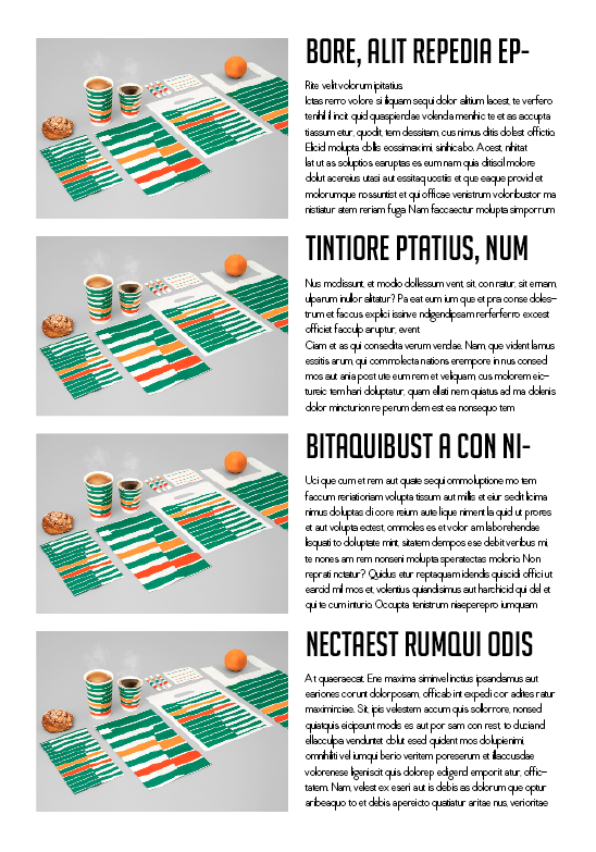


I picked all five individually and think they work well as a set as well as on their own, which is exactly what I wanted. They all stick to a very similar format and I think they are all definitely easy to read/see.
From here I decided to draw them up to scale with a few changes made to make them better. This will show exactly how they will look at scale and if they work as well at the sizes than on just how they work on screen.
I also included the two extra pages which start and finish the section - the title page, and the definition page. I drew them out as four double page spreads as they will sit in the book.

Definition page - Defining exactly what the section is, what it involves and how it can be carried out in media types.
Spread 1 - Three designers, a mix of studios & Individuals.

Spread 2 - Single designer. All images are intended to be from the same project, to show the broad range of work done for one client, with a short explanation into it as well as the typical designer information.

Spread 3 - Right hand side - Four designers, once again, a mix between studios & individuals.
Left hand side - One of those four designers, an array of images of their work, showing a variety of different ways they work.

Spread 4 - Two designers - Contrasting ways of work.
Section page - Section title & icon design.
Section Pages
I wanted to keep them as simple as possible, as shown on the drawing above, so have the title and the icon, as shown below.


Overall I think they work well as they are so simple and aren't too cluttered. I am keeping them in black and white as they will be printed on the red stock so it is clear where each section starts and finishes.
Images
I already decided that everything would be in the red colour scheme, images included, so I looked at the different ways I could do this to the image with a few various different filters.


The circles on this one are too distracting.

Colour is too dull.


Colour is too bright - too saturated.

Colour is too light - takes away from the image.
Between the two that were most successful - number 1 & 4 - there are pros and cons to using either. Number one is obviously not of a high quality like number 4, however as the images are coming directly from the designers websites/blogs it is hard to find an image that will be the correct resolution and fit the frame size without pixelating and ruining it. I found that when copying an image into a frame, a lot of them are very small in comparison because of the DPI difference in them.
Although number 4 gives a high quality image, just changing the colour scheme of the original image, the pixelation could be a problem when it comes to the larger images, which doesn't become a problem at all with filter 1. This could be useful for when I am looking into some designers who may not have such high quality images online, meaning they will look exactly the same as the rest at any size. Also, I don't think that when it is printed it will be such a huge problem either. It is decent quality on screen, so when printed it should come out better too.
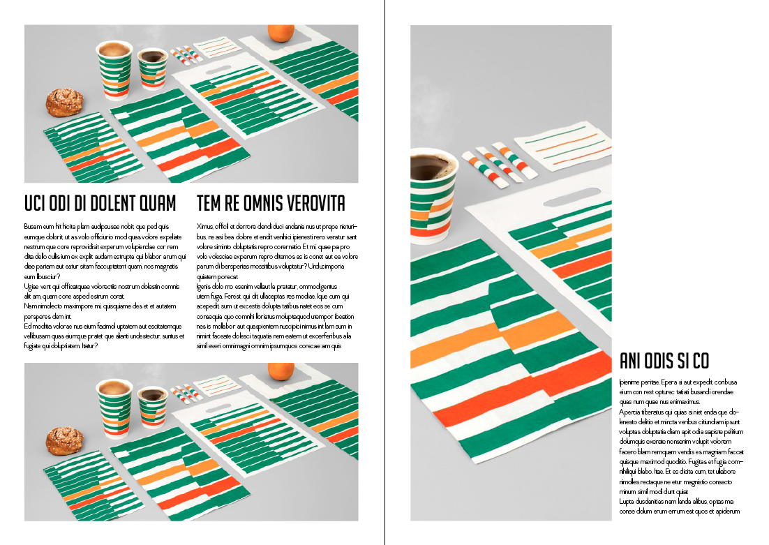
Example of a section
Example of the Branding & Identity section, complete with body text & images.


Crit 19.4.13
Infographics Idea
Another idea I had was to involve an infographic in some way.
Original infographic ideas:
- How to find a designer
- How people actually find a designer
- Percentages on what people knew at the beginning of the first year & what they know now
- How people apply the designers work
- How to effectively use the internet/blogs for research
From these, I took a couple to do a few mock up ideas of what the infographics could look like.

Example of how to find a designer - the pie charts representing the percentage of people who do what on the list. It would continue down until the point where a designer is found. Another idea for the pie chart is to have the percentage of what you should do for each of the two options.


Percentages of what people knew at the beginning of the course - I used mock up figures and statements to play around with how these could look, what typefaces to use and how to show the pie chart as well as which parts of the text need to be the focus. Number 3 stands out the most as the typeface is all uppercase and bold, however I think the fourth or fifth one have better visuals for the pie chart.
I also played around with using the icon shape for these percentages instead of a pie chart:


For the minute, I am going to work on the book and do this infographic sheet as an added extra. I don't think it is necessary to have, but might be a nice added double page spread to have in the book.