Showing posts with label Domino's. Show all posts
Showing posts with label Domino's. Show all posts
Tuesday, 22 April 2014

Friday, 21 March 2014
OUGD503 - Studio Brief 1: Main Competition Brief: Domino's (5)
After yesterday's final crit I decided to submit my individual entry to YCN for the Domino's Pizza Brief.
Final Boards:
Submitting:


Thursday, 20 March 2014
OUGD503 - Studio Brief 1/2 Final Crit
Today was the final crit for both the studio briefs 1 & 2. For this we needed to bring along boards of every brief I had done up to this point.
I took my 10 final Domino's boards, the 11 final Oasis boards and my 9 small briefs.
The first part of the brief was to present our collaboration boards and spend half an hour walking around and criting other peoples boards.
Overall the feedback on our collaboration was good, but a lot of comments were made on the fact that we had quite a lot of boards and could do with condensing them down. Comments were also made on the fact that the images were very bold so more white space on the boards might be a good idea.
Daisy and I discussed the comments made and agreed that we would need to make changes to our boards as they were not yet professional looking or showed off the images as well as they could.
The second part of the crit was on our individual boards. In pairs we went around the table and looked over everything each person had and filled in a peer review form, stating the strengths and suggestions for the following sections:


 Overall the feedback I received was positive. There were a few good suggestions pointed out to me. One was that in my smaller briefs I had been working in vectors for all of them and hadn't really worked with photography or any other kind of media. This was something that I hadn't really realised until it was commented on until now so if I have time I will try find a brief which will work with other media.
Another comment was made that I didn't really have any substantial briefs apart from my two main ones, Domino's & Oasis. Although I agree with this, a couple of the smaller briefs have been larger than I have put across in the boards, so this is something I want to work on and represent my work in a much more fair view of what has gone into the designs. With this in mind, I am intending to find a brief that does need a bit more of a development stage to it and a bit more experimentation. A comment was made on the fact that I had gone by the briefs and not really 'broken' them, however I do feel I did this to an extend with my response to the Domino's brief. While I did create a campaign to advertise the deal, the angle I took for it wasn't the typical angle advertisements take.
I took my 10 final Domino's boards, the 11 final Oasis boards and my 9 small briefs.
The first part of the brief was to present our collaboration boards and spend half an hour walking around and criting other peoples boards.
Overall the feedback on our collaboration was good, but a lot of comments were made on the fact that we had quite a lot of boards and could do with condensing them down. Comments were also made on the fact that the images were very bold so more white space on the boards might be a good idea.
Daisy and I discussed the comments made and agreed that we would need to make changes to our boards as they were not yet professional looking or showed off the images as well as they could.
The second part of the crit was on our individual boards. In pairs we went around the table and looked over everything each person had and filled in a peer review form, stating the strengths and suggestions for the following sections:
- Presentation
- Project Management
- Have you answered the brief?
- Any other comments
My feedback:
Another comment was made that I didn't really have any substantial briefs apart from my two main ones, Domino's & Oasis. Although I agree with this, a couple of the smaller briefs have been larger than I have put across in the boards, so this is something I want to work on and represent my work in a much more fair view of what has gone into the designs. With this in mind, I am intending to find a brief that does need a bit more of a development stage to it and a bit more experimentation. A comment was made on the fact that I had gone by the briefs and not really 'broken' them, however I do feel I did this to an extend with my response to the Domino's brief. While I did create a campaign to advertise the deal, the angle I took for it wasn't the typical angle advertisements take.
Friday, 7 March 2014
OUGD503 - Studio Brief 1: Main Competition Brief: Domino's (4)
After yesterday's session which was a focus on design boards, I decided that it was definitely best to look over the boards I had and potentially rethink the design of them in terms of the hierarchy and what will best represent my work.
Looking into the design board guidelines for this brief, there is no specific number of boards. I just have to upload a file of work, meaning I'm not going to be trying to squeeze the work to fit guidelines like I would have to with some of the D&AD briefs potentially. This gives me much more freedom in the way I lay out my work and how much I can show and the sizes these can be at.
The general images that I have been using on the previous boards are definitely the ones that I will be moving forward with in making these final boards, so looking over them, I need to decide the best course of action for the formatting of the boards.
I did find that I was having trouble fitting the work onto a landscape orientation, and if it did fit well, the text didn't necessarily. Because of this I have decided to move forward with designing the boards in a portrait orientation with a bar along the bottom where all the text can go. This means there is a large amount of room for the images and still a good place for the text to be placed in a consistent format.
I decided that the bar would be in blue and the text in white. Instead of having just white where the images will be, I added the dot pattern that is on a fair bit of the work I have designed. This means that it will add a bit more of the identity to the boards instead of just making it look like the images have been stuck there .
I took the images I had and adapted them to the new boards I had created.


 In terms of the leaflet page, I definitely wanted to use the photographs I had taken as I think they are a very good representation of the work. As the photograph of the flyers had clear sharp edges, it made it very easy for me to cut out the background. I then added a blue boarder to make it more consistent with the other designs.


Looking into the design board guidelines for this brief, there is no specific number of boards. I just have to upload a file of work, meaning I'm not going to be trying to squeeze the work to fit guidelines like I would have to with some of the D&AD briefs potentially. This gives me much more freedom in the way I lay out my work and how much I can show and the sizes these can be at.
The general images that I have been using on the previous boards are definitely the ones that I will be moving forward with in making these final boards, so looking over them, I need to decide the best course of action for the formatting of the boards.
I did find that I was having trouble fitting the work onto a landscape orientation, and if it did fit well, the text didn't necessarily. Because of this I have decided to move forward with designing the boards in a portrait orientation with a bar along the bottom where all the text can go. This means there is a large amount of room for the images and still a good place for the text to be placed in a consistent format.
I decided that the bar would be in blue and the text in white. Instead of having just white where the images will be, I added the dot pattern that is on a fair bit of the work I have designed. This means that it will add a bit more of the identity to the boards instead of just making it look like the images have been stuck there .
I took the images I had and adapted them to the new boards I had created.
While working on the second board I decided that the design really needed a bit of a revamp and needed to fit in much more with the whole Domino's identity, so I redesigned the layout and the typography.
Another change I want to make is to have an image which better reflects the app/website proposal I have designed, so instead of using the iPad image from the previous design boards, I created a phone page with all the opening text on to explain the reason for the app, and put this as the introductory page to this part of the campaign.
With the pizza boxes I found that in the square format I designed them in, they didn't really work on the previous boards because there wasn't really any context to them. They were essentially just four designs on a page which could have been anything.
I tried to mock the designs up onto images of a Domino's pizza box but found that it just didn't look professional at all, so it was definitely out of the question to continue with this. I then decided to just keep them as vectors as the majority of the boards were already vectors. Instead I drew around the shape of a Domino's box, which is unique in the way it folds up, and used this to put the design in, and it looked much better than the photoshopped designs.
At this point I have done the design boards that I wanted and think I have included all the work that is necessary to show.
Looking over them, there is a bit of an inconsistency in a couple of the boards, particularly the ones with photographs on. As the majority are vector-based, these boards do look a little out of place. After trying a fair few variations in how I could make these work, I decided that the only way was to make them work in the same way as the vectors, but cutting them down and taking away the backgrounds.
In terms of the 50 reasons book, this was very hard as all the photographs taken are cut off at the edges so wouldn't fit in very well anyway. To solve this issue I decided on using a magazine page mock-up and adapting these pages to fit the mock up. This was very successful and immediately looked far better.
As the edges of the mock up are white and were hard to see over the dot background, I added a blue boarder around to distinguish them, taking influence from the pizza boxes.
At this point I looked back over the boards and got a bit of feedback from a couple of people on the thoughts that I had about them at this time. My initial thought was that a few images needed a revamp like I had done to that one image previously, a thought which was agreed upon.
Also discussed was the placing of images on the first two pages. The first page is just describing the brief and the second is introducing my concept. At this point I've got the concept image on the first page and not with the text, so after discussion I swapped the two images around, agreeing that the second image was a lot more memorable and stuck in your mind more, therefore it should be the first image.
At this point I also went back to the poster promotions to revamp it with the developed ideas I had. Previously I had thought that these posters were a bit plain as they were mainly type based, but now I feel confident in my knowledge and understanding of the Domino's branding to be able to design them to a better standard. I didn't change much, but made it more visually interesting, adding a banner and editing the colour of the text to fit in more with how I am seeing the identity of this campaign now.
I think this works much better because it has a bit more of Domino's about it. From this I redid the bus stop mock up I had to incorporate this design.
Design boards:
At this point I am much happier with the design boards and definitely think I am heading in the right direction in terms of showing my work off well for submission. I'm still not sure about the design on the second page so will revisit this, and know I need to come up with a final, very memorable board to sum up my response to this brief. For the minute though, I am very happy with the progress I have made and have found that in doing these design boards it has made me develop my designs to be more visually striking and memorable.
I added a final board and saved them as a PDF.
Saturday, 22 February 2014
OUGD503 - Studio Brief 1: Main Competition Brief: Domino's (3)
At this point I am at the point where I am finishing off this brief and starting to think about making the final design boards.
For the design boards I need to make them stand out, bold and very obviously for Domino's, while showing my work off to the best it can be. Previously I did design boards which were blue, and this worked well in both digital and printed version, however there were a couple of issues I found when I printed, such as a lighter blue box appearing around the images for some reason, so I have decided that I will not be doing these in the same style.
I also wanted a very clear place for type and image, and have decided that I will use red instead of blue as the majority of my work incorporates the blue as the main colour, so this will give a balance between the two colours.
My initial idea was to have text on the left, and the image on the right, so I started working on the boards with this as the direction I wanted to go.
Initial Boards:


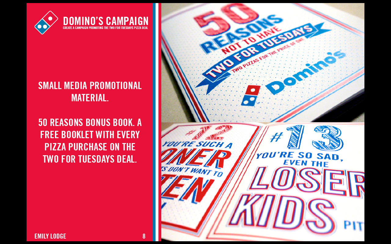
At this point some definitely work better than others. The ones for the web side work well, however the ones incorporating photographs definitely need more work on to try integrate them with the other boards.
Friday, 24 January 2014
OUGD503 - Studio Brief 1: Main Competition Brief: Domino's (2)
After the final crit I thought about the feedback I got and how I could use this to develop my designs and overall concept. The main point of feedback was to make it more friendly to the individual or less offensive in general. I decided that I would make it more friendly for the individual. However I didn't want to necessarily change anything I had already done as I am happy with it all. I decided that I would work on expanding the campaign from what it is already. It will not necessarily be included in the submission for the competition, but it is development of the campaign.
I looked over everything I had done up to this point and decided on two additional designs that could be used in this campaign. The first is designing pizza box packaging which is integrated into the campaign. The second is to design some kind of application/advert for television.
I started with the pizza box. I wanted it to be eye-catching and exciting to look at. As this is what someone would receive after buying the deal, it doesn't make sense to have with any of the reasons on it, more of the afterwards of these reasons where they're told how awesome they are.
To make it eye catching I decided to use the same pattern that I had previously used on the flyers and on the website. I adapted it to fit the square shape of the box.

I decided that the text would simply be 'enjoy' and 'you are so awesome', with the 'enjoy' in the banner.
For the banner I didn't want it to be just straight so went through warping it and decided on three that I thought could be worked into the design.

I then worked on the 'you are so awesome'. I wanted emphasis on the 'so' and for this text to be the centre piece of the design.

I then combined the three elements and experimented with the bannered text.

This one works ok but I do think the 'you are so awesome' is a bit too small and the 'enjoy' is too large and makes the image very unbalanced in general.

For this one I made the main text larger and moved the banner to the side. This one works better, however because there isn't much else to the image it does still look a little out of place. If there was more in the background working around it, then maybe it would be ok. Also the main text if off centre, which isn't something I want at all.

This one doesn't work at all. I tried moving the main text back to the middle but this moved the banner up and made the composition just not work well at all.
After trying these three I decided that it wasn't working because of how unbalanced they all look, with the banner on the top and nothing but the logo on the bottom. This was to do with the banner. It is quite short in length so needs to be at a large scale to make any kind of presence on the design.
To fix this I decided to change the text to 'enjoy your pizza!'. It makes the banner longer, so in turn it can be thinner even though it will be larger. I then decided that to balance it out I could have it above and below the main text. I decided that for this to work it would need to be a simple arced banner. I took away the logo and tested this out.

This works so much better as it is much more balanced in the general composition of the design. There is a clear centre and everything works around it. The one issue I now have is that the banners are folded the same way but arced in the opposite way, so the bottom one looks a bit out of place.
To fix this I edited the straight banners and flipped one vertically.


Overall this works together so much better than previously. It is much more balanced and the banners work well. To get the full effect of how this would look, I mocked it up onto a pizza box.

Putting it into situation is definitely a benefit as it shows the design on what it would be printed on. It looks much better like this than just as a flat design on Illustrator. While I was unsure of it previously, putting this onto the mock-up has made me more confident in the design itself.
After finished this box and being happy with what I had designed I moved onto the television application that could be part of the campaign. It is another way to attract the target audience as it would get them in their own homes.
I thought it could potentially be something that would appear when a film is just starting as a film is usually quite long and something in which people like to eat food while watching.
I started by creating a small image that could pop up when the film is just starting, giving the viewer the choice to press red to order a pizza.

I then needed to come up with something that would appear when the red button was pressed. I decided that when watching a film, nobody is going to want a full screen application to open, so restricted the design to about a third of the screen so it was more of a side bar.
I mocked up a couple of potential designs of what this could be.


After finding this a bit of a pain to design for I decided on focusing on the potential of having a full screen pop up that could appear for ten seconds or so before a film started.

However this seemed as pointless as the designs above, so I scrapped this idea too.
For the minute while I am still in debate over the tv application and what it could be, I decided that I could expand the idea of the pizza box designs and create some kind of collection of mono-coloured designs.
Part of the design from the box above could potentially be used to make something look quite rustic and hand-made, and this is something I wanted to play on. I wanted the designs to be simple and mainly image based, with a simple 'enjoy your pizza!' as the text.
In the previous design I liked the element of everything being central and the focus point being the centre. I wanted to have an image of a pizza on it, but in the same style of the rest of the campaign.
I created four variations of the same design.


I then mocked these four up onto pizza boxes.


These look much better in situation and I think they work really well. They're not necessarily backing the proposed campaign but as an added extra I do think it was beneficial to design these.
What I have to do now is figure out the tv advertisement/application in a way to integrate it into the campaign. Creating the pizza boxes also gives me an opportunity to expand the concept with these and potentially create new flyers/promotional material using these images.
Subscribe to:
Posts (Atom)