Coasters
I didn't want to change the coasters a huge amount from the initial designs I did, but I wanted them to fit in with the updated branding. The first thing I did was change the shape from a hexagon to a circle. I decided on just having two variations instead of three, and I have made them all green and white.


These are much better than the initial designs I created and fit in with the branding a lot better as well. The next thing I did was print these out to scale to see if the size ok.
 |
| Mock-ups |
For the loyalty card I am keeping the same idea that I had in the initial designs, but changing the format.

This format works a lot better as a loyalty card as it is a more conventional shape and size than the one I initially designed.
I printed out a mock-up.
 |
| Front |
 |
| Back |
Stickers
I am creating two sets of stickers for the brief, the first for the loyalty card/general use, and the second lot for sticking on the food/drink packaging. Right now I am focusing on the stickers for the loyalty card/general use.
As these are going to be quite small, they need to be clear and with little detail. I decided on just using the two elements of the logo on separate stickers, creating two different stickers.

I then printed these out as a mock up to see how they looked.


Sandwich Packaging
The next part of the printed material I would like to focus on is the packaging element. Now I have created the menu & menu content, this makes it easy for me to know what to design for.
I will need to create the following packaging:
- Sandwich/Toastie Box
- Panini Box
- Wrap Box
- Sandwich paper wrapper
- Sandwich box stickers
- Side order box
- Takeaway carrier box
The first thing I did was research into packaging in this area.
Packaging Research
What I learnt from doing this is that there are a variety of different packaging options for the same product, and the quality of that is down to keeping solid branding throughout and consistency through it all.
I started by drawing out my initial ideas for what forms these could all take.

 |
| Chosen design |
I drew out nets for these with the measurements in Illustrator.
 |
| Sandwich/toastie |
 |
| Baguette panini |
 |
| Wrap |
My initial thoughts is to use the typographical pattern, however I do think that this might be too much on it's own, and my worry is that the plain colour will be too little on it's own, so I need to find a way to potentially incorporate the two of them without making it look too messy or just put together.
After looking through my packaging research again, I decided that a plain colour on the outside may make it look a bit more professional then a large amount of information. With the green on the outside, I decided that the inside of the packaging can be the typographical pattern in green, so it makes the packaging more of a product itself than just something to hold a sandwich.
 |
| Exterior |
 |
| Interior |
My initial idea was just to do a square with the logo & what the contents would be.

However this is quite boring and standard throughout takeaway shops, so I thought about the positioning of the label when put on the packaging. It will be going over the edge, so I wanted something a little more interesting.


After completing these I set about creating the mock ups of the packaging in a small size to see how they worked when put together.
Sandwich/toastie box


The lids don't work as well as I'd hoped as they don't fit over the bottom half well. They fit inside well though, so I could potentially have the packaging do this instead. The wrap box wasn't successful at all due to the slanted area not being as steep as it should be. It just looks like it's been put together badly. However I do like the way the artwork has turned out, and am definitely going to keep the exterior and interiors the way they are.
I looked back to the initial ideas sheet I did and have decided that I will try out another which is of a similar net.

This one has quite an interesting top, which I think will work well with the sticker over the top.
I changed the previous nets so they adapted to this packaging.
 |
| Sandwich |
 |
| Panini |
 |
| Wrap |
I then printed out the Sandwich box to see how this worked.


I much prefer the aesthetics of this one when printed and put together. It looks a lot better to look at and is much easier to put together.
When putting this together I thought about a packaging which wouldn't need any sticking together apart from the sticker on the top, so went about making these changes to the net.

I then printed this out and mocked it up.


To hold it together the sticker needs to be on it, however I do like the idea of having packaging that opens up to a plate almost and will flatten out completely. This means it is less construction time for me and if this were a reality, these packages could be stored a lot more easily and efficiently than if they were all boxes. This kind of packaging also means there is an option to fold it in the other way and have the typographic designs on the outside.

After doing these mock-ups I wanted to see how it would look if the typographical pattern was in the grey instead of the green. In the green it looks a bit flushed out and doesn't really stand out against the white.


Immediately I can see that this works much better as it is much stronger against the white, and could easily stand its own as the outside of the packaging as well as the inside. I will be using this as the inside for all the packaging.
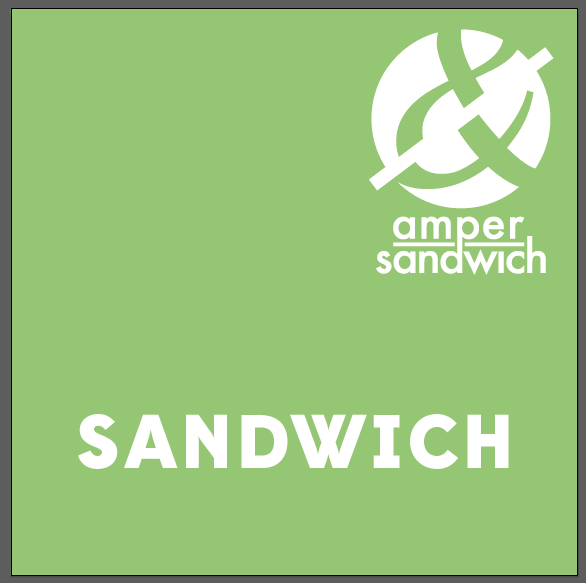
After deciding this, I went back to the labels for these boxes and added two: baguette & special. As a panini can be other breads than a baguette, not all of these will be big enough to fit in the baguette packaging, so will go in the sandwich packaging. Also there is an option for a baguette sandwich which won't fit in the sandwich packaging. The special label refers to the 'ampersandwich specials' sandwiches.
 |
| Completed labels |

Following the aesthetics of the sandwich packaging, I created a wireframe for the sides packaging.
 |
| Sides wireframe |


Overall I am happy with these, however I will not fully know how these work until I do full sized mock-ups where I might have to change some of the sizings, but at the minute I think these seem to be ok as they are.
Takeaway Menu
The next thing I did was create the takeaway menu. This is essentially the main menu, but in a more compact and smaller size. This one wouldn't have any of the images of the main menu.
I wanted it to be one folded sheet, with just a front cover and three pages of content. I drew out a basic grid system for each page.

I then took these into InDesign and took the artwork from the Menu to make up the content, manipulating it to fit the layout and size.


I then printed it out to scale.


This works well as a takeaway menu because of the compact size. I thought it might be a bit too big but when printed it is the perfect size for it's purpose.
Drinks & Condiments Labels
The final part of my printed media is the labels for the drinks & condiments that the restaurant will be supplying. For these I have made it so will be the restaurants own branded drinks/condiments.
The drinks will be:
- Orange Juice
- Apple Juice
- Mango & Orange Juice
- Apple & Pear Juice
- Kiwi, Apple & Lime Smoothie
- Strawberry & Banana Smoothie
- Mango & Passion Fruit Smoothie
The condiments will be:
- Ketchup
- Hot N' Spicy
- Mustard
- BBQ Sauce
The bottles:
For the bottles I have decided on a 500ml for the drinks & 250ml for the condiments.


The first thing I needed to do was create an identity for these. I didn't want it to be too different from the branding I already have, so decided to keep the 'ampersandwich' text and just add an 'own'.


I did two variations of this, and decided that the second was better as it is more compact and will fit in smaller places easily.
I tried out adding 'the' and 'range' to the logo, trying it in three of the typefaces I have used throughout the branding.


My initial idea was for it to be a strip which went around the whole bottle with the typographical pattern, and a coloured circle in the middle with the branding & name.


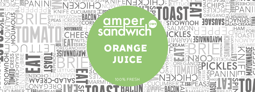
Although I am happy with these, I do think that the typographical pattern is unnecessary, so from this point I have decided to just work with circles as the labels.


I then printed one of each out as a mock-up to see how the sizing and overall look of it works with the bottles.

The sizing of the labels works well with the bottles and I am happy with these.
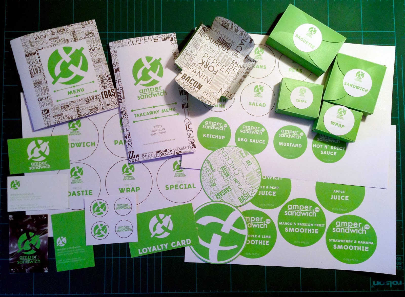
Once I finished these I looked back over all the mock-ups & designs that I have created to see if there was anything that could be improved.
The first thing I changed was the loyalty card. Looking over it with the rest of the mock-ups, I decided that the typographical pattern on it wasn't necessary and it actually works better without it.
 |
| Loyalty Card |

I made mock-ups of these and put them all together.
As a set I think everything works well and fits in the branding.