
Type research
I started working on a concept with the name I had chosen 'ampersand' - &. I wanted to incorporate the symbol along with the words so did a few logo ideas into how I could potentially do this.

I then took it into Illustrator and mocked them up to see how they would look digitally. I had a very clear idea in the typeface I would use for this. I wanted something with a contemporary feel so tried out a few variations of fonts like this.

Straight away the lowercase Futura stood out to me because of how balanced it seemed overall as a typeface. It wasn't too bold or too thin and the letters are all clear. I definitely prefer the lowercase to the uppercase version as I don't like the sharp corners that much, but I will incorporate the font into the designs and see how it looks.


My first thoughts on the two above is that they are too boring and aren't memorable at all. They don't really give me much to work with either.
I started to look at incorporating the '&' as the symbol for the logo itself instead of incorporating it into the text.

To get a feel for how this design was going to work, I used the '&' from Futura so it would fit in with the type. The strike though is what I wanted to stand out the most and I wanted a striking colour to do so.
As I want a luxury professional restaurant there were a few colours that came to mind: Black, white, grey, green & navy blue.
I decided on green because it will be a little more striking than the blue. For the blue to stand out against black it would have to be a light shade and this might take away from the professional feel I was going for.
As well as the strike though, I wanted the two halves of the ampersand to be off from each other, as if the strike through has cut it in half.
Working from the design sheet above, I started playing around with the logo.
Initial logo ideas:


From these four I definitely prefer the designs without the black and with green as the strike through instead of the background. I decided to drop black as a colour and just work with white text on a grey background with the green as the strikethrough.
I also thought that the text seemed a bit separate so started to work on incorporating the two together.


After working through a few ideas I decided that the first couple were the best, but I wasn't particularly keen on any of them. I started to work on the design of the ampersand in a circle.
To begin with I looked at choosing another typeface's ampersand as I didn't think the one from Futura was working brilliantly. It didn't really stand out on it's own, so I wanted to find another one which is in a different typeface so there would be a clear differentiation between the text and symbol.

The idea I wanted to work with was putting the ampersand into a circle with a strike though it.
I tried it out with all five I had chosen:


I decided on the top right one because it seemed a lot more interesting than the one below it, mainly because it wasn't a sans serif font I think. It seems to sit a lot better in the situation as well.
After deciding on this and making the adjustments to the ampersand, I worked on finding a font for the body copy/smaller details.

I wanted a font which was the opposite of Futura in terms of weight, so something thin and light, but keeping in with the contemporary feel. I tried them all out by the one that fit the best with Futura was the fourth one down, Quicksand.
I then put the whole logo together in a couple of variations:


I then decided that I would go with 'ampersandwich' as a name instead and instead of it being a classic restaurant, it will be a sandwich shop, mainly specialising in food you take away from the shop, but there will be a small amount of seating for eating in.
I took this name and applied the changes to the logo:
 |
| New Logo text |


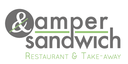


Final Logo:

 |
| Final Logo Colour Variations |
No comments:
Post a Comment