Thursday 27 February 2014

OUGD503 - Studio Brief 2: Session 3

This session was split into two halves. The first half was a crit in small groups where we talk through the progress in our collaborative project and get spoken feedback.
In preparation for this I made a few quick design boards to quickly show our progress and be a visual aid to our presentation.
Initial feedback was that there was an agreement that the general aesthetic we had gone for was strong and they all liked the digital watercolour effect. It was also said that we should try incorporating the green like we had planned to, as without it everything might look a bit bland and the same. It was also said that maybe we could experiment with the watercolour effect so there was a bigger variety of tones and white throughout it. In contrast to this they also said that perhaps the bold text would be better a little bit thinner.

After this, in our pairs we swapped our briefs around and had to fill in a sheet, answering questions on the brief given. Daisy and I were given Sam & Mel's Morrison's YCN brief.
In this sheet we answered questions on where the strengths and weaknesses were in their concept/idea and in their design direction. After this the questions were about how we would take on this brief from this point and improve it.
We found that doing this sheet was quite hard, mainly because it is a very hard brief to get a solution to. It is more about store concept & technological innovation in making the shopping experience more efficient. We decided that the idea they had come up with was creative and well thought through, making it hard for us to give a lot of suggestions into how this could be improved or expanded.

Caitlin & Sarah were given our brief and filled in the sheet for us.
The written feedback was pretty similar to the spoken feedback we were given before, with some suggestions in how to make our concept stronger. We found that this feedback was helpful and had some good points into what needs to be improved and what we should keep going with.
After this feedback we have decided to continue on with our progress and meet up in a couple of days time to start to put everything together.

Wednesday 26 February 2014

OUGD505 - Studio Brief 1: An Introduction To Air Jordan - Study Task 2 Crit

In today's crit we were split into groups of around six or seven and given about an hour to talk through our publications and how far we had got in terms of content, concept and designs. This was also a chance to ask questions and get a bit of spoken feedback. The second part of this crit was one where we went round everyone's in the group and gave written feedback.

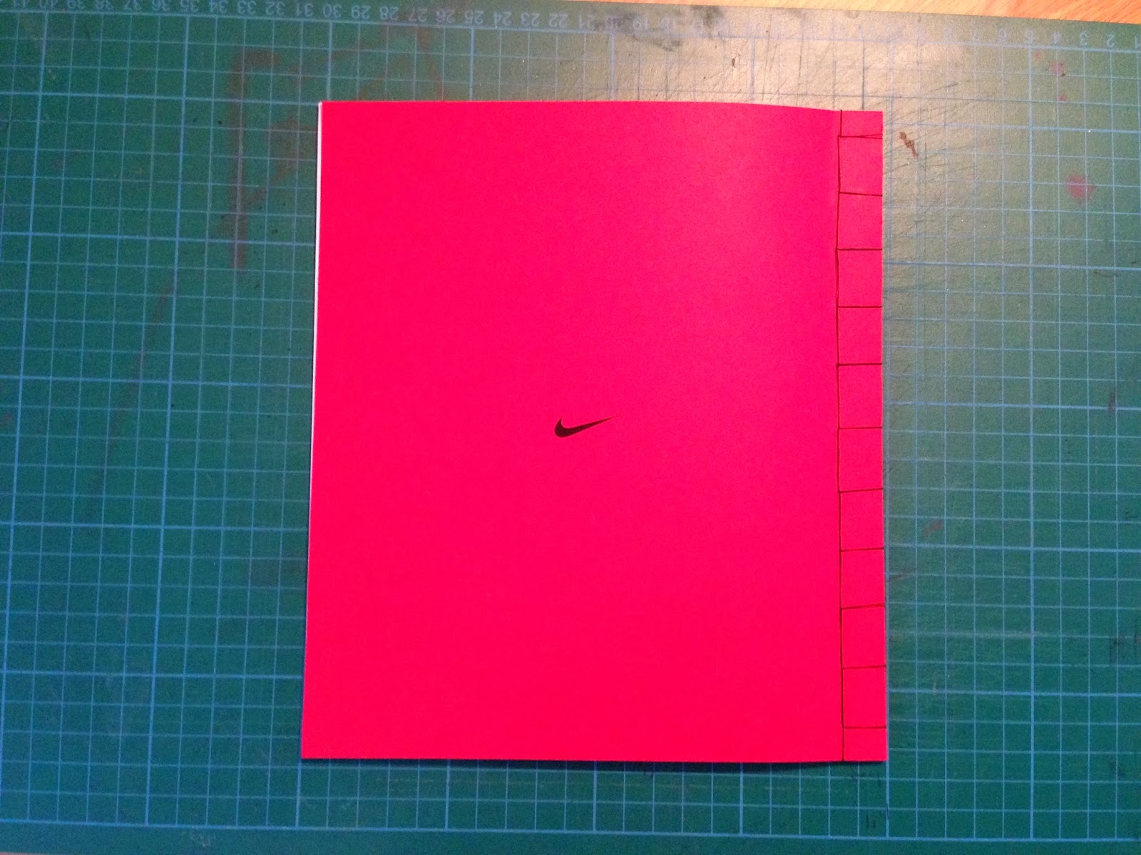
For this crit I brought along all that I had prepared for it. I had a 75% scale mock-up, bound to make it more realistic. A 50% scale mock-up with the perfect binding on it, and two packaging ideas.
I spoke through the initial research subject and what I had narrowed this down to - Air Jordan. I spoke through what research I had decided to include as well as the overall aesthetic of the book and packaging ideas.

Initial spoken feedback was positive on the amount that I had done for the crit, and it was obvious that having the mock-ups was beneficial to the group in giving constructive feedback.
The idea of combing the two packaging mock ups was the main topic. Everyone agreed that the two triangles was something not seen much and was interesting, however it was also agreed that the idea of a window to see the front of the booklet was interesting. Combining these two together is the direction the whole group thought I should take, so I will need to work on this.

They also commented on the fact that they liked the size of the 75% scale and didn't think I needed to do it at the intended size. This is exactly what I thought when I printed and bound it, but having this confirmed is helpful. On the topic of stock, everyone agreed that the stock I had actually printed on already worked really well. This was a bit of a shock considering this is my standard printing paper, and I had intended to print on something a bit thicker or matte. I will need to experiment with stock to see exactly what works well. 

It was also agreed that my choice in perfect binding was a good one, and they all seemed quite impressed at the fact I had been able to perfect bind such a small number of sheets and made it look decent. In terms of written feedback, my Peer Feedback sheet was written on, as well as annotations through the 75% scale publication.
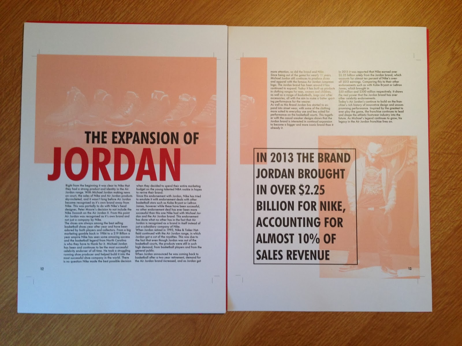
As I have just put the text in for a bit of context, the feedback concerning this isn't anything I will take on board in terms of the hyphenated words being over two lines etc. However I got some useful feedback in how to set the text out so it doesn't have such big gaps and look odd. I will definitely try these ideas out and see which works best.

There were a couple of notes about boxing around some of the larger text, but as I have previously tried this and decided against it, I am not too sure about trying it again now. I decided against it for a reason so will be trying to move forward without having to box all the text up again.

There was a note about lining up some text on the first spread with the title. I will try this, but because I have done this to the grid I designed I am not sure this is necessary as I am happy with it the way it is. There were a couple of conflicting points of feedback, so I will need to see what works best, however I do think I will go with the pieces of feedback I agree with in these cases.

There was a comment about the readability of the large text on the 'branding air jordan' spread because it goes across the two pages, however when looking at the two booklets I had mocked up, I believe the main reason behind this issue was down to the bind used. The Japanese bind was quick and isn't as precisely done as the perfect bind, and in the booklet with the perfect bind, the text is much clearer and readable.

Overall the feedback was positive and constructive, with some good points made that I hadn't initially thought of as good or bad design elements through the publication. I found that this crit was very useful and probably the most useful crit I've ever had because there was time for me to explain the idea and get some spoken feedback, but then a chance for everyone to think about it more and give written feedback where they are more concise and honest on their feelings of the publication, which gave a lot more feedback than I got spoken.

At this point I am feeling positive about the direction of the publication and feel confident that the content is all relevant and that all I need to do is develop the layouts so each page is as strong as the previous and there is a consistent aesthetic throughout.

Tuesday 25 February 2014

OUGD505 - Studio Brief 1: An Introduction To Air Jordan (6)

Once I finished the publication I saved it as a PDF.
From this PDF I looked over the publication to try spot and sort out as many errors as I could. Once I was happy with this I went about making a mock-up of the publication to see how it looked printed and see if any elements didn't work as well printed as they did on screen.
I printed it out to 75% of the intended size as it was just a mock up.
 
Printing went without a hitch and everything seemed to flow well. I then went about cutting it all down to size. I will leave a margin along the left side so I can bind it so it is more realistic for the crit.
Once I had cut everything down I started to think more about the binding techniques that I will use for this mock up and for the actual printed publication.
 For the actual print I want it to look as professional as possible so have decided that I will perfect bind it. This technique is usually for publications with a lot more pages than I have, however I have seen documents with single pages perfect bound together. For this mock up I decided to just do a simple Japanese bind as it is a quick bind that I have done a lot of times.
To get an idea of how well this could work I did a couple of attempts of practicing this as I haven't ever done it before but know how to.
 My first attempt was successful in getting the sheets to stay together in a publication but there were a few issues that I have encountered.
The first is that I used too much glue when binding the pages to a sleeve so it spilled out onto the areas where I didn't want gluing on the first and last pages.
 The second issue is that half way through the pages, it splits completely down to the sleeve, meaning I didn't put enough glue on the initial coating to bind the pages together.
 With these issues in mind I did a second practice, this time using a coloured piece of paper for the sleeve so it is a bit more realistic and applied to my publication.
 Overall this attempt was much more successful. I put more glue on and left it to dry for longer and this definitely benefitted how well the book worked from page to page. I had a small issue of too much glue on the sides again so a little bit did go onto the front and back page, but I have realised how to stop this.
To see how this binding would work on my publication, I printed out a 50% scaled version of my publication and then bound it together using this technique.
While binding this book there were only two problems I came across, luckily which can be fixed. 
The first is that a double page spread didn't line up completely. I'm not quite sure why because all the others seemed to, but this is something I will have to keep a look out for in the future.
 The second is that when perfect binding the sleeve must be bound to the front and back pages. I didn't think about this until it was too late so have cut off part of the heading on my last page. This can be simply fixed by adding in an extra sheet of paper into the publication to stop this happening.
After I finished with this, I moved onto the potential packaging for the publication. For the crit it is required to have three different mock ups for potential ideas.
As I was stuck for a third idea that I liked and could potentially use, I decided to just stick with the following two and get the feedback from these.