We were put into groups and given a title to discuss. Ours was 'Printed text and reading'. We covered everything to do with every day life and design: Posters, leaflets, packaging, magazines/editorials, logos, branding etc.
From this we made a spider diagram of the eight main areas:
From this we had to take one topic each to research into. I chose Legibility and Readability because it gives me a chance to finally look into designers such as David Carson, and others that I have not been able to look into.
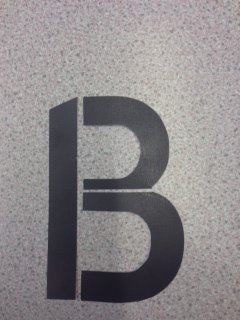
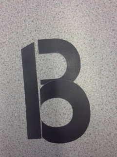
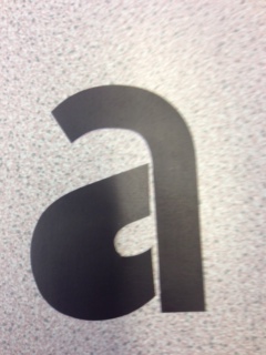
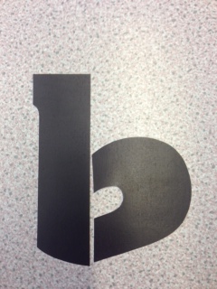
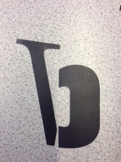
As a starting point I looked at the subject in a general sense - seeing what was deemed legible or readable, and what the point was where it was not either. Something doesn't have to be readable to be legible - this is something that I kept in mind while doing this.
My main interest lies in the type of work that Carson does, work that people say isn't readable, but is legible. I wanted to look at how the appearance and how readable something is affects people's perceptions. As in, if it's not clear immediately, will they like it/read it? More form over function work.
Research
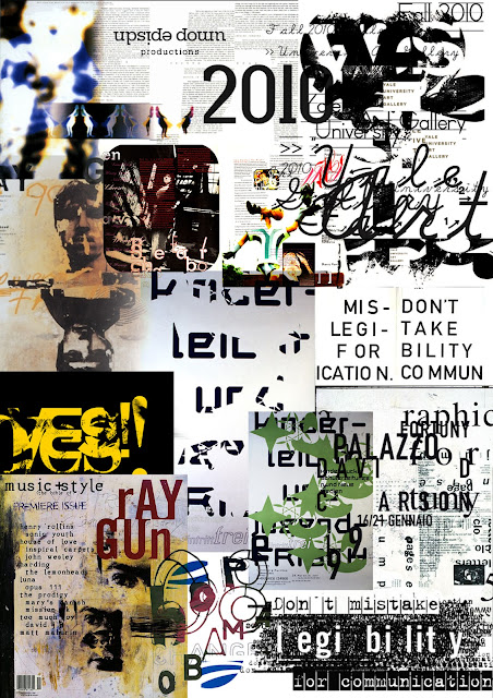
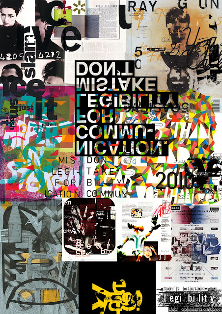
From this research I have put together three A3 sheets, one on primary research, and two on secondary research from all the important points of each. I thought it was important to do a sheet on David Carson as it is the main factor in this research and I think I will find it useful later on.
In keeping with the subject matter, instead of doing just a simple research sheet with everything laid out structurally, I kept with the illegibility and made the sheets full and overlapping. I think this helped me get a better understanding on how far you can take something to make it completely illegible, and what is classes as legible or readable.
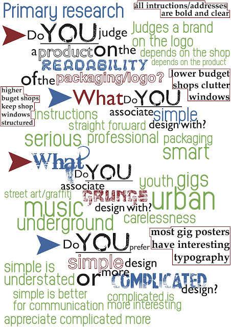 |
| Primary Research |
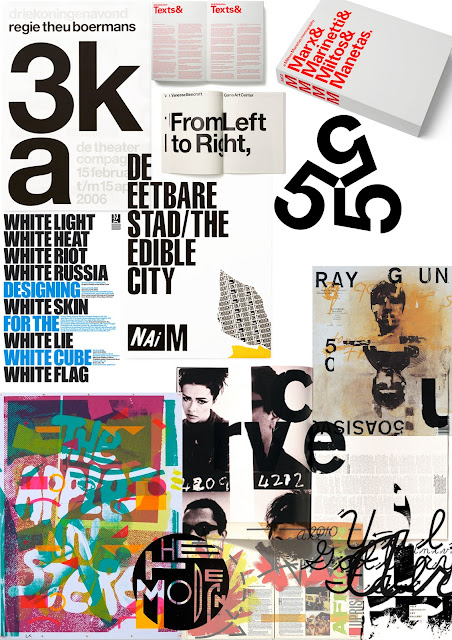 |
| Secondary Research |
 |
| David Carson Research |
From this research I have made a third A3 sheet on the direction I plan to go in with what I have learnt. The direction I am going in is about legibility primarily, and how something does not need to be legible to get the message across, and that something deemed 'illegible' by some, does what it needs to. Many people say Carson's work is terrible and doesn't communicate, but I think it fits the brief and does exactly what it needs to, the same can be said for the likes of Neville Brody too.
 |
| Direction |


.jpeg)

.jpeg)
.jpeg)
.jpeg)

.jpeg)
.jpeg)
.jpeg)
.jpeg)
.jpeg)

.jpeg)
.jpeg)
.jpeg)
.jpeg)
.jpeg)
.jpeg)
.jpeg)
.jpeg)
.jpeg)
.jpeg)
.jpeg)
.jpeg)
.jpeg)


.jpeg)


.jpeg)
.jpeg)

.jpeg)
.jpeg)
.jpeg)


.jpeg)
.jpeg)
.jpeg)
.jpeg)
.jpeg)
.jpeg)
.jpeg)
.jpeg)

.jpeg)
.jpeg)
.jpeg)
.jpeg)
.jpeg)
.jpeg)
.jpeg)
.jpeg)
.jpeg)
.jpeg)
.jpeg)
.jpeg)
.jpeg)


.jpeg)
.jpeg)
.jpeg)
.jpeg)
.jpeg)
.jpeg)
.jpeg)
.jpeg)
.jpeg)
.jpeg)


.jpeg)
.jpeg)