- Gothic fonts clearer closer
- Block fonts the hardest to read up close - used for headlines - one or two words usually, not body text
- Script fonts aren't designed to be used around different point sizes - will have been designed to fit a specific point size - too large & it breaks up. Too small & it starts to merge together.
- More readable when on one line - increase paper size to get larger text on one.
- Readability changes at distances - block is easier from distance - gothic/roman is easier from close up
- Lowercase is more readable than uppercase - uppercase is in a block, lowercase has dips - we read the spaces more than the letters. Uppercase doesn't have much space.
- Difference between books and magazines - books is one page - magazines have columns - small text on many lines - use of gothic instead of roman
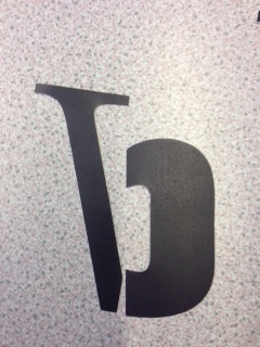
From the 24 letters we brought in, we must cut them out, disect them into their different anatomical forms and combine them together to create the letterforms with different characteristics.
 |
| Letters/Fonts used |
 |
| Dissected Gothic Letters |
Uppercase A


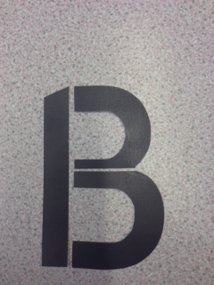
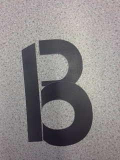
Uppercase B
.jpeg)

.jpeg)
.jpeg)
.jpeg)

.jpeg)
.jpeg)
.jpeg)
.jpeg)
.jpeg)

.jpeg)
.jpeg)
.jpeg)
.jpeg)
.jpeg)
.jpeg)
.jpeg)
.jpeg)
.jpeg)
.jpeg)
.jpeg)
.jpeg)
.jpeg)


.jpeg)


.jpeg)
.jpeg)

.jpeg)
.jpeg)
.jpeg)
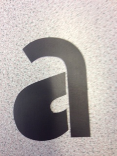
Lowercase A


.jpeg)
.jpeg)
.jpeg)
.jpeg)
.jpeg)
.jpeg)
.jpeg)
.jpeg)

.jpeg)
.jpeg)
.jpeg)
.jpeg)
.jpeg)
.jpeg)
.jpeg)
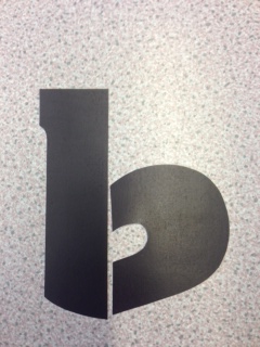
Lowercase B
.jpeg)
.jpeg)
.jpeg)
.jpeg)
.jpeg)
.jpeg)


.jpeg)
.jpeg)
.jpeg)
.jpeg)
.jpeg)
.jpeg)
.jpeg)
.jpeg)
.jpeg)
.jpeg)


.jpeg)
.jpeg)
No comments:
Post a Comment