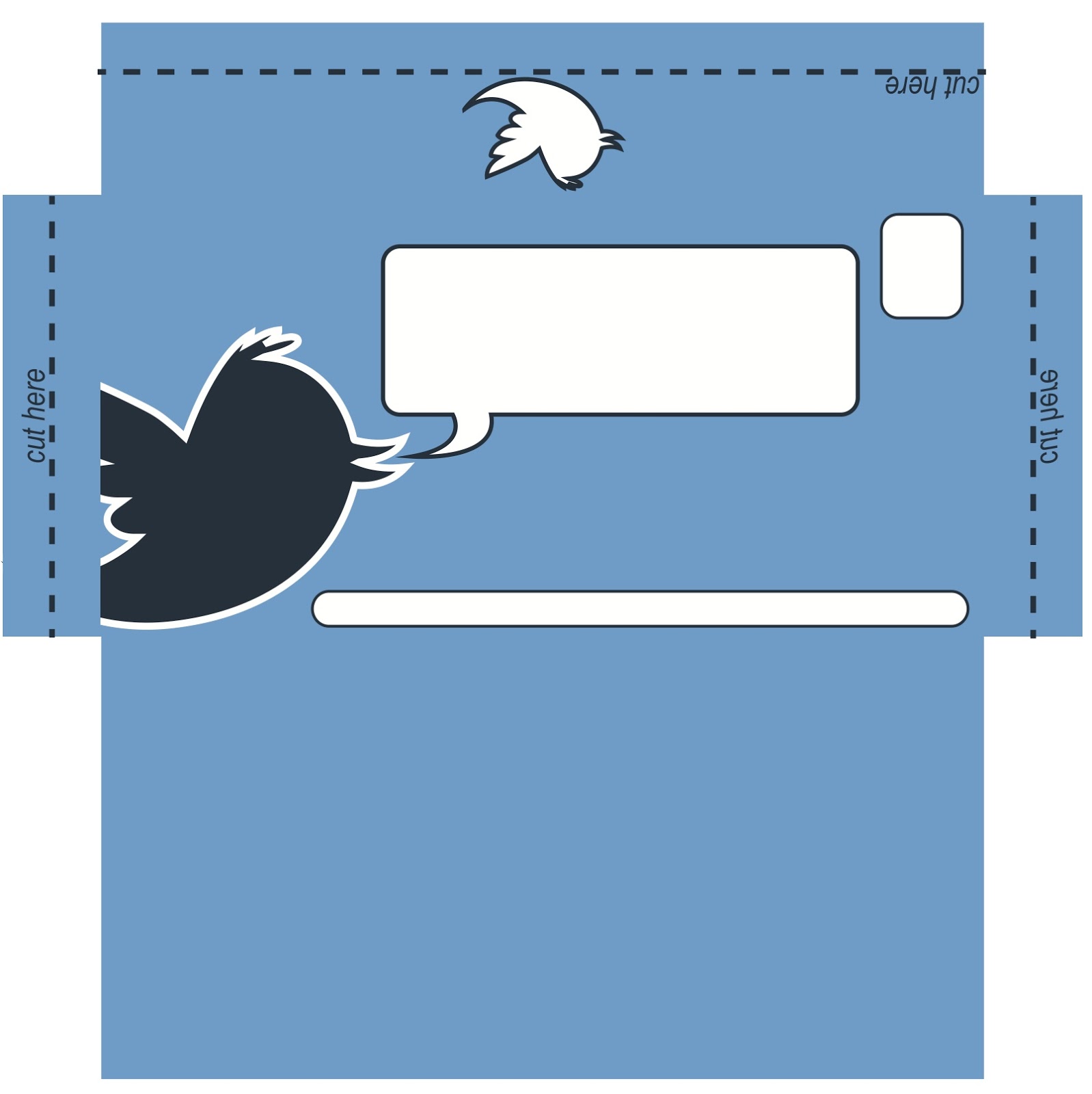
The Envelope:
From the original design of the envelope I changed a couple of things around to make it fit around the leaflet that I had created. Instead of the plain standard speech bubble, I changed it to one from the leaflet, along with this I made the main twitter bird larger and moved everything up a little so it was right at the top. The main difference I made was getting rid of the cut tabs as they would not be necessary anymore. I stuck with a standard envelope net because it doesn't have anything on the inside of it now.
 |
| Original |
 |
| Edited |
I thought that the paper I was using would not be very good through the post and would probably get ruined so instead I created a design around using thicker blue paper and having each element cut and stuck on. I liked the idea of this because everything else was all done on the computer and this gave it a bit of a human touch.

The Mailing List:
Government Department for Culture, Media and Sport
As this is the government department for media, I thought it was appropriate to send them a leaflet as it will highlight the fact that media and social networking is talking over.
BBC Worldwide
BBC are always interested in new information and articles on anything to do with technology and social networking, and as this leaflet is making a statement on how social networking is taking over, I felt it was appropriate to send them a leaflet.
Twitter Corporate Office
Although sending it to Twitter may not seem like a logical thing to do, I thought it would be a good indication to them on what some people think of twitter and social networking.
Printflow Communications Ltd
PF Comms Ltd is a design company that I have been to do a bit of work at and am still in communication with. They are interested in what work I continue to do, and I think they will find this piece interesting.
BA (Hons.) Graphic Design
Design-wise, I kept the sheet pretty simple with the same format as the leaflet. I kept the watermark at the back, and manipulated one of the speech bubbles to be the main space on the page. I did two layers of this and cut two different sections out using different areas of the twitter bird logo.
I wanted to keep it simple, but interesting at the same time and not just a list, so for each address I gave them their own white bubble to make each stand out against the background . I also included the small twitter logo I had created.

No comments:
Post a Comment