Session 1 - 6.11.12
Visual Literacy - The language of Graphic Design
- Construct meaning from type & image
- Interpreting images of the present, past and a range of cultures
- Producing images that effectively communicate a message to an audience
Visual Communication - Process of sending & receiving messages using type and image
All that is necessary for any language to exist is an agreement amongst a group of people.
- Rules - can not be broken - an agreement of everyone
Principles - how the rules came about - there to be investigated
- Type is illustration - shapes & lines used to create letterforms
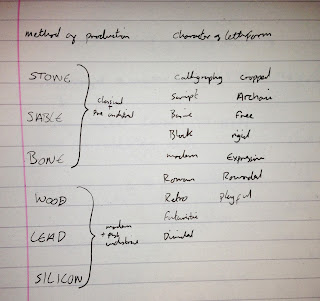
STONE - Chipping
SABLE - Brush (Ancient China etc)
BONE - Quill to generate writing & letterforms
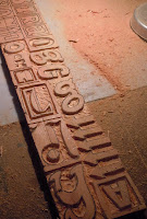
WOOD - Carvings - soft material that could have hard edges when printed
LEAD - Letterpress - Combines typefaces - casted & moulded - a huge range
SILICONE - Digital - a lot of possibilities
 |
| Stone |
 |
| Sable (Brush) |
 |
| Bone (Quill) |
 |
| Wood |
 |
| Lead (Letter Press) |
 |
| Silicone (Digital) |
Digital type now has references to the older styles (brush strokes etc)
Bauhaus - brought together traditions & mass productions.
- form & function in typography - form followed function
Bauhaus Typefaces:
Typeface I created for OUGD405 based on Bayer:
Function can drive form.
Johann Gutenberg - 1455 - The 'Gutenberg press' - first mass production - the bible
- Global typefaces - typefaces forming in the middle east etc
- Nokia created a global typeface - taking other cultures alphabets into consideration.
- Typographers taking other cultures language into consideration.
My chosen 5 typefaces from task - Choose 5 typefaces from the LCA Font Book:
Arcadia
Bauhaus Standard
Latha
Monoline Script
Monotype Modern Standard
In groups we laid out all our typefaces and categorised them into six different categories depending on their characteristics.
- Serif
- Sans Serif
- Hand written
- Type writer
- Modern/contemporary
- Traditional
As we had such a range of 30 typefaces, all which were completely different, we found this task quite hard to begin with. We started by splitting them into two main categories: Serif & Sans Serif. From here we went through the piles and split them further into the other four categories: Hand written, Type writer, Modern & Traditional.
As a class we complied a list of all the different categories we made.
- Serif
- Sans Serif
- Hand Written
- Type Writer
- Modern
- Traditional
- Western
- Contemporary
- Digital
- Script
- Decorative
- Bold
- Light
We were then given the six headings to categories our typefaces into:
- Stone
- Sable
- Bone
- Wood
- Lead
- Silicone
Once they were in the categories we then had to think of one word that described the top typeface. Ours were:
- Roman
- Calligraphy
- Script
- Block
- Modern
- Basic


No comments:
Post a Comment