Task: From the 240, select the 5 most successful and produce the A, B, C, a, b, c of each - trace and hand render - then do the X, Y, Z, x, y, z & name each font.
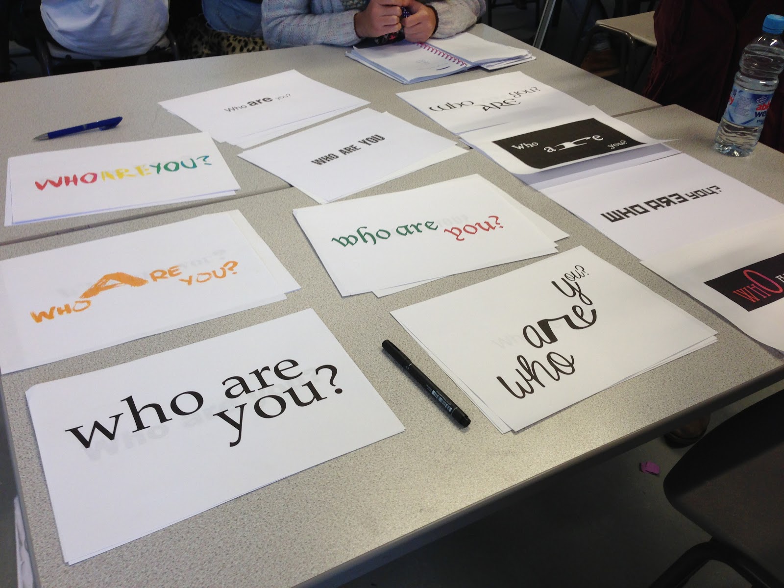
4 Original fonts:
5 fonts created:
1. Scripted Roman
I think that this font has worked well overall, however I do think the uppercase is a lot more successful than the lowercase, which in the case of the 'a', 'b' & 'z', looks a bit awkward and not quite right. If I were to expand it out to a full typeface, I think that this problem would be corrected as the other letters would all have a similar appearance.
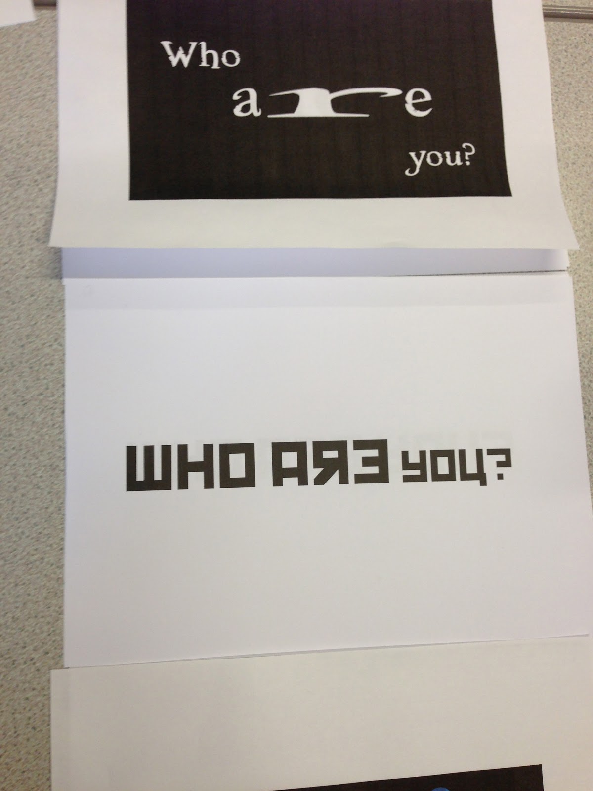
2. Identity Crisis
Overall I do think the font works well, however I'm not completely convinced on the 'c' or 'C'. As I have followed the rules I used on the other letters, it makes them look very uneven and out of place, whereas the other letters work quite well. As there are no serifs on the 'z' & 'Z' they don't really look like they have been changed so much, but I do believe they don't look that out of place. I particularly like the way the 'x', 'X' & 'b' turned out. I think they definitely look the best out of all 12 letters.
3. Lopsided
This is my least favourite final font. Although a couple of letters have interesting quirks to them, I don't feel it is a particularly exciting font and all looks a bit uneven. I think this has shown that I need to take the letterforms into consideration before deciding one letter looks good. I liked the original 'b' and created this from that, but that seems to be the only one which is completely successful.
4. Curved
I find this one an interesting mix. I think it works very well as a typeface in general, and would be interesting to expand further into the other letters and perhaps punctuation and numbers. I think the 'A' & 'X' worked particularly well.
5. Metro
This is my favourite out of the five because it effortlessly fit together and does look considerably like it could be a real typeface that could be used. Unlike the other four typefaces, I think the letters which worked best were the 'C' & 'c'. I also think the serifs work very well and give it a bit of formality.
Hand rendered:
Evaluation
I think the final fonts are well constructed, but if I could do something differently I would perhaps rethink the C's and make them all follow the rules a bit better. I would also maybe try a different combination from the Block & Gothic typeface as I don't think it is as individual as the other four, which all have a bit of character to them. Overall I think all of them could definitely work if expanded into a whole typeface, especially 'Metro' and Scripted Roman.