In the group crit we came back together as a group with all our research we had conducted and complied. We presented our findings and discussed it as a group, concluding that we had all done good and in depth research into our topics.
From this we could work individually or as a group on coming up with a solution. We decided, as we had such a broad range of research, it would be better to work as a group. This means we can come up with more effective solutions in a shorter amount of time and can get through more work.
Initial Ideas
We decided the strongest idea was to do a journey from one point to another - the entrance to the library as this is where we want them to end up as it's the source of books.
We want to stick to children, which means keeping it easy to read, colourful and engaging, as well as encouraging them to read. To keep it simple, image and text on the wall, and some sort of line to follow which points them in the right direction. Along with this, we wanted to create other elements which tied in: A bookmark, stickers, posters etc.
Research
I did the initial research into illustrators, wall design and designers to consider using. Research.
We then split up with our own topics to research & design for:
Kirsty - Animal Illustrations
Danielle - Animal Illustrations on Illustrator
Daisy - Bookmark
Melissa - Star chart
Anna - Quotes
Jasper - Photographs & superimposing
The part of the project I took upon myself was to deal with the text and typefaces for the whole project. As the audience is kids I looked at fun/colourful typography that kids would like.
This gave me enough insight to see that I needed to find a typeface that was easy to read at any size, and for any age. I needed to find something that was contemporary and would fit in with the illustration style we decided upon, which was to do designs in the style of Buro Destruct - and more in particular, perfect curves and straight lines.
I went on dafont.com and looked at the Sans Serif fonts to get ideas of what was considered easy to read and clear, and could be clearly read at different point sizes.
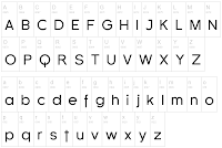
The fonts which were easier to read at different point sizes are the ones which have definite curves & straight lines. This fit in completely with the illustration style, of perfect curves and straight lines. This is the basis I used to create a typeface.I also looked into the typefaces that came out of the Bauhaus and Swiss Design.
When creating a typeface there are things I have to take into consideration to keep it consistent and make it flow well, and most importantly look professional.
Creating the typeface
 |
| Initial Ideas |
On Illustrator I made a simple net in which to create the letter forms from, using just two circles and two squares:
 |
| First Net |
 |
| Initial Designs |
Digital Designs
 |
| Second Net |
 |
| Initial Design |
 |
| Digital Design |
 |
| Third Net |
Initial Designs
 |
| Digital Design |
The main problem I came across was doing the 'S' - as this letter is different from the others, it was very hard to create it and fit it in consistently. I had to keep it the same with the big perfect curves, but also manage to have it only the size of one circle so it kept within the 'x-height' of the typeface.


No comments:
Post a Comment