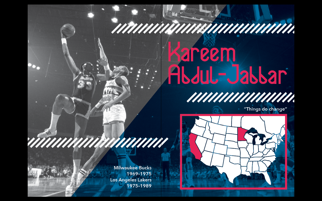
After completing the FindingVegan App, I decided to try find one last competition brief which I could develop an idea for over a few days at least. I wanted to do a logo design, so looked in this section of 99Designs and looked for briefs which were newly released or had at least four days for the initial qualifying stage.
I found one for the coffee company '1896 Coffee Company'. It had just been newly released and had 4 days for the initial round.
I have found that I really quite enjoy creating a logo design for coffee companies. I'm not quite sure why, but they always seem to be a bit more creative than some of the other logo designs asked for on this site.
After reading the brief I decided that this was quite up my street in terms of what was required for the design, and the kind of designs that they liked. It is also a logo design which is built up of the use of type and image, which is good as I need to have more experience in creating an image for a logo which is simple but detailed at the same time.
Brief:
Prize
$410 (around £245)
Name
1896 Coffee Company
Description of the organization and its target audience
We will sell freshly roasted coffee from around the world right to your door. Its modern company with and old tradition. The original facility was built in 1896 and will be a micro-roaster brand set apart from others.
Industry
Food & Drink
Color preferences
Black, tans, gold, browns, perhaps some green
To be used on:
Print (Business cards, letterheads, brochures etc)
Online (Website, online advertising, banner ads etc)
Merchandise (Mugs, T-shirts etc)
Signs (Including shops, billboards etc)
Notes
Looking for a modern design that meets old school style. Tradition meets the new age of coffee.
Perhaps incorporate a coffee bean into the 1896 design or using a burlap sack as an icon.
So many coffee brands out there that we need an innovative solution that combines modern feel and classic touch.
Logo design, Facebook page, menu background and putting onto a label to be branded on a coffee bag.
When compared to other coffee bags on the shelves we want our coffee to stand out and look sharp... modern but have that classic feel.
So many designs currently use coffee cups but hardly any use burlap bags as the icon. Perhaps a combination or just the simple sack with nice font.
In terms of what is required I complied a list of everything I need to consider throughout this brief:
- Use of image - Coffee Burlap Bag
- Type hierarchy - the '1896' is important to the client
- Classic design with a modern take
- Where this will be used - how it will look at different scales
- Full colour or one/two?
- Flexibility of design - how can it be manipulated to fit anywhere?/does the client want this or do they want the logo to stay the same constantly?
- Typefaces to use - one or two?
- Client hasn't specified slogan - does it need one? Should I create one?
- How simple should the design be?
- Does it need to be able to work in a number of different colours?
After writing this list I decided on what I was going for with my response:
Brief:
The brief is to design a logo for '1896 Coffee Company'. This logo must incorporate both type and image, and work them together in a simple, but effective way. The image used must be on a coffee burlap bag, and the '1896' must be the larger typographical feature. Colours to be used are rich colours such as browns, golds, tans and perhaps green/turquoise if needed in full colour.
The client has not specifically stated their audience, but the brief implies that the company owns its own micro-roaster but has a shop in which it sells a lot of different types of coffee to individuals.
The logo must be striking, bold and memorable. It must keep in with a traditional style with the
typefaces and style of imagery, but not look outdated. It must look modern, clean and individual.
To start with I decided on drawing the coffee burlap bag as the way I designed this would pretty much define how the logo worked as a whole.
The client has given a couple of images of burlap bags, and I looked around to try find one which looked good, however there was not much choice and the one given by the client was pretty much what I had in mind.
I took the photo into illustrator and began drawing around the general shape of it. I wanted it to work very simply and not have to have a huge amount of detail as I would have to put more detail into the coffee beans inside the bag, so I didn't want the image to be too detailed or overpowering, especially as it could potentially have to work at a small scale. With this in mind I looked at where the shadows where and put in lines to define these areas, changing it a little bit to make it work as a much cleaner design.
I then added in the simple coffee bean shape I had created, layering this to give the effect of a lot of beans being in the bag. Once happy with the layout I added in two colours to see how it would look.
At this point I am happy with the burlap bag. I didn't want to do the coffee beans in it too small because otherwise it wouldn't be easily seen at a small scale.
Once happy with the burlap bag I moved onto choosing the typefaces. The client seems to like the idea of a serif typeface for the '1896', so I will try find one which fits in with the overall look that I am going for.
As for the 'coffee company', I think I can be a bit more open to the different typefaces that I can choose from. I went online to find a couple more options when I realised I didn't have many that fit the clients needs. I made sure that these were all available for commercial use before going ahead with putting them as potential variations.
In terms of colour, I chose four different colours and got three different colours from each, as well as black and white. This gives me a variety to work from but gives me some restrictions to work within as I feel these colours are the ones to use to reflect the values the business is going for.
I then started to put together my initial idea for a logo, with the '1896' as the main feature.
I then tried it in two variations, one standard variation and then an inverted variation to see how it worked.
I then put these together in one document and saved it as a PNG file to submit to the client. At this point I am completely certain that this will not be the final design, but some feedback from the client could be useful in how to develop the idea.
Design submitted:

While I waited for feedback to this first design I started developing the idea into something a bit more along the lines of what they were looking for. I do like the first design and think it is a good starting point, and would work well as a business card or something like that, as a strong logo to represent the business, I don't think it is quite what the client is wanting or the best that I can do.
After some development and experimentation I came up with the following design.

It is quite a jump from the original design, but I think this is good as it shows the variety of ways that the design can be used. I much prefer the direction that this design is taking, and it is quite a unique shape for a logo. I do think it is much better than the original design and think the client will agree too. There is much more choice in terms of how it can be recoloured, and is much more eye-catching.
I then submitted this alongside the first design to wait for feedback.
I received feedback the following day:


From this it is obvious that the client much prefers the second design, like myself, so I will move forward with this design. Each design has been given the rating of 3 stars, so there is definitely room for improvement.
The client wants different colours and more vintage looking typefaces.
At this point I want to try experiment more with the gold colour and incorporate the blue or green I chose in my colour restrictions previously.
I looked back at the typefaces I had chosen previously. I chose a variety of different types, and now think that something with a serif may suit the aesthetic a bit more, and what the client is after.
The one at the bottom 'Vast Shadow Regular'.
It has quite an interesting visual look and goes with the kind of look I think the client is wanting. Also I can easily variate the two parts of the name by editing the typeface.
I decided on getting rid of the detail on the 'coffee company' to make it more readable as this will be the text which is likely to be smaller in the logo. It also makes the '1896' stand out.
I took the second logo design and changed it to include this typeface.
Something I didn't like about the logo was how tall it was. I felt it was a bit too large for a logo, while interesting, it seemed a bit unnecessary and I felt that the way to develop the logo was to make it as simple as possible in the surrounding shape.
With this in mind I got rid of the bottom semi-circle and moved the coffee beans to be above the '1896' in the top one, as the typeface is quite wide compared to the height of it.
I then decided on changing the semi circle to the gold, and the main circle to a blue colour to brighten the whole design up and make it a bit more contemporary.
I also added a rough texture to the blue circle to give it a bit more of a rustic look. Up until this point I felt it was a bit too clean cut for the aesthetic that the client wanted, so adding this makes it a bit more rustic and in line with the traditional sort of design they were after.
The client had also put a note on the competition saying that they liked the abbreviated version of the 'coffee company', down to 'coffee co.', so I used this instead of the full name.

Instead of submitting this design, I continued to develop it, trying to go with the idea of keeping the space as small as possible.
I tried the idea of wrapping the text around the circle and getting rid of the banner and semi circle.

I think this design works well because it is much simpler than I had it previously. Also I feel it is a much stronger logo as it is all enclosed together and fits together well.
I much prefer this second variation of the design, however as the client seemed to like the previous shape I submitted both designs for feedback, much more confident in these designs than previous.
While waiting for feedback I continued to develop the design.
The client seemed to want a full colour design, however in my mind, the logo would look better in one colour and white, as I have designed it to fit this better than a lot of different colours. I decided on furthering this type of design as I feel it will certainly be more successful in terms of how I design it. I can always add colour later, but I'd rather focus more on the overall design instead of fussing over colours at this point.
Something I am now unhappy with is the text and outer circle. While I think the image in the middle works well, I do feel that the type is a bit disjointed. I don't feel that this typeface is as contemporary and professional as it could be and want to find something that really makes the design much more complete.
The first thing I did was change the colours to be white and dark brown. I also changed the two dots to two coffee beans as it fits in well with the whole context of the logo. I also added a few coffee beans to sit at the bottom of the burlap bag.
Already I feel that this logo looks much better and much more professional. I do definitely feel that the typeface does need to be changed.
I went through the typefaces I had again and came across 'Geared Slab'.
I felt that this was the perfect typeface for the logo as it was much thinner and much like the first typeface I had designed with, but has the serifs on to give a bit more of a traditional/rustic look. At this point I didn't know what the licensing was on it as I got it from Lost Type Co-op, and a lot of the typefaces on there do have licensing rules.
I spent a good while trying to find out, and luckily I found that it was free commercial licensing and was available on a number of different typeface websites. This was a relief because I hadn't found another typeface that I liked as much as this one.
With this sorted I changed the typeface to Geared Slab. It is much thinner than the previous typeface so is repeated another two times around the circle to fit in. This isn't what I wanted to do, but I don't think it looks too bad at all.

At this point I have received feedback for my previous two designs, both with a rating of three stars again, like the first two, but there was no written feedback this time.
I decided that this was fair as now looking back at them I don't see them as serious contenders for winning the competition and they are quite near the beginning stages of the development. I feel much more confident with my current design and feel it is a large improvement, and even if the client doesn't like it as much, I feel it is much better in with the style of logo they are wanting.
I decided to continue on with this logo design I had before submitting it. At this point as I am confident in the logo design I do want to show it off in as many different contexts as possible to try convince the client that this is a good design to go with as it can adapt to different spaces, sizes and colours to be laid over.
I started by flipping the colours over so it shows the inverted logo. This is to be used when put on dark colours so it still stands out.

I also did two variations of the design in full colour, one which was more subdued in brown and gold, and another with the blue on like the previous design.
At this point I am confident in the design and the variations which can be created from it, so feel ready to submit this to the client.
In this submission I decided on making it a tall submission with six sections to show off the logo in different situations and different colours/sizes.
Submitted design:

I am much more confident in this design and definitely feel it is a step up from the previous one as it seems a lot more sophisticated and accomplished as a design and as a logo. I personally think it works best in the brown and white, but the client does seem to want it full colour.
I received the following feedback from the client:

Once again they have given a rating of three stars.
This is a bit frustrating as it is the same rating as the original submitted design. However their comment suggests that they like this improvement and I am going in the right direction.
At this point I decided to review the design and pick out everything I didn't like about it in an effort to improve it.
There were two main parts to the logo that I don't like; the amount of repetition of the brand name, and the grungy texture.
While I previously liked these, I do feel that these are the elements that need to be experimented with to develop the design. Something else I would like to develop is the overall shape. While the circle is clean, I like the idea of making it look like it is a seal with pointy edges around it all.
Something I also liked was the idea of a banner across the middle. While I don't think it worked brilliantly before when it went over the burlap bag, putting it underneath the bag, but over the background. This does limit the space on each side for text, but I think that I could put the '1896' in these spaces, and put the 'coffee company' on the larger space along the circle.
I spent some time experimenting with this until I was happy with the composition.

I am much happier with this design as I feel that the text and image is integrated well and sits much better than the previous design. I have still got the segmented areas so it will be easy to recolour well, and I do think that the client will want me to do this.
At this point I want to submit the design to see if the client is happier with this design. I would like to get a bit more than three stars at this point because I am starting to find it hard to design something I feel works better without having to redesign the whole thing.
Like the previous submission I split the submission into sections to show the logo in different contexts and showed how easily it can be manipulated/changed to fit the context.
Submission:

While waiting for feedback I continued with the development of the logo in experimenting with colours I could use for full colour.
I eventually settled on three variations of the logo:
Variation 1: Flat four colour logo

Variation 2: Gradient full colour logo

Variation 3: Flat two colour logo

I feel that these three variations show off the possibilities with the logo. I looked back over the previous full colour designs and felt that they didn't look quite right because of how flat they were, which led to my decision to try out using gradients. I do feel that this colouring looks much better on the design, and makes the logo look like a shiny seal, which is quite traditional and is something high-end coffee companies to commonly use on their packaging.
The first variation shows how the logo can be coloured in with flat colour and the different sections which can be coloured, and the third variation is the two colour logo, showing it in it's simplest form.
At this point I received the feedback from the submission made, and thankfully I got four stars, meaning I was going in the right direction. This definitely gave me confidence in the three variations I had just made.
I submitted the three to see which the client would like more. I personally still like the two colour design, but do think the client will like the full colour design as this is what they have continuously been asking me for.
Feedback received for the three variations:
I am happy with the feedback given by the client. I got the five star rating for the full colour design, which gives me confidence in the design. They were obviously just looked for a good full colour version of the design and not giving a higher rating because of the design, which is comforting to know.
At this point the first stage of the competition has finished and I will be waiting to see if I get shortlisted for the second half. I am fairly confident that I will be shortlisted because there is only myself and a couple of designers who have got above three stars. At this point I am not too confident in winning the competition as I have had to develop the idea a lot to get a good rating from the client, while a couple of others have not.
While waiting to hear back from the client, I decided on experimenting a bit with the burlap bag. When looking over it I realised how large the coffee beans were compared to the size of the bag, so decided to try them at a smaller size.
While it is more realistic, I do think that because of the gradient used on the beans, the larger beans work better. Also when the logo is smaller, the beans become very hard to see is the smaller version. It was definitely a good experiment to do to make sure I am fully happy with the design.
After a day I found out I had been shortlisted with two other designers. I feel that this is a good achievement considering the amount of work I have put into creating a good logo over the past few days.
The client wrote a note to the three of us to say that for submissions now they would like to see a potential business card and Facebook page cover image.
My initial reaction is to start with the business card as this is a small piece of media and something in which I can develop an identity for the brand in a quick and efficient way. I already have a bit of an idea of how I want to go with the identity, but if it doesn't look good on a business card, it's not going to look good on a larger piece of media.
I started with a very simple idea of using a flat gold colour and brown for detail/text. For the minute I think that I need to focus more on the layout as this will be what will win me the competition more than choosing the right colours at this point. Also if I get the layout right now it will be easy for me to change colours later on instead of doing it the other way round.
Initial designs:
I then took these into Photoshop and put them onto a business card mock up to submit to the client. One issue I found with the mock up is that the specified size of a standard business card seems to be different to the mock up. It is longer than the mock up, which means that it will be a bit distorted on the mock up. Luckily it isn't so much of a distortion because of the angle of the presentation.
Submission:
I received the following feedback from the client:
The feedback was not a surprise. I do agree with what they are saying with the suggesting a different colour. At first I liked the gold, but now looking back at it I don't think it is the way to go.
Another idea I had was to use a photographic image at a fade behind the seal, of coffee beans or of the burlap material.
However with the use of photographic images comes licensing, and this is quite tricky when it comes to commercial projects.
I found a website 'Pixabay', which operates on the 'Creative Commons Public Domain Dedication CCO 1.0 Universal'.
This works under the copyright of:
'The person who associated a work with this deed has dedicated the work to the public domain by waiving all of his or her rights to the work worldwide under copyright law, including all related and neighboring rights, to the extent allowed by law.
You can copy, modify, distribute and perform the work, even for commercial purposes, all without asking permission. See Other Information below.'
'In no way are the patent or trademark rights of any person affected by CC0, nor are the rights that other persons may have in the work or in how the work is used, such aspublicity or privacy rights.
Unless expressly stated otherwise, the person who associated a work with this deed makes no warranties about the work, and disclaims liability for all uses of the work, to the fullest extent permitted by applicable law.
When using or citing the work, you should not imply endorsement by the author or the affirmer.'
This means that any photograph I take from this website can be used for commercial projects. The photo's are not quite as good as stock websites where payment is needed, but I did find three photos that I can potentially use
At the minute I definitely think the second one is the most visually interesting because of the lighting effect on it. However I will try all three to see which works best.
Photo experimentation:
At this point I think that having the images as they are isn't working well so some manipulation is needed to make them fit better against the seal.
At this point I have decided that the most successful image is the image above. I think it works best against the seal and looks much more professional than the other two images. While I liked the idea of the burlap texture, I don't think it is working particularly well against the seal as much as the one above is.
I then tried out a couple of different variations with the brown outline to see how it would work.
I definitely think the image works better without the outlines. I tried a couple more variations.
I then used a colour filter of the dark brown and layered it over the image to get the image below.
This is definitely the best design I have at the minute and am confident in it. I will just have to hear what the client says in feedback for it.
In terms of the back of the business card, I kept the same layout as the yellow design, but got rid of the lines, keeping it as just a solid colour.
Submission:
After I submitted this I decided that I wasn't too happy with the back side of the card. I did previously like it with the two lines, but because this didn't look great on the front, I decided to scrap it.
I tried it with just one thin line. I think that this does look a bit more considered and professional.
I then edited the mock up and submitted this design.
Submission:
At this point I am now waiting for feedback and will focus my efforts on creating a Facebook page cover image.
This is something that needs to reflect the brand but also be sophisticated and clean design. As this shortlisted stage of the competition is short, I don't have much time to create something detailed.
I have considered the idea of creating some kind of image while is illustration around the logo, all in white and brown, with the colour logo in the middle, however before doing this I want to get a couple of simple ideas sorted so I definitely have something before the deadline.
I moved onto the stationary side of the response while I thought about how I would go around designing the cover image.
The first thing I did was create a portrait version of the business card. While I kept the front the same as the landscape card, the layout of the back of the landscape one would not work well on a portrait orientation because it has been designed to fit the landscape. While the general layout would be ok with the lines and sections, there would be a lot more space.
Something I wanted to do was use a cut down version of the logo for the top of the portrait card. While the full colour design is on the front, I wanted to use the one colour design on the back, but felt that the full logo took up a lot of room and a cut down version of the logo could be interesting to use and give me a bit more variation in the designs.
I experimented for a bit until I found a variation that I was happy with:
I then took this and used it on the back of the business card. Below the general information I put a small piece of text with the company name and a small slogan of 'freshly roasted coffee from around the world'. I thought that this was nice to add as it gives the viewer something that definitely says what the company is. As the logo doesn't incorporate any kind of slogan, the addition of this makes it very obvious what the card is for.
I decided that the two main features that I wanted to use throughout the rest of the branding was the photographic image and the dark brown. I think the photograph works really well with the filter and looks very clean and professional.
I then moved onto the envelope and letterhead. For the envelope I didn't want to do anything too complicated as it is an envelope and only needs a simple branding element for the user to know where it has come from.
I created a line and added the spiky edges like around the logo, rounding them off and adding the logo over the top. I decided that this was what I wanted to use across the larger media to cut off the image from a block colour instead of doing it suddenly. I also thought it worked well on it's own so used it along the bottom of the envelope.
Stationary:
At this point I am quite happy with the designs I have above. They are simple and I really like the idea of playing on the photographic image and keeping that as a running element. I'm not entirely convinced about using it on the letterhead but I will have to develop this idea further to see if I come up with something a bit better.
I submitted this to the client before starting on the Facebook cover image.
I had two ideas for this; to do something which was all white illustration on the brown, or to have it very simple and just use the photographic image. I decided to do both of these variations and see which I thought was better in the end.
I started with the white illustration. I didn't want to create new imagery as I felt I had enough elements in the logo that I could break down and use to make something visually interesting. I experimented for a bit until I came up with two variations I was happy with.

At this point I submitted them to the client before moving onto working on a photographic cover image.
I think that this design definitely works much better because there isn't as much going on and it is a very visually striking photograph to begin with. I think the one with the banner and the larger logo works better, but the second is definitely a possible variation that I would like to keep.
I submitted these designs to the client before reviewing the letterhead again. I wasn't completely happy with this in the initial design so wanted to see if there was something better I could do.
Something that was bothering me was the practicality of having the photographic images at the top and bottom of the letterhead. In a practical sense, having something like that isn't typical on a letterhead because of obvious printing issues that might occur. With this in mind I stripped back the design to just the top banner and added a one colour version of the coffee bag to the bottom left hand corner for a bit more of a branded feel. I didn't want to include the logo for a second time at the bottom so felt this was appropriate.
After this I reviewed everything to see how it all worked together. I am confident in the branding and think I have applied it across the various media in a way which reflects the brand the client wants, and in a way which is practical to printing.
I then worked on creating my final submission with all the design work on. I started by creating a document and splitting it into six sections: Logo, variations, business cards, envelope, letterhead, cover images. I then put all the images in and added lines between each section to differentiate them.
Final submission:
Overall I think that this has definitely been my most successful small brief. I think this is down to the fact that I have had much more experience now and a lot of time to reflect from previous briefs and group crits. I also think my design skills have improved dramatically over the past few weeks compared to the first half of the year, as well as my conceptual design skills.
The way the brief was written really appealed to me as it sounded like the client wanted a design which is to the kind of work I design. I threw myself into the brief and spent a lot of time developing the initial logo, getting regular feedback from the client to further this. I found that this was very helpful initially, but after a while I felt the feedback was starting to deter my design more than help it. At this point I did start to ignore the client and do the design that I wanted, which the client then liked than the previous design. This has shown me that while it is good to listen to the client and their ideas, going with my instinct is something I should definitely do as it could turn out that the client likes the design much more.
Something I didn't like about the brief was the fact that the client stopped giving helpful feedback after a point and starting using the star rating system. This made it very hard to know which elements of my design they like or didn't like, pretty much making me do blind design and have to work a lot harder to come up with designs they liked, when really, if they had given written feedback, a lot of time might not have been wasted. I also felt that while their brief said one thing, they were continuously asking for another. They were asking for a modern design, but started continuously saying they wanted a much more traditional design, and in the end the winning design was not that modern at all, which does make me feel like I did waste a lot of time when the brief clearly was not written to what they really wanted at all.
In the end I just lost out in winning this brief, coming in second. It wasn't a surprise as I had a pretty strong feeling that the winner was already chosen by the first stage and the client was just going through the competition for formality. This was a bit disheartening but I decided to continue with my designs and developing my response for myself more than the client. While my design may have been breaking out of what they wanted, I feel that I answered the brief well and created a design which really was something that is visually striking and something to be proud of as a designer. There are definitely a few design decisions that I would not have made if I had my own way, but ultimately I do think I made a design that I do like and worked hard on.