Today we had an interim crit for our progress in Studio Brief 2.
For this I showed what I had done so far, which up to this point is my completed brand guidelines and my initial layouts for my exhibition book.
Feedback given:
Overall the feedback was positive to what I had done up to this point, however I made the error in not leaving anything which explained what the project was. This was on a page in the brand guidelines that I displayed, however not having it obvious at the start was obviously a mistake as some of the feedback might have been more helpful if the context was known clearly.
After this crit I got on with developing my book. I worked out that for hand in, I needed to get it finished and sent off with around 10 working days spare so I would definitely get it printed and back in time. The last day for me to send it off is the 6th May, so that gives me two weeks to get it fully completed.
While this is quite a short time span for what I want to do, I do feel that I will be able to fulfil this as I have experimented with layouts and know how I can move the image blocks around the text columns. I have also decided that because the exhibition is in association with the NBA, written content about the players is something that I can take from their website.
While I would have liked to write my own body copy, I do feel that for the most professional approach, taking the body copy from their website is beneficial. They are the specialists in the sport and have full biographies written in full detail, as said in the previous post with the link to the written content I will be using.
As well as having the players information in, I want a couple of other sections which make the book a bit more interesting for the reader.
- An Introduction To Basketball
- An Introduction To The NBA
- The Naismith
- The Top 10 NBA Moments
I want the first three to be at the front of the book, with the Top 10 Moments as an inset in the middle of the book, which will mainly be photographic with minimal text, just to explain the moment.
I then worked on how I wanted the images to be displayed throughout the book.
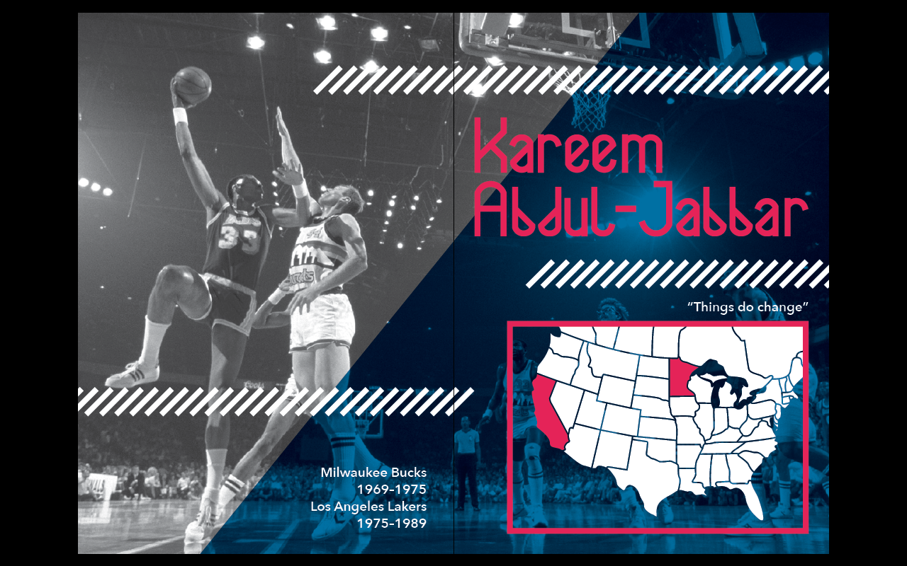
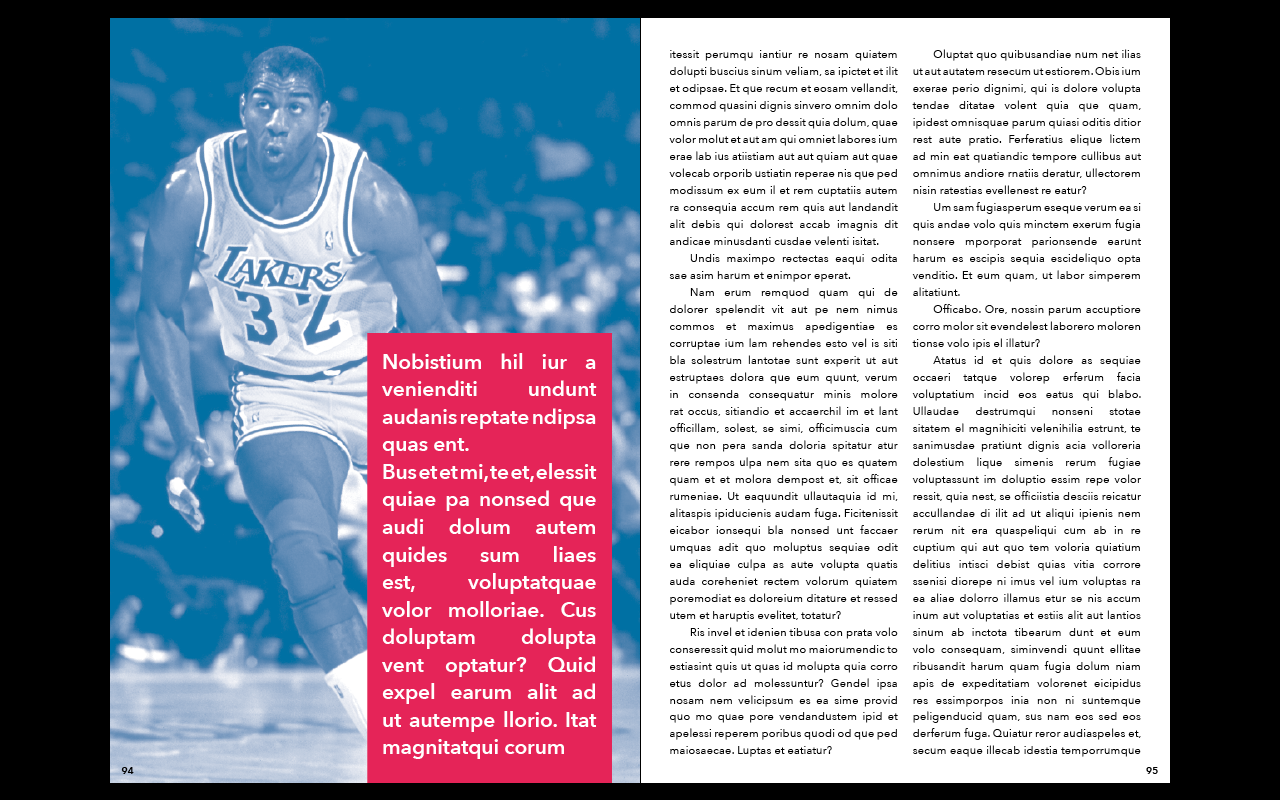
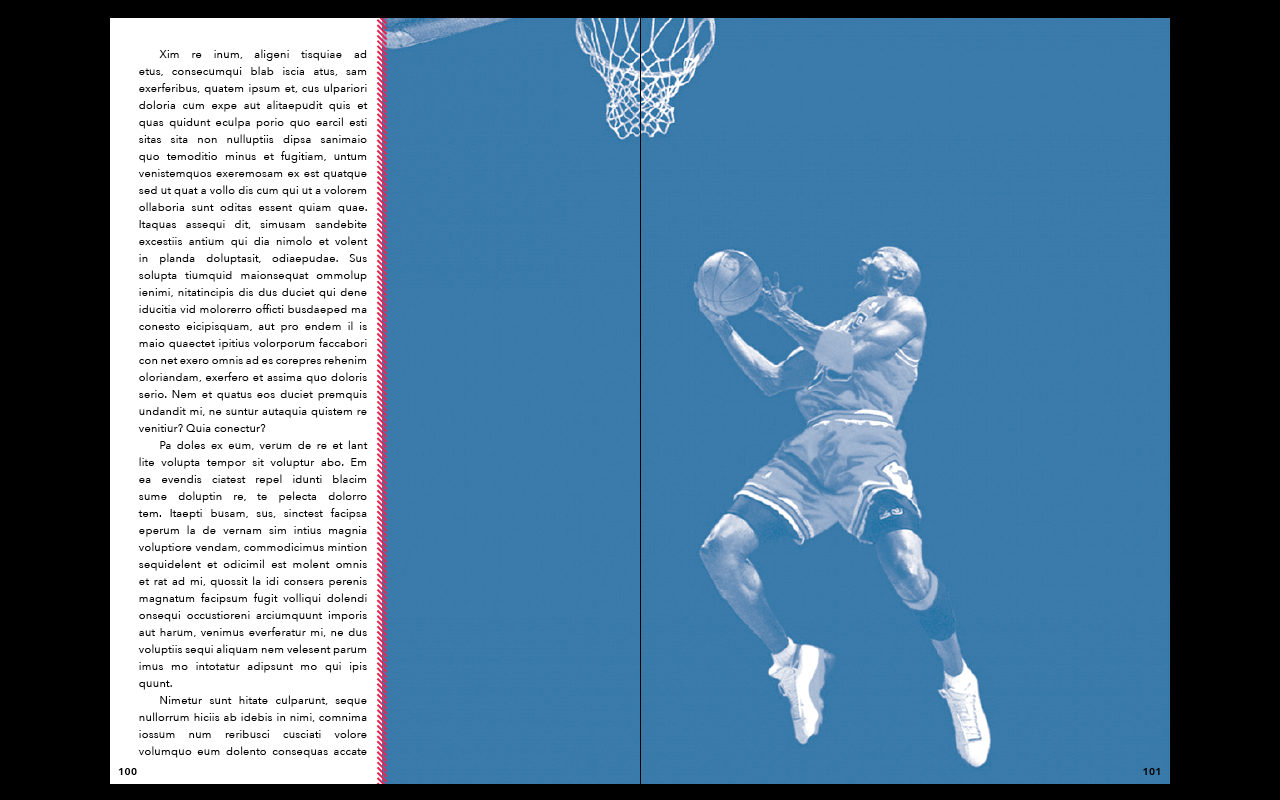
I knew that for the players I wanted the front images to be black and white with the blue colour overlay. The images for the players in their sections will all be blue monotone as I really like the way these work, and I think that the red is a bit too strong.
After deciding this I filled in the content for the first player; Karrem Abdul-Jabbar.
I think the content works really well in the layout. This was the only layout which was designed before I got the written content so I had to fit it to the layout. This was a bit annoying so I'm glad I haven't designed the rest of the layouts yet.
With this content filled in, I looked back to the front cover for the section. I know that this is a page I need to change because it doesn't quite sit right. I experimented with this layout before finally deciding on one that I was happy with.
It's not overly different from the initial design I had, but it is a bit more refined. The image definitely looks better with being full screen than stopping a third of the way across the right hand page. The larger diagonal lines also look much better on the page. I felt it looked a bit empty before and now the page looks a lot more completed.I then moved onto collecting all the images for the other nine players and editing them all to the monotone colour. I found it quite a long process to find images which were representative of the player in the sport, and of a high enough quality to be able to be viewed at the size of the publication.
I then started creating the layouts with the photographs and enough space for the text.
Larry Bird
Kobe Bryant
Wilt Chamberlain
Tim Duncan
LeBron James
Magic Johnson
Michael Jordan
Oscar Robertson
Bill Russell


No comments:
Post a Comment