To start with I had a look for the promotional posters/material used for the film when it was first out.
There wasn't much, as most of it was the same image used and just cropped and the text changed. The main focus was solely on Melvin, Jack Nicholson's character.


I then watched the film. While doing the initial research into the film and seeing the awards it won, I thought it would have been quite a decent film to watch. However I found it really quite boring and not my type of film at all. This made it quite easy for me to pick out important features on the first watch though.
After I watched it I did a quick spider diagram of everything important throughout the film.

I did some research into movie posters and found that the type I liked were the really simple designs with one main feature.
Research Link
I then drew out a few thumbnails for initial ideas quickly. I wanted the poster to be simple, maybe with only one or two individual elements which I could then work on giving detail and work with different tones to create a more realistic image.
 |
| Initial thumbnails |
From these thumbnails I decided that there were two ideas which I thought were strong enough and that I liked enough to move forward with.
As this is a quick brief I wanted to do something I enjoyed because it means I'll work on it harder and get it done faster. I also wanted to use this brief as an opportunity to practice my Illustrator vector skills as I haven't done much work with image in this program. I also wanted the poster to be quite quirky and stand out with the use of bright colours.
As Verdell is such a big part of the film, I decided that I would start by using him as the basis for my poster. Although this goes against the initials thumbnails I had, I thought it would be a challenge for me to try work with the dog. I wanted to just use the silhouette of the dog, but that still required quite a bit of work because of the fur.
I took a film still of him and started creating the vector of him.


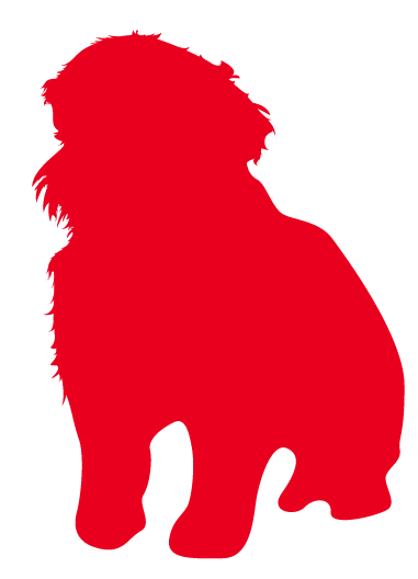
I did a quick mock up of a potential poster using the silhouette.

I have decided that even though this is quite quirky, I don't want to move forward with it.
I reviewed my initial ideas.I noticed a lot of the things in the film which were important were objects, so I wanted these to be the focus. I decided on two designs which I liked the idea of; the dog bowl, and bacon.
Both of these elements are related to the dog and are parts of the film which are underlying to the plot.
Something I also want to use in the design of the poster is the OCD that Nicholson's character, Melvin suffers. In the film he suffers from this and does things throughout the film that illustrates this such as using soap only once before throwing it out, putting on plastic gloves before picking up the dog, doing his door locks five times every time he gets into his house.
I thought the best way to illustrate the perfections that he creates would be for the layout of the contents to be perfectly aligned and for distances to be the same.
I tried out a quick design with the dogs bowl.

While I thought this initial idea was the best one I had because of the simplicity, I don't really find it anything exiting to work with.
With this in mind I decided on moving onto the ideas that I had for using bacon. This is definitely the design in which I had the most ideas and could do the most with.
I started by finding a picture of a piece of streaky bacon, like used in the film, and drew around it, drawing around all the lighter and darker shapes too for tones to be used.

I then chose my first colour. I decided on the colour I had previously used on the dog bowl as this was similar to bacon colour and had a very good range in terms of how this would fit in with bacon tones.

I then worked on colouring in the piece of bacon.

My initial thoughts are that it is quite a good design, especially considering I don't usually spend this much time on creating images on illustrator.
As I wanted to make the poster simple and contemporary, I chose two typefaces which worked well with this idea.
I then went through some initial layout ideas I had for the poster. I have not decided on the second colour yet at this point and will hopefully be able to choose through choosing a layout.


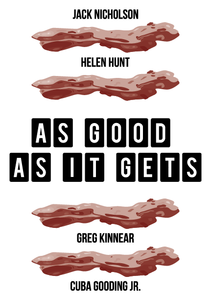


Revised bacon:

From the layouts the following is the one that I liked the most.
When looking back at it after a while I found that the orange is a lot more orange than originally thought. When I had it as just the film title in this colour it didn't look that orange at all against the white, however in a large amount it is very orange. It also didn't contrast against the bacon as much as I wanted it to, so I decided on going back to the yellow I had used previously as this does stand out against the brown.


Final poster:


Overall I am happy with the final outcome I had designed. It kept in with the simple approach that I was going for, but allowed me to test my skills in drawing in Illustrator. For what the film is, this poster is quite bold and reflects the quirky side to the film. I also like the fact that I have created the poster without the use of a character from this film.
I have enjoyed this brief, and while I didn't really enjoy the film and didn't really know what I wanted to do at first, I think my final design is simple but effective and is a good, simple layout, using bold and contrasting colours to make it eye-catching and not a typical film poster. While I may not have designed a poster for a hugely prominent feature of the film, I do think the bacon was featured quite a lot throughout the film and makes for an interesting and different poster to those typically seen.
No comments:
Post a Comment