After trying to figure out what I wanted to do for this brief, going between a few different routes I could go down, I decided on doing an exhibition on NBA's top 10 players of all time.
With this subject I feel I have quite a large research range and have enough to work with to create a substantial response to the brief.
I did some initial research into NBA: Link
With this I started generating ideas into what I could do as the outcomes for this exhibition. I could go down any of the five routes and create a lot of work for each, so I need to choose the ones that I will enjoy the most and be able to work on at a consistent level for a long period of time.
As well as this I started thinking of locations into where this exhibition could be held. With the research into NBA I thought, as this was started in New York City, I could hold the exhibition somewhere there, however New York doesn't have any kind of basketball museum or sports museum with a relation to basketball. I want the exhibition to be help somewhere which has a strong correlation to basketball or the NBA.
While researching possible locations I came across the Naismith Memorial Basketball Hall of Fame and have decided that this will be where my exhibition will be held, in their specially built exhibit gallery.
I also found that this year on August 3rd it would be 65 years since NBA was officially started with it's namesake. This gives me a good reason to put the exhibition on as it will celebrate what has come of the NBA and the pioneering players behind the global success.
I then brainstormed some ideas about the direction I wanted my response to take.

I have decided that my two focuses are:
Branding & Identity
Editorial & Publishing
The third area I will probably focus on is Retail & Promotion as I think it would be hard for me to completely ignore this side of the exhibition, and I think it will work in with the development of the branding and exhibition as a whole.
In terms of what I am going to create, I looked at the two focuses separately to decide what I needed.
Branding & Identity:
For the branding of this exhibition, I have decided that it will be in association with the NBA & the Naismith museum, so these are two branding elements which I must research into, more NBA than the museum, but I need to find out if there's anything particular that needs to be done for this to be within their potential guidelines.
On top of this, I have decided to brand the exhibition, so it would be more of an 'NBA presents' instead of all the branding just being the NBA.
In the branding of the exhibit I want to create the following: Brand guidelines, branding collateral (letterhead etc), Logo, typeface, colour scheme.
In terms of the typeface, I want to create it using the geometry involved in basketball. I have briefly researched into this and decided that I will work to the court shape and markers to make this, also incorporating shooting angles.
I also researched into the current typography being used for the NBA teams and found that they were all similar in the fact that they were big, bold and colourful.
For the colour scheme, I want it to reflect the NBA and the USA, so the blue, red & white. However when it comes to images, I am unsure as of yet as to how I will move forward with them. I will decide this when it comes to building the brand guidelines.
Editorial & Publishing:
For this side of the brief I have decided on creating an exhibition book, which contains all the information about the exhibition, players being recognised, as well as a brief history into the NBA, basketball etc.
This is something that would be bought in the shop after viewing the exhibition, a keepsake to take home.
I am also considering creating the small booklets that could be picked up on the way into the exhibition, however the main focus will be on the exhibition book.
This is a large task as it will require me to fully get the content for the exhibition and decide exactly what needs to be spoken about. In this respect, I think this is my main focus of the brief as the content for this is going to be a lot.
Promotion:
For promotion it would be mainly print based material, such as posters, flyers, leaflets, etc. but I do also think there should be a website designed specifically for the exhibition that is linked to from the NBA website as well as the Naismith Museum website.
At the minute I will not be focussing on completing these as a priority, more of something to do if there is enough time.
After deciding all of this I moved onto the first element I wanted to work on; creating the typeface.
I have a pretty clear idea in how I want to construct this, and am confident that I will be able to make it work well as I have had a bit of experience in designing typefaces before.
Sticking to working by the NBA guidelines, I downloaded their guide. This contains everything there is to know about NBA, the current years roster and the rules & regulations.
From here I took the image of the standardised basketball court to use as a base for my typeface.


I did some research into angles and found there are 6 to focus on:

Reading over the research it becomes apparent that these are the important angles needed for taking shots at the hoop.
It is ideal for the player to throw at a 45º angle from a standing position, so this is the one I have decided to use.
I took away a couple of elements I didn't think were necessary and added in the angles.


I then started creating the letters. For this I used the pen tool and had the line weight at a thickness so it was easy to see how it worked as a letter form.


I came up with two variations for the 'A'. While I like the first one, I do think the second one is a bit easier to read, so will be going with this.
Creation of the other letters:


I decided on revisiting the 'K' & 'P' as these don't really fit in well.


Uppercase typeface:

While I find it easy to create an uppercase version, I have found in the past that I struggle with the lowercase as there is more to consider in terms of how the letters are constructed as they must all remain proportional and consistent, which is hard when they're all at different heights and widths.
I started with the 'a' and found this to be successful, as well as the 'c' & 'e', however when I moved onto the 'b' & 'd' I found that these just didn't work well as they were too large and wide compared to the other three letters as these needed to be created on the uppercase grid due to the height of them.


I tried out the 'f' & 'g' and found that these didn't look right either as they were too short.
After a lot of different variations I decided the best thing to do was to add a defender & ascender grid to the lowercase grid to see if this would work any better.

Lowercase typeface:

I also created numbers using the uppercase grid:

I also asked Charlie for a bit of feedback for it and if she felt anything didn't sit right.

Charlie said that the '7' was a bit hard to recognise it as the shape was a bit abstract. This is something that I had thought previously so it was good to hear some feedback on this.
I took the '7' back to the grid and worked around making it a bit more readable.
I then created three weights for the typeface; light, regular & bold.
Light:


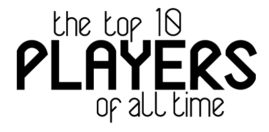
I then moved onto creating a logo for the exhibition, using the typeface.
I first tried 'NBA' in the typeface.

I really like the way the letters worked together, so moved onto creating a typographical logo.
I thought that this was the best thing possible for the exhibition as it sums it up.
Logo type:
For the 'NBA' logo design, I added in a vector basketball.

Although I am not planning on rebranding the NBA, I do like the way this works and I could potentially use it in accordance to the exhibition, but have the actual NBA logo on there in the small print too. This is something I will need to explore.
For a starting point of my brand guidelines I got all the logos that I will need for this project, and created the variations for each which is allowed. For the two pre-existing logos, I took the variations off what they allow so it keeps in with their branding.

I also started looking into typefaces I could use for the body copy.

At the minute I am torn between 'Avenir Roman' & 'Source Sans Pro'.