
Thursday, 31 January 2013
Friday, 25 January 2013
OUGD405 - Product (Finals)
Feedback from crit:
Final images:
Calendar:


- Fits infographic structure perfectly
- Good consistency
- A bit too much information on a few pages
Feedback for others which I think is applicable to me:
- Use white space
- Consider the stock printed on
- Think about it in context to location etc
Calendar:


Magazine:


- To hold the magazine together, I did simple book binding.
Thursday, 24 January 2013
OUGD405 - Product (3)
 |
Page layout designs  |
Colour variations

I changed the opacity to 20% for the lines and background, and started to look at which colours worked well in general.
1. 2.
2. 3.
3.
 2.
2. 3.
3.
4. 5.
5. 6.
6.
 5.
5. 6.
6.
Overall I found 1 & 2 worked out the best of the 6. The others were too dull and dark, and would not look good or contemporary in the magazine. I decided to go with number 2 because the colour scheme is a little more diverse than just three shades of blue. I can make the text stand out with this colour scheme.
As there would be a large amount of text in the magazine, I need to find a font which is easy to read and sticks to the contemporary style I am trying to get across.
Body text variations

1. 2.
2.
 2.
2.
3. 4.
4.
 4.
4.
5. 6.
6.
 6.
6.
7. 8.
8.
 8.
8.
9. 10.
10.
 10.
10.
Looking over the chosen fonts, the serif fonts were a little harder to read than I would have liked and didn't put across the style I wanted them to, so I needed to use a sans serif fonts. Out of the ones I tested, number 8 & 10 are the ones I consider to be the best suited and easiest to read.
In the end I have decided to use number 10 as it is a compact, but easy to read font. All the letters are in capitals so each section of text is the same height and width, and the numbers are the same.
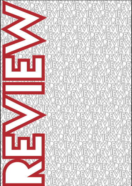
The font on the front cover is different to the body text as I wanted something wide and bold that would go across the whole length without taking up too much of the front cover. Most fonts took up over half of the page, which did not fit the design I wanted, but I finally found one that fit perfectly.


Creating the text pages was easy now that I had planned out the font, colours & layout. I made a template page, and from there, created the text based pages, slotting the posters in every two pages.
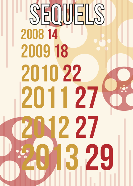
To keep it interesting, for a couple of pages, I included imagery which was based on the content, which kept with the Saul Bass style of work.
Final Pages


I created a logo to finish the magazine off. I took the 'R' from the title page and added the arrows to make it a little more interesting. I thought it could also represent the past and future of film, as that is what this magazine is about.


As a extra to go inside the magazine, I created a 2013 calendar to go with it, using the imagery from inside the magazine to go on each month. The original idea was to create imagery from films coming out in the 12 months, however the issue with this is that most of the films coming out have not been advertised/are unknown about at the minute, so it would be very hard for me to work with.


 |
| Calendar layout |
Subscribe to:
Posts (Atom)