Showing posts with label Studio Brief 1. Show all posts

Wednesday, 21 May 2014

OUGD505 - Module Evaluation

1.  What skills have you developed through this module and how effectively do you think you have applied them?
The main skills I have developed throughout this module is my ability to take a logo/identity and apply it effectively across a range of media and across different channels. I think that this module has taught me real values about branding and how to do it well, not just sticking a logo on anything and calling it a branded item. Creating brand guidelines is also something I have learnt and thoroughly enjoyed through this module. Developing my skills in this area is something which I have definitely enjoyed and will continue to take this forward.
I think I have used these growing skills effectively through my work, and I think that it shows obviously from the first brief of the module through to the last, in which this is applied in a very strong way with a lot of considerations.
Not necessarily a skill, but I think my constant need for bettering my designs is something that I have put to effective use in this module. While it is constantly said that I am too hard on myself and my designs, I don't think that this is the way to think of it at all. I am constantly trying to better the designs and see where the issues are so it is the best that it can be. I think that this is something that I have done consistently through the module, and have produced some strong work because of it.

2. What approaches to/methods of design production have you developed and how have they informed your design development process?
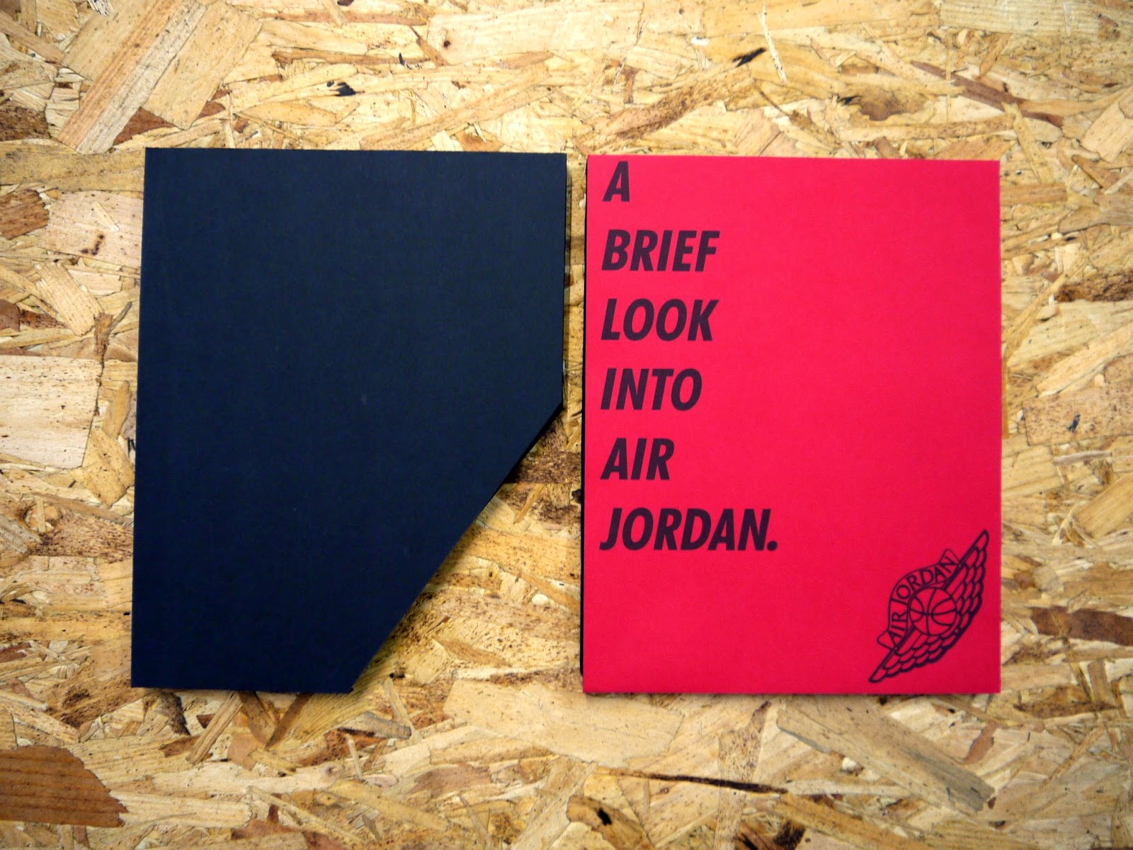
One of the main design production methods I have furthered in this module is my book binding skills. While I had a basic understanding of binding from inductions in the last module, I took it upon myself to further this skill throughout this brief. I taught myself how to perfect bind, and am very confident in my ability to do so. I think my ability to learn fast and craft well certainly helped develop this skill much faster and to a better quality. Doing mock ups of the binding certainly helped me too and let me learn where I have gone wrong and how to fix it.
I have also designed work for a range of different sizes and medias, focussing particularly on editorial work and creating work that is to be bound together in a publication, large and small. I think that working in this area has improved my layout skills and helped me organise how I want information to be displayed and seen.

3. What strengths can you identify in your work and how have/will you capitalise on these?
The main strength in my work lies in my effort to make each project consistent. I think this is down to my development on branding, and down to my constant need to make everything perfect. While this means I have redone elements a fair few times, I definitely think it is worth it when it comes to the final product. An example of this is my research publication. While I had the information and general layout resolved within a couple of weeks, I have continually pushed the design and display up until the last possible point and to where I am happy  with it and feel that it works at its best as a publication. I think that my strength in making everything consistent is shown in Studio Brief 2. This was the largest brief and the one that I worked consistently on to make everything work together well and make it all clearly part of the same event.
Another strength of mine has been time management. While many have struggled in this, I have found that if I give myself a set timetable and give myself deadlines, I get the work done and can move forward and develop my outcomes more than I initially thought. This has definitely been beneficial to all the briefs in this module. I feel that these strengths have aided me in creating some of my strongest work to date.

4. What weaknesses can you identify in your work and how will you address these in the future?
I think once again, my weakness lies in the number of printing processes used in my briefs. While I am a designer who likes to design for digitally printed media, I do think that my designs could have been pushed that bit more to include methods such as embossing or laser cutting in the production to give a more refined and professional appearance. I would like to use both of these processes in the future as well as foiling and spot varnishing. These are the four processes that I particularly like and think will push my designs further in the future.
I also think my main weakness in this module has been in Studio Brief 3 - the movie poster. I didn't particularly enjoy this brief at all, and I do think that it shows in my poster. I felt the film given was terrible and didn't give me much enthusiasm for creating a poster for it. As well as this, I don't think I went around the right way of designing for it, giving quite a poor final poster, and definitely the weakest work of the module.

5. Identify five things that you will do differently next time and what do you expect to gain from doing these?
  1. Use more print processes to give a more refined and professional appearance. This will help me take my designs to the next level and work differently in ways of making the designs more simple and giving more of a focus onto these processes instead.
  2. I would like to make a more conscious effort to design for web. While I enjoy designing for print, I do think that designing for web confidently will help me become a much more rounded designer and will help my overall design skills.
  3. Work with a larger colour palette. While the colours used were in context to the projects, I do feel that I have been working with small colour palettes of only three or four colours. I would like to do a brief where I use a wider range of colours as I think this will create new challenges for me to work on.
  4. Experiment a bit more with how I can take binding methods forward. I thoroughly enjoy binding a book and would like to continue to learn this skill. Over summer I want to learn coptic binding so I can apply this in the third year.
  5. I would like to spend a bit more time thinking about the audience/context of the briefs before starting with the designing side to it. I'm enthusiastic when it comes to getting a brief and like to get right into it so sometimes I don't think about audience etc, so I would like to start to do this. I did towards the end of my research book, and had to make changes at the last minute, which is something I don't want to be doing again in the future.

OUGD505 - Studio Brief 1: An Introduction To Air Jordan Design Boards

Tuesday, 20 May 2014

OUGD505 - Studio Brief 1: Evaluation

When initially given the brief I knew that it was going to be one that I enjoyed as it involved creating a publication. This isn't really something I had done this year up to this point, so to be able to do this was something I was looking forward to. I found it very easy to choose a subject and begin to collect research while starting the initial development phases.

The thing that I really liked about doing this publication was that as it was research, the content was already there and I just needed to reword it to fit in with the tone of voice that I wanted. Writing original body copy is something I haven't ever been incredibly confident at, so to have a base to work with made me much more relaxed throughout this brief.

I wanted to use this brief as something to develop my personal practice in the way I create publications. Up to this point my work has been quite structured, with everything in it's own place and not really a large amount of creativity in my opinion. I felt that the work I had done up to this point wasn't my best and wasn't as good as I could have made it, so I really wanted to push myself and my visual skills in this brief. With this in mind, I immediately got started on the brief and found that my eagerness in this really helped the later development of the publication.

I found that when it came to the first crit, where I had the written content and general layouts, it was much more useful to me as the feedback given was constructive and helpful. If I had turned up with any less, I don't think the publication would be what it is today. I think that this crit was a fundamental part to the development of the publication and of my practice. Before this crit, I had done the layouts and put the content in, and had thought that I was pretty much there in terms of finishing the book, with only a few changes that needed to be made. However I found that this crit really opened my eyes to the possibilities of where I could take the design further. It definitely helped me with the idea that you can always develop something more and refine it more.

The main skill I picked up in this brief was perfecting binding a book. I already had knowledge in a couple of simple techniques, such as Japanese binding and pamphlet binding, however I really wanted to make the book look and feel more professional so decided that perfect binding was the way I wanted to go. Learning this was a lot easier than I had initially thought, and I found that because of the nature of how I am with crafting, I found it very easy to improve my skills quickly. When it comes to mock ups I have always tried to get them to the quality that it would be if it were the final piece of design, so this definitely helped in getting the binding as good as I could in the initial trials.

Being confident in this skill really took a weight off my shoulders and meant that I could focus all my efforts on the development of the book as I knew that the binding method of the pages would be strong at the end. Developing the layouts is something that I thoroughly enjoyed throughout this brief. I think that this is the strongest part of this brief by far.

The weakest part of the design, I feel, is the packaging. Packaging is something that I've never really had a huge interest in making. I do like to look at packaging, but I have never really been too great at designing packaging or designing for packaging. I think that this brief did help me overcome this a bit, but I do think that it wasn't as creative or visually good as I could make it. I do think I should have spent more time on this instead of overlooking it initially. I spent so much time on the page layouts, I should have done the same with the packaging so the book would be consistently strong.

Another area of weakness for this book came down to the choice of stock. While I had thought about the stock for the pages, and was very happy with how these turned out, the stock for the cover is something that I did overlook and didn't carry out particularly well in the end. I went through a few different variations and when it got too close to the end, I don't think I created the covers that I wanted. This is definitely something that I have taken away from this brief. Getting the stock right is as important as the design, as I have come to understand.

While I don't think the final outcome was terrible,  I do see the errors and do see where I could have improved the design choices made. The one positive about my book being like it is now is that the pages can all open flat and no information is lost or ruined. This had been a previous concern in the way the book was before this final outcome, however I managed to fix it by fluke, which was good and something I was happy with.

I thoroughly enjoyed this brief and think that it was a good brief for me to do as I really do like making publications over other design work. While there are errors, these are things that I have learnt from and will take this experience forward with me to help my future practice.

Friday, 16 May 2014

OUGD505 - Studio Brief 1: An Introduction To Air Jordan (10)

Today I had another print slot, my last before the module deadline so knew I only had one chance to get this book and packaging completely right.

After the thoughts and issues I had the other day about the book and packaging, I decided that I would reprint the book and bind it with a hardback instead of soft. I think that this is a bit more luxurious and would give this feel and what Air Jordan is all about.

I decided that I was going to case bind it, which involves perfect binding and then creating a hardback cover and joining them together. With the print slot available I decided to print out the cover for this. I would glue this to the board to create the hardback case. I also reprinted the packaging, scaled to the size appropriate for the hardback book and making sure all the text was on it this time.

When I got everything printed I attempted to do this case binding, however it didn't go well at all. It looked good until I tried to shut it, where it all seemed to get a bit messed up and the case wasn't as big as it should have been, which was a shame. I think the stock used was a bit to thick to fold as cleanly to make the book shut properly, so this was a shame.

With this setback I was pretty much back in the same place as before with no clue how to do the cover for my book, and now the packaging would be too big if I were to just use the previous printed book I had. As there are no more print slots for me, and I wasn't sure if I would get a slot in drop-in I decided to make do with what I had an make it work, because I had all the elements, I just needed to make them work.

I designed a new back and front cover, and decided that I would bind everything together with binding tape as I had previously used this to much success and know it gives a smart appearance, and at this point, it's the best option as using this will mean that I should be able to open the pages of the book completely. I also edited the packaging to fit and created the second element to the packaging.

Once I was happy with everything I photographed it all, showing how the packaging works and how the final spreads look.

Final Images:

Packaging

Book:

This book definitely looks much better than the mock ups and previous attempts at the final book. I feel it is much more resolute and reflects the ethos of Air Jordan much more, with the binding method and way the packaging is made and presented.

Friday, 9 May 2014

OUGD505 - Studio Brief 1: An Introduction To Air Jordan (9)

Today I had a print slot so decided to print out my front cover for this publication as I had already printed out the content pages and bound them together.

Bound Book:
 

I had initially wanted to laser cut the front, however due to it being fully booked and a waiting list, this is now not possible, so that's a shame and I'm annoyed at myself for it. However I don't think that it being printed will necessarily take away from the book. There are also a couple of issues inside the book because of where the pages are bound together.

I also noticed an error in my packaging as I put it together today. For some reason, the 'A' is missing from the front of it, which is frustrating to say the least, however, as I have a print slot next week, I will be able to print it out. It is also a bit too big for the book, so I will need to resize it a bit.

Another issue is that I don't think the red 'card' is strong enough to be classed as card or strong enough to be the packaging. I think that I will need to reinforce it if I want to have any hope of it being sturdy enough, otherwise it's not really worth having.

On top of this I have been thinking about the context behind the packaging and how it really applies to the content. My initial idea was that Air Jordan is about luxury, quality and looking great, so the packaging should be created to mirror this. While I think it does do this, the content is shoes, and I have to think about how the packaging relates to this subject. At the minute, it doesn't really, only to the Air Jordan sort of ethos, so I'm not sure whether I should redo it.

Once again, thinking about this luxury branding idea, does my stock really represent this too? I don't know whether to print it all onto a more luxurious, thick stock, rather than have it like it is now.

All of this is something I have to think about now.

Having these problems now is something I'm glad of instead of them happening much closer to the deadline for the module. While I don't want to spend a huge amount more of time on this brief as I have done a lot wen the brief was set, I don't want to just leave it and be unhappy with the final result.

Tuesday, 25 March 2014

OUGD505 - Studio Brief 1/2: Presentation

Today we spent the day presenting our publications to the rest of the group. In this we had to present our findings, our designs, packaging and how we were going to move forward with this research into Studio Brief 2.

For this I decided on just presenting a PDF of my finished book and talking through the research I conducted and found, and about the design decisions made and their reasonings.

Final Research Publication:

After presenting the book I then spoke about how I wanted to take this forward into the next studio brief. At this point I was planning to do An Exhibition of Air Jordan - celebrating the history and heritage of the brand and how it has become what it is today.

However I was finding myself more drawn to do something a little bit out of Air Jordan as I had spent a large amount of time working on this topic. I wanted to take one element and design a response to the studio brief around this instead of just staying with Air Jordan.

I have therefore decided that for studio brief 2 I will be doing 'An exhibition on the Top 10 greatest basketball players in NBA history'.

I think this will be quite an interesting topic for me to design for, and won't require too much additional research as these top 10 players are chosen on purely facts so I won't find a lot of opposed information to who these 10 are. I will continue to work on building up this brief and working on exactly what I want to do.

Tuesday, 18 March 2014

OUGD505 - Studio Brief 1: Study Task 2: Final Crit

For today's crit we were put into groups and given two hours to go through the crit as we wanted to. Due to a large amount of people being absent today the group I was in only had four of us, meaning we had a lot of time to give feedback, but probably not a diverse amount of feedback that would usually be got with a larger group.

We decided on a brief explanation to our books, stating the subject and a few design choices, before we rotated round and individually looked at each book while giving written feedback.

Content presented:
For this crit I presented the mock up of the finished book and the mock up of the packaging. I also brought along the three other versions I previously designed so there was reference if it was needed in terms of development or design choices.

Feedback sheet:
The general feedback I was given was feedback that I was expecting and nothing that threw me completely by surprise.

The main point of feedback was referring to the two white pages that were slotted around the content pages. There were queries as to why they were needed in the book as they seemed unnecessary. Although I take these comments into consideration, I do have a valid reason for having the sheets there so the bind doesn't ruin the content pages. A comment was made to maybe use red paper instead of white, which is something I have decided I will definitely do.

A good comment for improvement was to give the text a bit more room on the Branding pages. This is something I agree with and will attempt to try find a solution to. Another comment about the text was that the indentations were quite far in, so I will need to address this too.

The strengths of the booklet was in the layout design, content and binding process used. There was a bit of a mix of feedback in terms of the colour scheme used. One person wrote that they preferred it all in red and black throughout because it was very consistent, however another person wrote that they like it split into the three sections as it keeps the book interesting and refreshing with each section instead of just being the same colours throughout. I think these comments are down to personal opinion at the end of the day. Personally I thought all red was a bit boring and the whole booklet works much better when it's got the three different colours to split the booklet into sections.

I also took this opportunity to ask Phil about the amount of pages as this is something I had previously been quite concerned about. I have sixteen pages of content, but between them I had the section dividers, and including the front/back covers it comes to twenty six pages. This is something I just wanted to check with him and make sure was alright to move forward with otherwise I would have to rethink some of the layouts and how the booklet flowed. Thankfully he said that as there are sixteen pages of content, the booklet is fine in the format it is.

At this point I am happy with the way the crit went. There weren't any massive points in need of work in the book, just small tweaks, which is where I was hoping to be. I found that this crit was very useful because it gave some fresh eyes on my booklet and I got some good points of feedback.

Monday, 17 March 2014

OUGD505 - Studio Brief 1: An Introduction To Air Jordan (8)

After a few days of reflection on the way this book was going, I decided that I needed to make a much more slick design in terms of how the book flows. While the content pages are good as they are, I don't like the way the sections are divided up. While I initially thought the dividers were a good idea, I now think that they aren't brilliant and seem a bit cut and paste. I also wanted to make the colours flow better in terms of the overall identity of this book.

The first thing I did was look over the printed mock-up I had. At this point I decided that while I had done the images to be quite light on the page, they did look a bit too light and now I have the darker text they could be more colourful images. With this in mind I changed the opacity to each of them so they were all more striking on the pages.
I then moved onto the front cover of the book. In staying with the branding of Air Jordan, I am only having the Jumpman on the front cover without any text, so this means that I need to add a title page into the booklet.

This is what I want to use to incorporate all three of the colours. After some experimentation I decided on the following design:
It is a lot more visually creative than the original title page I had and incorporates all three colours well. I also tried out the text effect and think it works very well so will use this for the sections titles throughout.

 Something I wanted to do was make the images on the section pages a bit more interesting. While I liked them in just the colour, I wanted to do something that would make them stand out and something I could develop and take forward in the next part of the brief.

I tried out a few ideas and found that the following worked the best:
 I also wanted to incorporate the hatching I had done on the title page. I initially tried it with just two lines above and below the heading.
I thought it worked ok but did seem a little random and not necessary. With this in mind I tried to make it have more of a place on the page and made it so it was part of the heading.
I like this because it makes the heading stand out that little bit more and makes the eye go straight to it.

I applied this to all three sections pages:
 After doing this I printed out and bound a to-size mock up for the crit tomorrow. I decided for the reason of just being a mock-up I'd just keep the front cover as the black card, and I didn't have any red card left over to use for the Jumpman.
 I also added in a plain sheet of paper around the content for the front cover to be stuck to along the left hand edge of the page, so none of the content will be ruined.
 Although the pictures don't show it that well, I also managed to fix the issue with the text I had last time where it cut off some of the letters in the middle of the spread.
Overall I do think the mockup works well and I will have to get some feedback in the crit to know where to take it next, if anywhere. I am happy with how it is at the minute but I know there will be a few tweaks that need doing. Something I am a little wary of is the fact that it is no longer 16 pages. There are 16 pages of content, but there are added pages between, so this is something that I do need to query in the crit.

I then moved onto the packaging. I haven't done anything with this since the last crit and have had a lot of time to think about it. I decided on designing a new idea which incorporates the feedback given in that crit.

I made a quick digital mockup of how this will look:
 I then printed and made this mock up to around 75% size the actual size:
As a first attempt I think that it works well. It still needs work to refine it completely, but at the minute I am very happy with how it works.

At this point I am pleased with how this book has progressed. I am glad I didn't just leave it all in red and developed the overall design of the book and packaging further. I now feel it is a more realised solution and I am confident with moving forward into the next studio brief and continuing to work with this subject.