Pathfinder
The pen tool is quite a time consuming process which can get quite tedious when it comes to larger shapes, so we leant about pathfinder in this second session.
Taking the 'g' again, we were told to make the basic shapes of it out of circles.
When we had done this we went into 'Window' and clicked 'Pathfinder'. This brought up the window below, which has four shape modes and six pathfinders. To create the 'g' we used two 'Unite' and 'Minus front'.
Minus Front is what I used to create the 'ear' and 'link' of the 'g'. By layering a smaller circle over the larger one, in the correct position, and clicking 'Minus Front', it gets rid of the smaller circle, and removes that section from the larger circle too, as shown below.
To add the smaller circle to the shape, I drew another circle, put it in place and clicked 'Unite'. This action joins the two shapes together, as shown below.
The final image:
I found this exercise to be quite easy as most letters are made up of shapes and it's very clear to see what shapes are where and what to use to cut sections out. I think it's a useful tool, however it is nowhere near as accurate as the pen tool. It is a lot simpler, and I personally wouldn't use it for letterforms. I prefer the pen tool, even if it is a lot more time consuming.
Width Tool:
We started looking at the lines, their thickness and different ways for them to be present on the page. The simplest way to change the line width/style is with the tool bar up at the top with the default six, each with a different outcome.
As this tool is very easy to use, but is pretty standard and boring. To be able to change the width of the lines, at any point to any width, we looked at the 'Width tool' - this allows you to change the width completely, at any point, to any width - as shown below.
This will make it a lot easier to create shapes instead of using the pen tool all the time. It means any shape is possible and will be with good curves instead of some uncertain ones that the pen tool could make when trying to draw the shape.
We also looked at the 'Stroke' toolbar which had a lot more different options for the lines, from the ends and corners to the overall style being dashed etc.
Blend:
I started this by creating two different shapes on the page. I then clicked 'Blend Tool' on the left hand side tool bar.
This brought up the page below. There are three options shown. We started with the 'Specified Steps' option. Then I had to choose the amount of steps to use.
When this was done, I had to click on an anchor point on each shape - the places which I wanted to join up. I chose the top left hand corner of the rectangle and right hand anchor point of the oval.
This was the outcome of this tool:
I think this tool could be very useful in creating images, and I will definitely use this in the future.
The second part of the 'Blend Tool' we used was the 'Smooth Colour'. I started by creating five different coloured and sized circles on the page.
Going back to the 'Blend Tool' I changed the Spacing to 'Smooth Colour' and clicked OK.
Like the skill above, I had to click on the anchor points for the start and finish. I clicked on the left hand side one of the purple one, as well as the left hand side one on the yellow circle to create the blend below.
I clicked the bottom point on the yellow one and then the top one on the green. This created a sort of cross over effect, while blending the colour.
I continued until I had joined up all of the points to create this shape below.
Creating Outline:
When the Type took is used, you are unable to edit it apart from the colour, typeface etc, so we learnt how it can before possible to edit it further.
I typed a letter onto the page. When right clicking on it, a options bar comes up with a few options. By clicking 'Create Outlines' it changes the format from type to a shape.
It gives the letterform anchor points in which I can now manipulate in any way I please.
Anchor Points:
I typed a letter on the page again, doing the steps from above to make it into a shape instead of text. A basic typeface so we could add serifs to them and learn how professionals do it so they don't have to pay huge licensing fees to use typefaces.
I started by changing the pen tool to the 'Add Anchor Point Tool', so I am now able to add anchor points to the shape. I added two. One where I want the edge of the serif, and one anywhere in between that and the edge.
I then selected the line between the middle anchor point and the end one, pulling it up to how high I wanted the serif to be. This creates a slanted line connecting this to the third anchor point. To make a straight serif I then move the third point to be in line with the second.
I repeated this on the top as well, and the final image is shown below with the new serifs added.
After this session I feel a lot more confident in my ability to use the basic tools of Illustrator. I found it all relatively easy and know I would be able to use it again on my own. From these skills we must now create an alphabet of one of the letters we drew in the first part of this Alphabet soup project - the letters based on words.
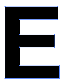
From the ten letters above, I think I could confidently make over half of them on Illustrator. From the ten I decided to experiment with three of them. The 'E', the 'X' and the 'I'. From this, I will make a final decision onto which one I want to go forward with and create a whole alphabet for.