After completing the alphabet set, there were 5 letters that I felt didn't fit in as well as the other 27:
S, Y, G, X & N
Because of this I took those four and redesigned them so they had the same characteristics as the rest of them.
S: The ends are the only issue with this. In the others, all the ends are steps, this one has straight edges, and doesn't really suit the rest of the letters.
 |
| Original |
 |
| Sketches |
 |
| New Version |
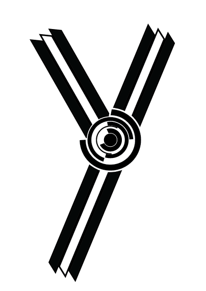
Y: I realised that for some reason I had done this letter in lowercase. Although it wasn't that noticeable, I put amends to it.
 |
| Original |
 |
| Sketch |
 |
| New Version |
G: The G has been the main problem I've had with the alphabet. There isn't really any other letter with the same shape & joins as this one, so it made it very hard to create. I ended up just putting the rings on the join to solve the issue, but I still didn't think it looked right.
 |
| Original |
 |
| New Version |
X: Like the 'S', this letter was completely different to the rest of the set as it's edges are straight and not stepped, and the middle black cross doesn't even join the edges.
 |
| Original |
 |
| New Version |
N: I like this one, but it didn't fit in with the rest of the set because of how the three lines are completely separate and not joined like the other letters. I put it back into Illustrator and joined up all the lines and it flows a lot better and looks a lot more like the other letters in the alphabet.
 |
| Original |
 |
| New Version |
New Alphabet
Name Tag:


No comments:
Post a Comment