Saturday 30 November 2013

OUGD503 - Studio Brief 1: Competition Brief 4: 131PIZZA

131PIZZA - Pizza Box
Brief:
We would like a graphic that will be printed on both brown and white pizza boxes. The graphic can cover the top of the box as well at the sides. It can be either black/grey or 2 colour which would preferably include red. It needs to be simple, obviously relate to pizza, but a fresh approach as opposed to the typical pizza box. I have attached some examples of what kind of thing we are thinking of but feel free to be creative, you are the experts after all!
Note: although our company is 131PIZZA, we dont want the box to have 131PIZZA on it as this box is going out to all different stores Australia wide. We are after a contemporary 'stamp style' graphic similar to example uploaded. Also with layers i.e. stamp over a template of pizza related words etc.

My response:
I was asked to take part in this by the contest holder after recently winning the last design competition I entered.
However when I was asked, there wasn't much time left, so I couldn't spend too much time on it.

In total I created five different designs, the first with 4 variations. I kept them all similar because I didn't have much time, but made an effort to come up with a few different designs.
Variation 1:
Variation 2:
Variation 3:
Variation 4:
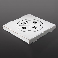
To show how these would look on a pizza box I superimposed them in Photoshop so it would give the contest holder a better idea as to how these would work in the real world. Just having the designs above doesn't really show how well these work in situation.
I entered one from each variation:
Entered designs
Unfortunately my design didn't get picked, but because I didn't spend so much time on it, it didn't bother me as such. It was a brief which had time constraints, and this has helped me to design a bit more efficiently and stick to the brief.

These three briefs are from quite similar areas in the industry, but wanted different outcomes in different formats. Doing the three of them has given me confidence in my ability to design in these different areas while keeping in with what the brief is asking.
It has also shown me that at the end of the day I am designing for the contest holder, not myself, and their opinions on design are different to mine, and what they see as good, is what a designer would see as terrible. This has shown me that as a designer I need to be flexible in my designs.

Wednesday 27 November 2013

OUGD504 - Design For Print & Web: Studio Sessions

Studio Session 1 - 27.11.13
For the beginning of this brief we were given ISTD brief packs from 2009, 2010 & 2011 and told to choose three briefs that we would consider doing to bring to the session.

Three chosen briefs:
The first thing we did in the session was read through the three briefs and highlight the words/phrases that initially drew us to the brief.


After a discussion on these, we were told to choose the one we wanted to work with for the brief. I chose 'Mutton Quad' - branding a typographically themed restaurant.
I found that out of the three that this was the one which appealed to me the most. It was the brief I initially thought I would do out of the three and doing this first bit of the session made that even clearer to me.
For the second part of the session we were given a series of questions to answer about our brief, essentially dissecting it and seeing what it all really was about and what we needed to do to fulfil it.

5 problems in the brief to solve & why?

  1. Create a concept for a typographically themed restaurant
  2. Integrate the type theme through everything
  3. Define audience & target market
  4. Define the environment & type of restaurant through design
  5. Language & food to be define by design

5 facts about subject & content

  1. Branding for a restaurant
  2. Typographically themed
  3. Designer chooses target market
  4. No clear indication into what type of restaurant
  5. No clear indication into what needs to be created

5 facts about the audience

  1. People who go to restaurants
  2. People who have an interest in food
  3. People who can pay - disposable income
  4. Local interest
  5. Broad age range

What do I want to communicate?

  1. Strong brand/theme of restaurant
  2. Good quality food
  3. Contemporary food & theme
  4. The price range/luxury of restaurant
  5. Typography can be manipulated & interpreted into food/restaurant

Things I don't know about this brief

  1. Audience
  2. Type of restaurant
  3. Required outcomes
  4. Tone of voice & language
  5. How much type to include - how much integration
  6. Reason for restaurant
  7. Location
  8. The food served
  9. Colour schemes - type/font choices
  10. Single restaurant or a chain?

After doing these questions we were given a blank brief and told to fill it in as specifically as we could with what we wanted to do in this brief. At this point I didn't feel comfortable enough with a concept to fill it in, so did a brain storm instead.
It is just a brief look into the brief as a whole, my general ideas at this point and everything I could potentially include while designing. I decided immediately that I would be working in print & putting in a proposal for web as I thought this was the most suited to the brief and that one I feel a lot more comfortable doing.
My overall feeling for this brief is that I wanted to do a contemporary restaurant with very clean cut design, perhaps only using one or two colours. It will be aimed at young professionals, and I wanted to incorporate a type-themed name and build on the concept from there. My initial thoughts is to do a luxury restaurant.
After brainstorming & getting a general idea I filled in the blank brief sheet.

Monday 25 November 2013

OUGD504 - Design For Web (3)

After I completed my homepage I started to work on the content pages. There are six content pages, five of which have the same layouts, and the sixth with a different one.
Content pages:
  • Sumerian
  • Phoenician
  • Greek
  • Latin
  • Now
  • Timeline
Working from the thumbnails I drew, I created the wireframes for the two different layouts.
Content pages
Timeline page
From these I started coding the first content page, using coloured backgrounds as a means to differentiate each box from another.
The overall layout for this page was split into 4 separate boxes, with their individual boxes in each to hold the content. Once I was happy with how everything sat, I started putting in the navigation bar in.
I encountered a problem when putting in the last navigation icon:
This was a bit unexpected as the pixel numbers were all correct and it should have fit next to the others perfectly. I tried replacing it a few times, but it kept moving around navigation bar into different places each time.
Eventually I replaced the code but chose not to name the image, leaving it with the default name.
Once I did this, it worked perfectly.
I then started adding in the image contents.
When all the content was added and working I took away all the background colours.
As all the content is working on this page, I saved this file and re-saved it with the other content pages names, creating the five content pages which need this same wireframe.
Once all the pages were done, I started adding in the content to all of them. Another design problem I came across when putting in this content. As some of the alphabets have more symbols than could fit on the page, the page was cutting them off.
To fix this, I added in a line of coding which will make that content box scroll down when there is too much content in it.
Page
Scrolled down
After completing this part of the page for every content page, I turned my attention to the timeline page. As I couldn't have this as interactive as I would like, I decided to make it one simple image of a timeline. This was very easy to code into the page.
Timeline:


Once this was done, I started on linking all the pages together.
Linking the pages:
Once I had linked all the pages together and checked they were all working I left it there, taking this half finished website to the Crit with me.

Thursday 21 November 2013

OUGD504 - Primary Research: Foiling & Flocking

After completing primary research into screen printing, Charlie and I decided to further this into Foiling and flocking.
To do this we had to get a textiles screen (white mesh). We then went through the same cleaning and exposing process to create the screen. We decided to only do one design each for this process as.
Exposed screen
To start with we decided to do one print for each process, though bought enough of the material to do two. We decided on a gold foil on black paper and burgundy flocking on white paper. To do this process we needed glue which is specifically for this process, which is what you put through the screen.
Equipment
We taped up the area around the screen. For this printing it isn't done on the screen printing frames, rather on a board which is placed on a table and has screw clamps to hold the screen in place.
Taped up screen
For the glue to go through the screen well, a small amount of water must be added until the consistency is smooth and still thick.
Printing the glue
We then printed the glue onto the two pieces of paper. As the print goes into the heat press, the glue doesn't need to be wet when this process is completed. It means there is no rush to get it from the screen straight into the heat press. This is good because the glue clogs the screen up very quickly so it needs to be washed immediately otherwise the print may become useless.
Glue on the paper.
For the heat press there are multiple different temperatures and time limits depending on the materials used. For foiling, the colour side must be facing up, and for flocking the textured side must be facing down. For foiling 160ºc for 12 seconds, & for flocking it is 160ºc for 20 seconds.
Once these were done, we peeled the foil off to reveal the first design. We then put the flocking through and did the same.
Finished designs:
Once these were finished I cut them down to size and we each took our designs.
My designs
Overall I was very pleased with the outcome and quality of this process. Before doing the process I thought it wouldn't turn our brilliantly as I hadn't done it before, however this process shows that you don't have to be an expert to do it well.

Problems faced/everything that went wrong
Flocking: On the second attempt at flocking, a small bit of my print came out a bit patchy. I'm not sure if this is to do with the amount of the glue in this area or if the flock paper was pulled off too soon.
Foiling: On the second attempt at foiling, the foil came out quite creased in certain areas. This was to do with the face the foil was spread across the print too many times instead of just left to sit on the top.