After the crit I took my concept back to basics and brainstormed a few possible ideas that I could develop.

The brief is to make an info-pack for print, so my concept is to create an info-pack to help new students/current students in LCA learn how to use the print facilities in the university, and know the considerations which need to be thought about before doing a process.
To do this I am going to use flow chart posters as the main focus, and supporting materials in the form of booklets/leaflets or foldouts, depending on the content.
Flowchart Research
The aim is to do 10 flow charts relating to a different area of the print subject:
- Screen printing
- Photoshop
- Illustrator
- Book binding
- Embossing
- Laser Cutting
- Letterpress
- Colour Modes
- Stock
- Format
The flow charts will take the viewer through the steps of how to fulfil the process, with solutions and information along the way, and by the end of the flow chart, that process should be completed.
Supporting content so far is booklets on:
- Format & page sizes
- Book binding
- Colour mode samples
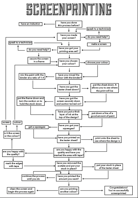
To start the flowcharts off, I focused on the first one: Screen printing.
I drew out a rough layout, going through the necessary stages, but keeping them as concise and short as possible, while keeping all the understanding there.

I then took this into Illustrator to get a clearer picture of how it lays out and fits together.


I then looked at typefaces to use. I wanted the titles to stand out and not be typical sans-serif fonts, so decided to go with 'Sullivan'. For the body text I wanted it to be clear and easy to read at smaller point sizes so decided on 'Blanch' because it is all uppercase but still works well as body text because of the curves in its design.


After doing the chart with variating title size, I decided a size in the middle of the two was best. I also felt that I needed something that would link all the pieces of the info-pack together.
For the flow charts I did the simple design below, numbered 1 - 10 with a heading and a changeable title for each chart.

I then added this to the bottom of the flow chart.
Final Screen printing flow chart:
No comments:
Post a Comment