Showing posts with label Study Task. Show all posts
Showing posts with label Study Task. Show all posts
Tuesday, 20 May 2014
Wednesday, 5 March 2014
OUGD505 - Study Task 4: Uplifting
For this study task we were split up into groups of three and given a profession. I was put in a group with Ant and Jake, and we were given the profession of an Elevator Maintenance.
The first thing we did was do a quick brainstorm into the direction we wanted to go in and the different kinds of jobs/services we could potentially do, as well as our brand values and tone of voice.

What we have decided on is to take a very professional approach to it. Repairing elevators/other mechanical travel aids must be done quite quality and with maximum safety guaranteed, so this must be reflected in our branding. Because of this direction our tone of voice is informative, professional and reassuring.
We also decided that to reflect this, our price range would reflect the quality of our work, and we would be working for mainly large commercial or public buildings, such as large office buildings or hotels, however we would also offer our services to smaller buildings such as schools or cinema complexes etc.
We then started working on an idea for a name. We wanted something that was reflective of the elevator, but was also positive.

After that we did a third brainstorm into the kind of design collateral that we could design for.

We then started on designing a logo. Ant had an idea of incorporating an old-style elevator dial somehow as this is quite recognisable.
Individually we took about half an hour to do a few logo ideas which we could then compare and possibly combine to get a defined logo.
I had a couple of ideas, mainly which incorporated the elevator more than the other mechanics like an escalator. Keeping in with the professional idea of everything, I went with a very simple clear design with the use of just one colour and trying to make something that would be easily seen at smaller sizes.
The first idea was to simply do a elevator.

The second was building on what Ant's idea was, but using the style that I used above.


The fourth is incorporating the

I wanted the typeface to be sans serif as this is contemporary and professional. Using a serif font is very traditional and being in the mechanical business we wanted the feel that we were completely up to date with all the goings on in this industry.
I tried out a few different typefaces.


I think my logo designs were pretty successful, a couple more than others, and clearly represented what our business is about.
Jake and Ant both agreed that the logo above that I had designed was the one to go for, and in the blue. We found it was quite a professional colour, which represents a calm approach, which is exactly what we wanted to put across to clients.
We made a few changes to it, making the lines a bit thinner and adding 'Elevator repairs' underneath as a sub-heading. At this point we were very happy on how the logo was looking.
We then started discussing the use of colour in the logo and throughout the branding. Our initial idea was to use a mid to dark grey to go with the blue and reflect the professionalism of the brand.
After a chat with both tutors, it was brought up that we shouldn't use a colour just for the sake of using a colour, there needs to be a reason behind it in the concept of the branding. Because of this discussion we decided on getting rid of the blue and going with black, white and a mid-tone grey.
Logo:

Colour Variations:

Logo Variations:

Exclusion Zone:

After deciding on these, we chose a typeface to use throughout. We agreed that using one typeface throughout with different weightings would be the most professional look. We decided on Ant's suggestion of Source Sans Pro, using 'bold' for headings, 'regular' for body copy and 'italics' for indexing when necessary.
We then started looking through a couple of the brand guidelines that had been provided for us to get a general idea of what we needed to include. We compiled a list of everything we thought was appropriate for branding our business and split it up between the three of us.
The tasks I took was to create the majority of the presentation and work on the guides for: Our Brand, Our Values, Our Jobs, Logo Design & Stationary Kit. This included creating all the artwork and written content.
Ant worked on the logo placement & sizing for different formats & sizes, as well as creating a mock up of a website and the Employee ID card.
Jake worked on the colour palette and typography pages for the presentation, as well as the uniforms, transport and advertisement for the business.
While I created the presentation, I created the stationary set. In this there will be a letterhead, business card, envelope, pad and pens.
Stationary Kit:

Presentation:
Brand Guidelines:
Body of Work:
I found that this task was a good challenge. Working in a group makes a larger amount of work easier to do and had three different points of views and angles to take at the brief given. Working in a group wasn't as bad as I thought it would be and took the pressure off trying to get a large amount of work done myself, even though I do feel that I still did a large amount of work. This brief showed me that even if I get given a profession that isn't such a standard one, there is still a lot that can be done to create a strong and interesting concept, based on the audience and the overall tone of voice. Creating brand guidelines is something that is new to me, but I found it quite an enjoyable task overall in which I think I responded with a good outcome.
Wednesday, 26 February 2014
OUGD505 - Studio Brief 1: An Introduction To Air Jordan - Study Task 2 Crit
In today's crit we were split into groups of around six or seven and given about an hour to talk through our publications and how far we had got in terms of content, concept and designs. This was also a chance to ask questions and get a bit of spoken feedback. The second part of this crit was one where we went round everyone's in the group and gave written feedback.
For this crit I brought along all that I had prepared for it. I had a 75% scale mock-up, bound to make it more realistic. A 50% scale mock-up with the perfect binding on it, and two packaging ideas.
I spoke through the initial research subject and what I had narrowed this down to - Air Jordan. I spoke through what research I had decided to include as well as the overall aesthetic of the book and packaging ideas.
Initial spoken feedback was positive on the amount that I had done for the crit, and it was obvious that having the mock-ups was beneficial to the group in giving constructive feedback.
The idea of combing the two packaging mock ups was the main topic. Everyone agreed that the two triangles was something not seen much and was interesting, however it was also agreed that the idea of a window to see the front of the booklet was interesting. Combining these two together is the direction the whole group thought I should take, so I will need to work on this.
They also commented on the fact that they liked the size of the 75% scale and didn't think I needed to do it at the intended size. This is exactly what I thought when I printed and bound it, but having this confirmed is helpful. On the topic of stock, everyone agreed that the stock I had actually printed on already worked really well. This was a bit of a shock considering this is my standard printing paper, and I had intended to print on something a bit thicker or matte. I will need to experiment with stock to see exactly what works well.
It was also agreed that my choice in perfect binding was a good one, and they all seemed quite impressed at the fact I had been able to perfect bind such a small number of sheets and made it look decent. In terms of written feedback, my Peer Feedback sheet was written on, as well as annotations through the 75% scale publication.


There were a couple of notes about boxing around some of the larger text, but as I have previously tried this and decided against it, I am not too sure about trying it again now. I decided against it for a reason so will be trying to move forward without having to box all the text up again.
There was a note about lining up some text on the first spread with the title. I will try this, but because I have done this to the grid I designed I am not sure this is necessary as I am happy with it the way it is. There were a couple of conflicting points of feedback, so I will need to see what works best, however I do think I will go with the pieces of feedback I agree with in these cases.
There was a comment about the readability of the large text on the 'branding air jordan' spread because it goes across the two pages, however when looking at the two booklets I had mocked up, I believe the main reason behind this issue was down to the bind used. The Japanese bind was quick and isn't as precisely done as the perfect bind, and in the booklet with the perfect bind, the text is much clearer and readable.
Overall the feedback was positive and constructive, with some good points made that I hadn't initially thought of as good or bad design elements through the publication. I found that this crit was very useful and probably the most useful crit I've ever had because there was time for me to explain the idea and get some spoken feedback, but then a chance for everyone to think about it more and give written feedback where they are more concise and honest on their feelings of the publication, which gave a lot more feedback than I got spoken.
At this point I am feeling positive about the direction of the publication and feel confident that the content is all relevant and that all I need to do is develop the layouts so each page is as strong as the previous and there is a consistent aesthetic throughout.
Tuesday, 25 February 2014
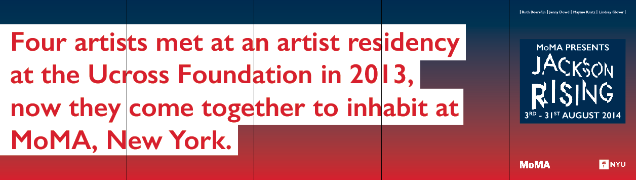
OUGD505 - Study Task 3: Jackson Rising Task
For today's studio session we are focussing on layout design, doing a day long brief to fulfil this. The brief set is for a fictitious exhibition at MoMa. In this there are two tasks.
Task 1
The first task was to design an A5 leaflet.
 |
| Brief & Specifications |
 |
| Branding Images Provided |
We were given 45 minutes to design the leaflet.


Final Leaflet:

I found this task was a good because it makes you think quick in terms of layout and overall design in such a short space of time. You have to think immediately about what needs to be important and how it all needs to layout so the viewer can see these elements first and give their attention to it. It shows where the weaknesses in my design skills are and where the strengths are, especially working under restrictions in terms of colour and images used.
Overall I thought my leaflet works quite well and is balanced in the way everything is set out. My thoughts were that the exhibition name, date and location were the most important pieces of the leaflet, which is why I put them at the top in a large size. I created a bit of a footer to the leaflet with the contact information and logos provided, with the descriptive text between the main headings and footer. I didn't think this information was necessarily that important when it comes to a promotional leaflet so I had it at a point size that was readable but didn't overpower anything else on the sheet.
Task 2
After task 1 we were given the second task which is to design a 10 page concertina booklet. In this we were given body copy and images to work with. We aren't allowed to edit the images in any way, only crop them down, and as a challenge the body copy varies for each section so we have to figure out a way to balance it all out.
 |
| Brief |
 |
| Specifications |


We were also given a ready-made InDesign document.
Before starting, I made a quick mock-up of how the document would fold when printed out. This made it much easier to design for digitally as I knew what page would be where.

After working around a general layout I developed the design until I was happy with it. I stuck with white on black like the leaflet and I think this works very well in making the image stand out.
Final Concertina:
 |
| Inside |
 |
| Outside |
The main issue in creating this concertina was down to the amount of body copy. Two of the artists had a large amount, whereas two had quite a small amount. I decided on balancing the amount each was given so it looked as though it was only a taster to the exhibition and there was more for each artist. To go with this idea, I decided on only giving one page to each artist. There was room for each to have a double page, however I didn't think this was necessary. A lot of the time when given a concertina, the main focus is on the inside and not the back, so I wanted all the information all in one place.
Overall I am quite pleased with my design. Not being able to edit the images in anyway was something I found quite hard to work around, but in the end I came up with an overall design that I was happy with. For the time limit I think I designed something that was pretty good, however it definitely needs cleaning up and developing a bit more.
After the time limit was up we all put our designs out and went round the studio to look at what everyone had come up with. This was a very interesting exercise because it showed how everyone had taken the information and designed differently to each other. There were obviously quite similar ideas, but all carried out and designed in completely different ways.
Task 3/Extended Practice
The third part to todays session was to extend the work and see how far we could take the designs and into what other situations this could be applied to.
The first thing I did was develop the concertina design I previously did as I feel this could definitely be better than it is at the minute. I wanted to change the black to a colour, but a dark one so the text could still remain white.
I started with a dark navy blue.


Once I had the gradient on and was happy with it I went about changing the titles to make them fit better. In the initial design they looked like part of the background colour but this obviously isn't possible with the changing colour of the gradient, and I wanted them to stand out, so decided on making the boxes white and having the text in red. This includes the red much more into the design than just being in the gradient, giving a much more consistent design approach. I decided that the body text should just stay in a navy blue box because it works quite well as a contrast to the white heading boxes.
When I was happy with this I moved onto what I could potentially design for to extend this out to full exhibition promotion.
I made a list of what I could potentially design for:
- Posters
- Colour leaflets/flyers
- Interior way finding/walls
- Exterior building promotion
- Banners/Bus Stops/Subway/Wall promotions
- Publication promotion (newspaper/magazine)
- Website Promotion/App
- Opening Night Invitations
- Tickets
- Business Cards/Letterheads/Stationary
I started with the posters, designing them to an A3 size, but these could easily be scaled up for use.
Something that I found quite annoying in the previous two tasks is that all of the branding has been given in black and white, apart from the MoMA logo, so the first thing I did was create a white version of this. It might be going against the limitations a bit, but it will work much better in my designs.
I decided on two posters, one which was just a promotional poster with the exhibition name and dates on, and the other which was mainly the introductory text. I wanted them to be quite simple and have the same aesthetic look as the front of the concertina and of the A5 leaflet.
Poster 1


I moved onto designing some A5 invitations for the idea that there would be an opening night for private view, as there are with most exhibitions.
I decided that this would be a good media to use the same design that I had for the headings in the concertina.
I came up with two different variations.


I definitely prefer the second. The first doesn't balance as well and seems to limit the space for the exhibition title.
At this point I moved back to the posters momentarily because I realised that there should be a consistent element in them in the footers. This is common in promotional material and should be something I continue to use through my practice.
I took the footer from the second poster and changed it slightly to include the information necessary, applying this to both posters.


I added the introductory text and artist names to give the reader a bit more information on the exhibition. I also included dates for the 'opening night' and how long the exhibition was open for, with the location and contact information too.

I felt the first design was a bit too crammed with information so decided on getting rid of the first piece of text to free up some space and let me utilise it much more.

I thought this layout worked better than the previous one as it as there is much more space between the text.
I changed the footer so it was a bit more structured and came up with two variations of the page.


Going back to the posters again, I decided on getting rid of the MoMA logo at the top of the poster, just having it in text instead.

At this point I went to the concertina and replaced the MoMA logo with the white one, and made the date on one line to free up more space.


Eventually I decided on the following:


I also applied this to the invitation.


As this needs to be readable I decided on having a white frame over the top of the gradient so this is only seen around the edges. The issue that comes with this is that throughout this I have been using the white branding, and this would not be seen over a white frame so I would somehow have to make it work while sticking to the branding.
In my first design for this I decided on having the text in blue and having a blue frame around the branding element. I quite liked how this worked, however with the white frame it makes me unable to use the branding for MoMA so I would need to work around this to get something that is realistic but also suitable.


I added it to all the designs I have done up to this point.


When adding it to the concertina I thought about the reasoning for having the location on the front page. In reality, something like this would probably be given out at the location and not around the city, and even if it were given out around the city, the location isn't as important as the exhibition title. I decided on moving it to the back page with the rest of the contact information.


Going back to the ticket, I thought about it in realistic terms in the fact that this would probably be printed very quickly, so the efficient choice of ink would be black for the text and branding. With this in mind I changed all the blue to black, but decided on keeping the gradient as there needed to be something that keeps a strong identity to it, and this could potentially be printed before put on a roll to print the ticket information.


After finishing these two designs I looked back over everything and made sure it was all in sync with the branding and overall aesthetic of it all.
Final Designs:
A5 B&W Leaflet

A5 Colour Leaflet

A5 Concertina

A3 Posters


A5 Invitation


Ticket


Business Card


A4 Letter Head

Proposals
In terms of proposals I took the elements that I have already designed and applied them to the right sizes & shapes for the placings.


For the website I did two different pages, one for on the home page of the MoMA website, and the other for what could potentially appear if this link is clicked on, a homepage for the exhibition.
 |
| MoMA Homepage |


Overall I have found this task to be an enjoyable one as it is quick and a break from the larger project I am currently doing on the course. Coming up with a design so quickly and seeing how much media I could put this over was something I enjoyed and found it to be a good exercise in seeing how good my initial design skills are without development, and how I could quickly develop the ideas to something that is visually strong on both printed and web based media.
Subscribe to:
Posts (Atom)