Thursday 28 February 2013

OUGD406 - InDesign

Following the InDesign workshops, we were each given an animal. I was given the Eagle.

Research

Following the research, and using some thumbnail designs from OUGD404 I began to experiment with a few different layouts.
Single page layout designs

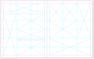
\\DOUBLE PAGE LAYOUTS DESIGNS//

Putting it into InDesign

I started by creating the correct document size. As it is a double page spread, and would usually be inside a publication, I set it up exactly like that. Being a double page spread, the document is made up of three pages, (as the first page doesn't have a facing page).
I then added some basic guides to start off with.
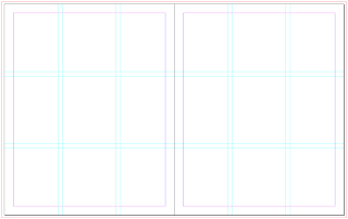
Guides
I added some frames in place of the first layout design I have chosen.
Adding frames
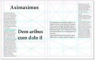
I then filled a few fames with dummy text so I could see how well it would work.
Text frames filled with dummy text
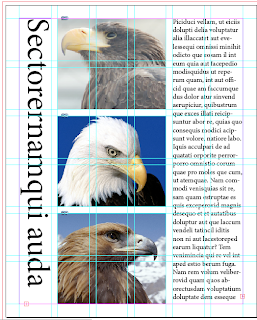
Along with the dummy text, I put in a few of the pictures that I could use. After this, I experimented with a further few layout ideas & designs:
Layout 1
Layout 2
Layout 3
Layout 4
Layout 5
Layout 6
Layout 7

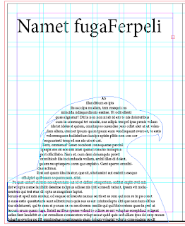
Once looking over the layouts I decided that I liked the idea of text wrapping around an image, like in layout 3, so got the three images I wanted to use and cut around the eagle.
Layout 8
I then put these images into the frames, with the text surrounding it. However I found that I really didn't like this kind of layout as I found it was too structured and too boring. So because of this I decided to take a completely different approach and go for a more illustrated and colourful layout.

I started by creating this background in Illustrator.
I wanted to keep it quite plain and simple as I have to be able to fit at least 500 words on it, so there had to be an area which would be easy to read type over. I created the clouds by drawing lines and changing their thickness & what sort of mark it was to make. I then layered these over the top of one another at different opacities to give the illusion of clouds.
I then went through the images of eagles I had collected, and since I had decided to focus on the Golden Eagle in particular, I looked over the images of this kind. I then took them into illustrator, and to get a more realistic effect, I live traced them:

Bird 1

Bird 2

Bird 3
As they are brown birds, I put them all in the same brown and then layered them over the background, making sure to leave enough room for type. I then imported the image to InDesign.
Once in InDesign, I created a grid of 4x4 within the margins, so that on the left, I could have one large chunk of text to start it off, and on the right, four smaller columns of text.
Adding the Frames
I found that once I had added the text to the frames, it didn't quite sit right on the right hand side as the columns were too thin and there were only four of five words per line, which makes it harder to read and harder on the eye. To fix the problem, I changed the grid to 3x4 so there would only be three columns on the right hand page, which definitely seemed to work better and read easier. I used an easy to read, sans serif font - Caviar Dreams.
I also created the title on Illustrator and imported it 'the Golden eagle'. I then positioned it into the space I had left, and after adjusting the placement of the eagle below it, it fi perfectly.
I found there was a bit too much blue space around the title which made it look empty, so I added a bit more cloud to it. I also changed the text from black to white as I found it was easier to read and sat against the whole image better.
 I felt that although the text stood out against the background, it wasn't entirely readable, and because of this I changed it to bold. For this typeface, bold isn't much of a difference, but it is enough to make it readable, which was the intention.
When looking over the page without the guides, I noticed that because there was only a left hand side adjustment, the box on the left hand page does not look like it has the same margin difference to the one on the right hand page. It looks further away from the centre. So I changed the justification to be left hand aligned and to go right to the end of the box.
 This looked much better, but left a big gap. After trying to change the leading between each line to a larger number, I found it was impossible to do in this format and keep all the words. So because of this, I created another image of an eagle and put it in the gap, and it seems to work well.
Final Page

Wednesday 27 February 2013

OUGD406 - Communication Is A Virus (4)

The starting of our promotion is with the stickers we plan to put around, so we all went away to create our own variations. I decided to keep them simple and stick to the same aesthetic as the type in the logo we are using. I created a couple of variations, all simple, but stand out enough to be seen if used as stickers.


 In the end we decided to go with the stickers created by Adam, Grace & Anna. We printed them on white paper, and some on transparent sheets to be stuck on bus stop/lamp posts.

Stickers


I am designing the E-book/Downloadable & printable book which is about the do's and don'ts of twitter posting - the 'Twitter Etiquette'. As we are unsure about the contents for now, I drew up a few designs for the front cover page, and then digitised them. I have used two typefaces here, Monoline Script & PicoBlackAl (The twitter font).
Designs
Design 1:
I found that when this was created digitally it looked very plain, and didn't look much more interesting when colour was added:
Because of this, I decided to skip the second design as it was the same type format.

Design 2:
Design 2 goes back to the logo design much more, using the bird face and type style. I think this looks much better than the first design as it isn't just a couple of words stuck in the middle of the page. It looks a lot more thought out and stylised. It definitely looks better with the outline as a line instead of a block colour. In the block colour it looks a bit too bold and not as sophisticated as the line.

Design 3:
This one works the best so far I think. The focus is more on the words and not on the bird face, like above, where I think because it's right there and in the middle you immediately look at it. In this one, you read the words first and then see the bird face, which is the way round it should be, as the bird face is just the logo and not so much what the book is going to be about.
I tried it in a few different colours to see how it would work, and if it would work. So far I can say I think it does, but I have to be selective on which bits are in colour, and which bits are in white, especially the 'Etiquette'.
I also tried the bird face with an outline, just to see if it worked better. I can't say it looks any better or worse, so for the moment I will be keeping it without the outline as it fits in with the way everything else has been produced up to this point.
I also looked at switching the colours round so the darker one is the background and the lighter colour is the lettering and bird. I found this was a lot worse visually as to make the bird face clear, I needed to use an outline around where the eyes are, as the colour and white seemed to fade into one and weren't noticeable at all.

Along with the bird face and title, I wanted to add what the book was about. 'The Do's & Don'ts of Twitter'. In my initial designs I used a block font, so started there.
However, I found it didn't necessarily fit in with the rest of the page, so started to look at other options to use. As the tone of voice of it all is informal and aimed at a student/teen age range, it needed to be something that went along with that and was more approachable than the block capitals used.
Typefaces looked at
My initial instinct was to use the typeface at the bottom 'Swagger' as it had a bit more personality to it than the other hand written typefaces.

 I tried it in two different formats (Adding the final colour change in) and decided that it was definitely better to the side so I would continue with it there instead of at the bottom.
Caviar Dreams
Architects Daughter
Apple Casual
Out of the four typefaces I tried, I wasn't convinced on any, as they all seemed too polished and perfect, especially for handwritten typefaces. Instead of trying to find another typeface on a font website, I decided to use Adam's handwriting instead as it was clear and easy to read, looked like it could easily be made into a good typeface and was keeping with the casual and informal tone of voice.
Adam's handwriting
I got him to write out the alphabet in uppercase, lowercase, eleven glyphs and all numbers, that way it could be used in whatever way needed.
Alphabet by Adam
From here I put it into Illustrator and vectorised each letter, number & glyph, and from there too it into Fontographer and created a basic typeface which can be used to type with. This means that anyone in the group can now use it for whatever they want, be it the posters, leaflets or desktop backgrounds.

Typeface on Fontographer
Installing to Font Book
Final Alphabet - Adam Sans Regular


Further designs