- Before you can apply a grid you must understand the requirement of the grid for work to be produced.
- Typeface, text & illustrations, print method and paper quality must be confirmed beforehand.
- Thumbnail sketches will make your job of final layouts easier and productive - should be proportionate to final layouts
- Before drawing your sketches, consider the number of columns needed
For example:
- 1 column only for text and illustration gives little freedom of layout - restrictions of making illustrations small, medium or large.
- 2 columns, logically, gives more scope; column for text, column for illustration.
- 2 column division can be subdivided to create a 4 column layout.
Three columns
- Opportunities for arranging and accommodating text and illustration in numerous sizes. Can be subdivided into 6 columns.
- Distadvantages of 6 column system - lines of text will be narrow. Small typeface will have to be used. But this solely rests on the function that is to be performed.
- For statistics, figures, graphs and trend line publication use 4 columns per page.
- 4 columns can be subdivided into 8, 16 + columns - convenient for representing stats.
- The width of the column dictates the size of typeface used.
- The rule" The narrower a column is, the smaller the typeface.
Thumbnails & development
- Make a variety of thumbnails of layouts/design.
- Don't rely on one set of thumbnails.
- Enlarge a small selection of thumbnails to size.
- Compare them and select and repeat process until you are confident with the design
Apply type to columns
- The first line must fit the flush to the top limit of the column grid.
- The last line must stand on the bottom of the limit.
- It is difficult to find the final solution the first time round.
- It could mean that your grid field is too high or too low.
- To know you have the right point size, there will be an even amount of lines in each field - a field is the layout split into three.
Example
- Column length - 15 cm.
- Loosely means using 15 point leading.
- At this length there must be 10 lines per box.
- Meaning 30 lines every per 15cm.
- The depth of my fields ascertains how many 1-point type lines I have.
Font Heights
Type & Picture - 8 field grid
- A4+ Format.
- 8 & 20 grids.
- 8 field grids are used frequently for advertising material and brochures.
- If using 8 field grids, you can subdivide into 16 grid fields.
- 8 & 16 grid fields gives you a range of possibilities.
- 8 Grid fields allow various sizes of illustrations to be portrayed.
- You can use with out without text.
- You need to have a good perception of composition.
The grid is only an instrument in which you can make interesting and balanced designs.
Creating Grids in InDesign
Way 1 - Using margins, columns & guides
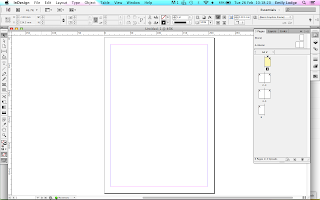 |
| Original page |
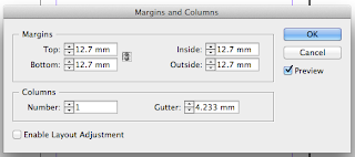 |
| Original margins & columns |
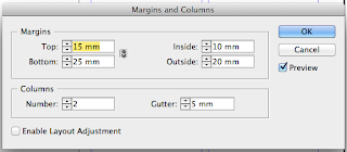 |
| Changed margins & columns |
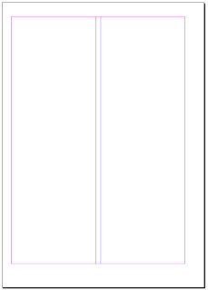 |
| Changes on page |
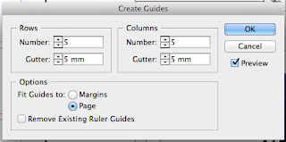 |
| Making guides |
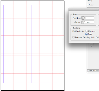 |
| Setting guides to the page |
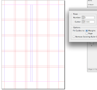 |
| Setting guides to the margins |
Way 2 - Using Scripts
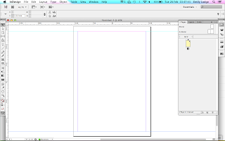 |
| Original page |
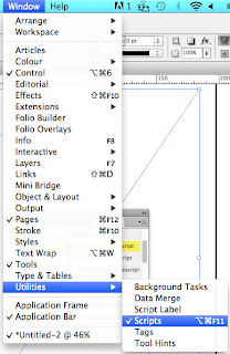 |
| Utilities - Scripts |
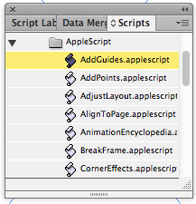 |
| Scripts page |
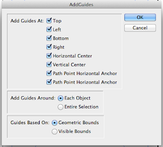 |
| Adding guides |
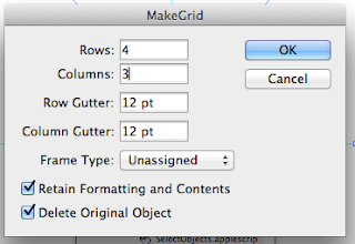 |
| Making a grid of frames |
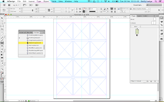 |
| Final boxes on page |
Working with image & text
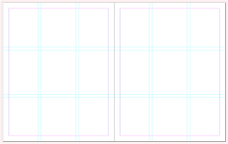 |
| Guides |
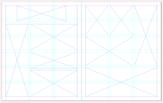 |
| Adding frames |
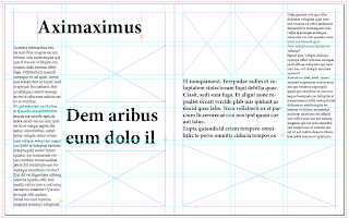 |
| Text frames filled with dummy text |
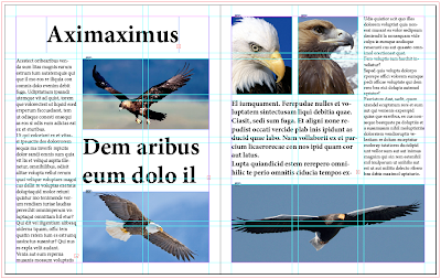 |
| Layout 1 |
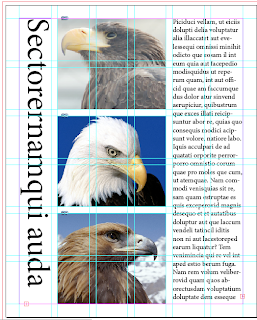 |
| Layout 2 |
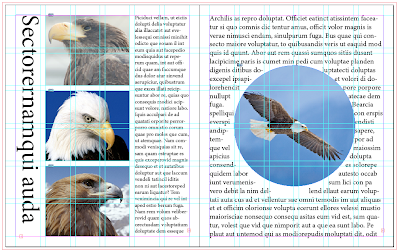 |
| Layout 3 |
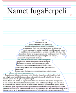 |
| Layout 4 |
Using the layouts I designed before
Task - Find various layouts & grid them
 |
| 5x3 |
 |
| 9x9 |
 |
| 6x3 |
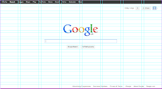 |
| 14x8 |
 |
| 6x9 |
 |
| 6x5 |
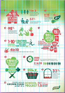 |
| 8x8 |
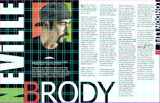 |
| 10x20 |
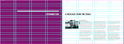 |
| 8x8 |


No comments:
Post a Comment