Secret 7" artwork design for chosen songs by the following artists:
- Public Enemy - Harder Than You Think
- Elton John - Bennie & The Jets
- Nas - The Don
- Jessie Ware - Still Love Me
- Haim - Better Off
- Laura Marling - The Beast
- Nick Drake - Rider On The Wheel
After listening to all the songs, I decided on Jessie Ware.
It was the song I liked the most out of the seven, as it fits the best with the style of work that I like to create. The song is pretty repetitive so it fits in with the idea I had of geometric shapes/patterns.
Research
I had a few initial ideas, and from there I made 30 thumbnails of ideas and different variations of each different style.
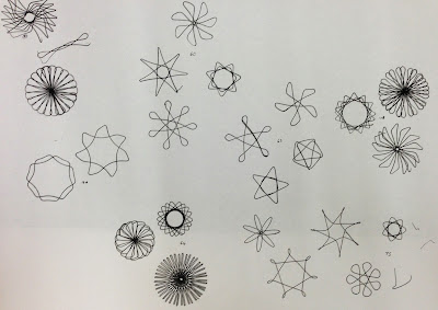
Using just geometric shapes could be a little boring for the piece, so I experimented with the idea of using a spirograph to create a sort of centre piece & focus for the design.
From the ones above, I thought that there were only two designs which I liked and thought would fit in well with what I had come up with prior. I scanned these pictures into Illustrator and created the shapes in a vector form, creating the patterns:
I did two variations of each, one simple, and one more complex, so that I could see which would fit better with the designs as they were quite simple.
From the 30 above I chose 5 completely different designs to see how, in general they would work when created & coloured on the computer.
Colour variations:
Idea 1:
I do like how this one turned out, especially when I had decided upon the colours to use. The red & yellow work well together, and I like the idea of having a complete absence of black, instead having the white for the detail and to stand out.
Idea 2:
This is the one that is different from the other ideas I had. It isn't strictly geometric, but it keeps that sort of look going. It's more complex & interesting to look at, especially when it's smaller, but I will experiment with the other ideas I had for this pattern as I'm not entirely sure about it as it is.
Idea 3:
This is the simplest one I created. I know I definitely won't be using it, but creating a simple design was an idea that I wanted to explore, and it could be used for a cover if feedback for it is positive. I also found the colours didn't work as well as they did in the previous two.
Idea 4:
I like this one the most as it shows the patterns and lines that can be created in a square format. At first I didn't think I would have much luck with it, but after creating the lines, colours & opacity, it worked out really well and gave quite a few really good variations.
Idea 5:
In this one I wanted to add in another colour to see what else it would bring to the piece as a whole. However I did find it very hard to find another colour which went with the existing ones, and fit in smoothly with them. I settled on the blue, however am not happy with the outcome and will continue to experiment with this layout in different colours.
Group Crit
After the crit we did in groups, the feedback given was that ideas 1, 2 & 4 were the strongest. As I had already done quite a few variations of idea 4, I started to look at idea 2 in more depth & see what I could do to make it more interesting to look at.
The main issue I had with this style is that it looked too clinical & boring for me, so instead of doing it on the computer, I started by drawing out a pattern on plain paper.
 |
| Hand drawn layout |
 |
| Final cover |
I then looked at idea 1 again. This is my favourite one that I created because of the spirograph in the middle. The main change I wanted to make to this one was the background. I think it is too simple/boring, so am going to create a background which is a bit more interesting, so I drew out a few basic layouts in which I could start exploring.
 |
| Layout development |
I liked the idea of using triangles, but found them a bit boring when they are plain and equilateral. I decided to use isosceles instead. Looking back over the aztec style prints, this was more common than perfect triangles. I drew a few variations on how the triangles could look.
 |
| Triangle Variations |
 |
| Digital variations |
I took the 6 designs I liked the most and started experimenting with them to see how they could be used. On the first two, I kept it simple with the same sized triangles, depending more on the colour to make it interesting. On the next two I played around with scale, and they definitely came out a lot more diverse and interesting even though they were simpler. The last one is using the combination of two different triangles to create the pattern.
The most successful one to me is the fourth one, as I like the triangle the most in that one. With the chosen design, I then created a geometric and symmetrical design to use as the background, using the triangles and lines between, some straight, some dashed, just like in the aztec prints.
 |
| Background |
 |
| Variation 1 |
 |
| Variation 2 |
 |
| Variation 3 |
 |
| Final Cover |
 |
| Confirmation Email |


No comments:
Post a Comment