Itten's Colour Contrasts


Experiment 1: Contrast of Tone


As the black got easier to read, the white got harder to read.
Mid-tone they were both as readable as each other.
White easiest to read out of the two.
Experiment 2 & 3: Contrast of Hue

Black & white just as easy to read as each other.
Same distance from red on the colour wheel so readability isn't affected by hue.

More purple type is easier to read.
Makes the red seem lighter than it is.
Orange/red makes the red seem darker.
Is very hard to read. Very little contrast.

Purple text is easy to read. Contrast is high.
Vibrance makes it hard to look at for so long.
Orange is readable, but not well.
Red makes the text seem very dull and makes it fade against it. Contrast is low.

Both as easy to read as each other.
Both stand out against the red easily as the contrast of hue is high.
Yellow stands out more as it is brighter.

Both are readable, but hurt the eyes.
Both have simultaneous contrast, making it hard to look for so long.
Blue is easier as green is the perceptual opposite of red.

Both are readable the same amount.
Both have simultaneous contrast and are as equally hard to look at.

Light blue stands out against the red a lot more here, is a lot more readable.
Red gives the blue a slight glow around the edges.
Green fades against the red, makes it less readable. Hard to look at.

Pink is almost impossible to read. Very close to the red so it disappears amongst it.
Low contrast of hue.
Purple is very easy to read.

Lighter green is definitely easier to read.
Darker green has simultaneous contrast and makes it hard to look at.

Yellow very easy to read, whereas the yellow/orange fades against the red.


Overall, the darker coloured pieces of card make the lighter ones stand out a lot more.
Purple vs Green & Green vs blue seem to have no effect on each other. Both sit evenly.
Green card seems to stand out the most against the other colours.
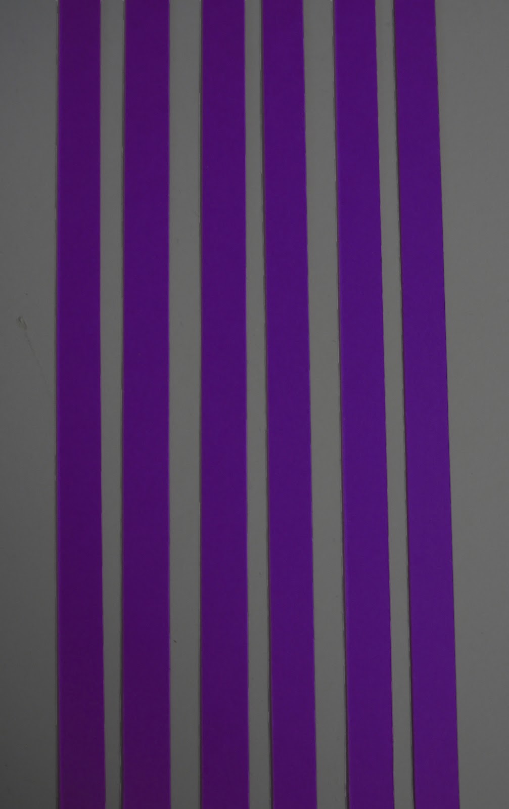
Experiment 4: Contrast of Saturation


Overall the more vibrant pieces of card make the lighter ones seem a lot duller and desaturated, when separately they are just light coloured card and nowhere near dull or desaturated. Red & Blue show the biggest desaturation. Green doesn't seem to be as effected as the rest, & purple is the same.
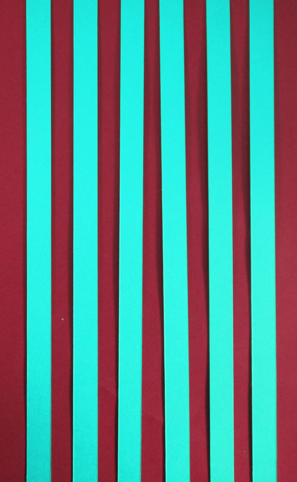
Experiment 5, 6, 7: Contrast of Extension


More blue or more red doesn't seem to make a difference.
Both work well.


Not a huge difference.
Red works better on the blue. Makes the blue fade out a bit, makes the red more visible.
Whereas the red takes over a little in the second. A bit too overpowering for the blue.


Once again the red on blue works better. Seems an even match.
The amount of blue helps bring it out a bit more against the red, however the red is still overpowering.


Each strip of red stands out against the blue, including the one on it's own.
Second seems like a good even spread of red & blue.


Both seem at an even level to one another.


Green with a bit of red works better. Red is too overpowering otherwise.


Red on green stands out the most.
Green on red is harder to look at.


A even spread of each. The red on green spread out seems to make it a little harder to look at.
The green spread out on the read makes it very easy to look at.


Once again, the red on green is harder to look at. Simultaneous contrast happening here.
Green spread across the red makes the whole image calmer and easy to look at.


Single strip of red is a lot easier to look at than the five strips together.
Red is too overpowering on the second, makes the green fade away completely.


Orange is overpowering, so second is better to look at.


Single strip of orange is easier to look at.
Blue strip on orange disappears amongst the vibrance of the orange.


Strips are harder to look at than the block of orange. They take attention off the blue completely, whereas the block is more even against it.
Blue strips are hard to look at, overpowered by the orange. Simultaneous contrast happening.


Single strip of orange against the blue is the easier to look at. Orange completely overpowers the blue in all four aside from that one strip, which is even against the blue.
Experiment 8: Contrast of Temperature


Separately the coloured squares seem completely different colours.
Together they merge. Makes the red look very purple, as well as the darker blue.
Red looks more brown in image 5. When individual in image 3, it looks more red/pink.


Purple square over the red makes it seem very hot as it is the mid tone.
Does the same with the blue, making it look very cool.
Mid tone colours make the end colours more vibrant, seem warmer/colder.
Experiment 9: Complementary Contrast


Bright blue on brown is hardest to look at. As well as orange on purple & purple on green. Simultaneous contrast happens here.
These make orange on blue & red on blue seem fine to look at when these are contrasting colours.
White on black is also quite hard to look at.
Three colours on blue is easier to look at than on purple. Yellow & red are hard to look at on purple. Blue just fades against it.
Experiment 10: Simultaneous Contrast


Pink & bright green have the most effect & are the hardest to look at.
Darker colours on grey are easier to look at than the lighter colours.
Orange has no effect at all compare to the other nine colours.
No comments:
Post a Comment