1. What skills have you developed through this module and how effectively do you think you have applied them?
The main skills I have developed throughout this module is my ability to take a logo/identity and apply it effectively across a range of media and across different channels. I think that this module has taught me real values about branding and how to do it well, not just sticking a logo on anything and calling it a branded item. Creating brand guidelines is also something I have learnt and thoroughly enjoyed through this module. Developing my skills in this area is something which I have definitely enjoyed and will continue to take this forward.
I think I have used these growing skills effectively through my work, and I think that it shows obviously from the first brief of the module through to the last, in which this is applied in a very strong way with a lot of considerations.
Not necessarily a skill, but I think my constant need for bettering my designs is something that I have put to effective use in this module. While it is constantly said that I am too hard on myself and my designs, I don't think that this is the way to think of it at all. I am constantly trying to better the designs and see where the issues are so it is the best that it can be. I think that this is something that I have done consistently through the module, and have produced some strong work because of it.
I think I have used these growing skills effectively through my work, and I think that it shows obviously from the first brief of the module through to the last, in which this is applied in a very strong way with a lot of considerations.
Not necessarily a skill, but I think my constant need for bettering my designs is something that I have put to effective use in this module. While it is constantly said that I am too hard on myself and my designs, I don't think that this is the way to think of it at all. I am constantly trying to better the designs and see where the issues are so it is the best that it can be. I think that this is something that I have done consistently through the module, and have produced some strong work because of it.
2. What approaches to/methods of design production have you developed and how have they informed your design development process?
One of the main design production methods I have furthered in this module is my book binding skills. While I had a basic understanding of binding from inductions in the last module, I took it upon myself to further this skill throughout this brief. I taught myself how to perfect bind, and am very confident in my ability to do so. I think my ability to learn fast and craft well certainly helped develop this skill much faster and to a better quality. Doing mock ups of the binding certainly helped me too and let me learn where I have gone wrong and how to fix it.
I have also designed work for a range of different sizes and medias, focussing particularly on editorial work and creating work that is to be bound together in a publication, large and small. I think that working in this area has improved my layout skills and helped me organise how I want information to be displayed and seen.
I have also designed work for a range of different sizes and medias, focussing particularly on editorial work and creating work that is to be bound together in a publication, large and small. I think that working in this area has improved my layout skills and helped me organise how I want information to be displayed and seen.
3. What strengths can you identify in your work and how have/will you capitalise on these?
The main strength in my work lies in my effort to make each project consistent. I think this is down to my development on branding, and down to my constant need to make everything perfect. While this means I have redone elements a fair few times, I definitely think it is worth it when it comes to the final product. An example of this is my research publication. While I had the information and general layout resolved within a couple of weeks, I have continually pushed the design and display up until the last possible point and to where I am happy with it and feel that it works at its best as a publication. I think that my strength in making everything consistent is shown in Studio Brief 2. This was the largest brief and the one that I worked consistently on to make everything work together well and make it all clearly part of the same event.
Another strength of mine has been time management. While many have struggled in this, I have found that if I give myself a set timetable and give myself deadlines, I get the work done and can move forward and develop my outcomes more than I initially thought. This has definitely been beneficial to all the briefs in this module. I feel that these strengths have aided me in creating some of my strongest work to date.
Another strength of mine has been time management. While many have struggled in this, I have found that if I give myself a set timetable and give myself deadlines, I get the work done and can move forward and develop my outcomes more than I initially thought. This has definitely been beneficial to all the briefs in this module. I feel that these strengths have aided me in creating some of my strongest work to date.
4. What weaknesses can you identify in your work and how will you address these in the future?
I think once again, my weakness lies in the number of printing processes used in my briefs. While I am a designer who likes to design for digitally printed media, I do think that my designs could have been pushed that bit more to include methods such as embossing or laser cutting in the production to give a more refined and professional appearance. I would like to use both of these processes in the future as well as foiling and spot varnishing. These are the four processes that I particularly like and think will push my designs further in the future.
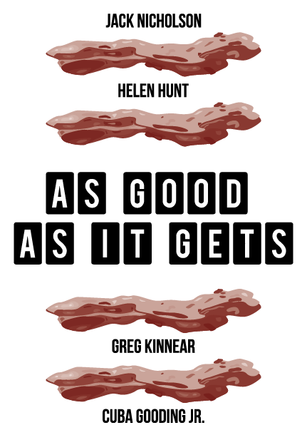
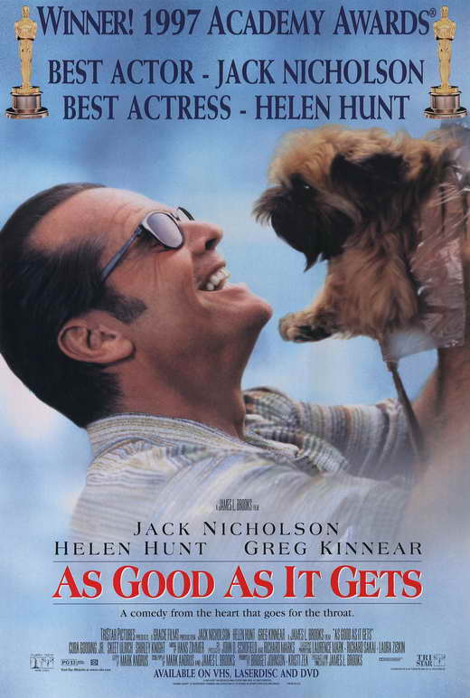
I also think my main weakness in this module has been in Studio Brief 3 - the movie poster. I didn't particularly enjoy this brief at all, and I do think that it shows in my poster. I felt the film given was terrible and didn't give me much enthusiasm for creating a poster for it. As well as this, I don't think I went around the right way of designing for it, giving quite a poor final poster, and definitely the weakest work of the module.
I also think my main weakness in this module has been in Studio Brief 3 - the movie poster. I didn't particularly enjoy this brief at all, and I do think that it shows in my poster. I felt the film given was terrible and didn't give me much enthusiasm for creating a poster for it. As well as this, I don't think I went around the right way of designing for it, giving quite a poor final poster, and definitely the weakest work of the module.
5. Identify five things that you will do differently next time and what do you expect to gain from doing these?
- Use more print processes to give a more refined and professional appearance. This will help me take my designs to the next level and work differently in ways of making the designs more simple and giving more of a focus onto these processes instead.
- I would like to make a more conscious effort to design for web. While I enjoy designing for print, I do think that designing for web confidently will help me become a much more rounded designer and will help my overall design skills.
- Work with a larger colour palette. While the colours used were in context to the projects, I do feel that I have been working with small colour palettes of only three or four colours. I would like to do a brief where I use a wider range of colours as I think this will create new challenges for me to work on.
- Experiment a bit more with how I can take binding methods forward. I thoroughly enjoy binding a book and would like to continue to learn this skill. Over summer I want to learn coptic binding so I can apply this in the third year.
- I would like to spend a bit more time thinking about the audience/context of the briefs before starting with the designing side to it. I'm enthusiastic when it comes to getting a brief and like to get right into it so sometimes I don't think about audience etc, so I would like to start to do this. I did towards the end of my research book, and had to make changes at the last minute, which is something I don't want to be doing again in the future.