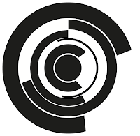
The main issue that arose was how complicated to make them. This was down to the use of the circles and how many of them to use. Originally I intended to use the 'O' for every circle I needed, however, when scaling down, the lines started to blur into one another and made it quite difficult to tell where they were separated.
To solve this, I decided that, depending on the size of the circle, the number of rings would be reduced. The 'P' is an example of this. I got rid of the inner rings to stop the clutter and sort of give an outline to where the letterform stops in the centre. It makes it a little more obvious what the letterform is than if it was just the 'O'.
From then on it was pretty simple to create a full alphabet. However when it came to creating a couple, I had a few different ways of doing it, and had to take some time to try figure out exactly which one to use, taking into consideration the whole alphabet working as a set.
The 'N':
I was trying to make the 'N' in the same style as the 'M' with the circles at the joints, but however I tried it, it wasn't working very well. I used the 4th one as my final one as it looked better and sat with the rest of the alphabet a lot better.
The V:
I settled on the last one as it showed the point and the other three made the letter seem quite soft, which is not what the letter is at all, as they look a bit more the a 'U' than a 'V'. In the end I did actually use the first one as the final 'U'.
The same problem happened in 'W':
Again, like the 'V', I decided to use the last one as I knew there would be other letters with exactly the same issue, so decided from this point onwards all those letters would be done in this way.
As there are a lot of different shapes in the alphabet I put them into a couple of different categories to make it easier to create them.
1) Straight lined:
2) 'O' as a main feature:
3) Straight lined & 'O' combined:
4) The Glyphs:
I put all the letters in the layout for the poster:
The finished hand-drawn poster:
Name Tag:
 |


No comments:
Post a Comment