1. What skills have you developed through this
module and how effectively do you think you have applied them?
|
|||||
The main skill I have
developed throughout this module is my practical work on the computer, using
Illustrator. At the beginning of the course I had used it for a minimal
amount, only knowing the basic controls, but now after the workshops we were
given I feel confident in my use of this program to create visual variations
and my final outcomes. I think this has definitely aided in making my work
look a lot more professional and finished.
The use of Illustrator has
allowed me be more creative and a lot less worried about taking risks in
pieces as I can now change it at the click of a button. This in turn has
helped my idea generation and development.
|
|||||
2. What approaches to/methods
of design production have you developed and how have they informed your
design development process?
|
|||||
My approach to design
productions has definitely been more experimental throughout this module. I
have taken time to get my ideas down on a piece of paper and then take it
from there, whereas I used to just go for it and make the changes later. This
has helped manage time during this project as I have a clear idea what I am
doing before I start doing it digitally.
The tasks in which we come up
with ten or twenty variations has become a lot easier for me because of this.
I have found I am a lot more open to what I can do creatively in development
because I now have the skills to fulfil these on the computer/by hand.
The main thing I have started
doing is looking at the briefs as if I was a viewer and what I would
understand, instead of as the designer who knows everything about it. This is
important as these outcomes have had to be things that have to recognised and
understood immediately, and I am learning to get a balance and capitalise on
this.
|
|||||
3. What strengths can you
identify in your work and how have/will you capitalise on these?
|
|||||
In my personal opinion, my
final outcomes are my strong point. The professionalism and cleanness of them
makes them aesthetically pleasing in my eyes. I need to bring this same
approach to the development stage and remember to keep it all at the same
level of professionalism.
Another strength of my work
is the ideas generation. Although I may not come up with a huge amount of
ideas, I do feel that the ones I come up with are strong ideas and get the
message across well. From the few strong ideas I have, I am able to combine
them to create the final outcomes.
|
|||||
4. What weaknesses can you
identify in your work and how will you address these in the future?
|
|||||
My main weakness is that in
the end, when we are doing group critiques, not everyone understands exactly
the message that I am putting across. This is something I need to work on and
to make the message as clearly as possible so anyone who looks at it will
know exactly what they are looking at. Although I feel they are aesthetically
pleasing, others may not and this could lead to them not understanding what I
am saying through the piece.
Another weakness is that I am
more focussed on the final outcome than the development and ideas generation.
I need to give myself a balance and be able to spend more time on this and
hand drawn development than doing everything digitally to try get a final
outcome quickly.
|
|||||
5. Identify five things that
you will do differently next time and what do you expect to gain from doing
these?
|
|||||
1.
The first thing I want to change is the
amount of digital to hand drawing ratio. I would like to increase the hand
drawn element in my work, as this is an important feature of being a
designer. I feel I have not done enough, however this could be down to the
time frames of the brief and trying to get a final outcome out before the
deadline.
2.
I would like to do more ideas and design
development in the briefs so I can come up with a more resolved and thought
about final outcome. This will help me learn what gets the message across and
will benefit me in the future.
3.
Improving and sourcing my research is
something I would like to work on. I want to be able to get a balance between
research, development and the final outcome. Research is definitely the thing
that is lacking and I have always had an issue with.
4.
The quality of my hand drawn works. A lot
of my hand drawn pieces are development or quick sketches. I would like to
incorporate this element into the final outcome some how so I can get some good
quality drawing/hand rendered work in there.
5.
I would like to start making more
sophisticated work. I don’t feel like I have been doing this yet. I think it
has all been quite simple so far and I would like to make more intelligent
and sophisticated work. I would also like to make work that is more true to
my style than the work I have been creating. I am more of a post-modernist
designer than a modernist and I don’t feel that has been shown.
|
|||||
6.How would you grade
yourself on the following areas:
(please indicate using an
‘x’)
5= excellent, 4 = very good,
3 = good, 2 = average, 1 = poor
|
|||||
1
|
2
|
3
|
4
|
5
|
|
Attendance
|
x
|
||||
Punctuality
|
x
|
||||
Motivation
|
x
|
||||
Commitment
|
x
|
||||
Quantity of work produced
|
x
|
||||
Quality of work produced
|
x
|
||||
Contribution to the group
|
x
|
||||
The evaluation of your work
is an important part of the assessment criteria and represents a percentage
of the overall grade. It is essential that you give yourself enough time to
complete your written evaluation fully and with appropriate depth and level
of self-reflection. If you have any questions relating to the self evaluation
process speak to a member of staff as soon as possible.
|
|||||
Showing posts with label Alphabet Soup. Show all posts
Showing posts with label Alphabet Soup. Show all posts
Friday, 23 November 2012
OUGD403 - Module Evaluation

Thursday, 15 November 2012
OUGD403 - Printing Workshop
I have taken part in three printing workshops, two at the Rossington Street studio, and one at Blenheim Walk.
The first at Rossington was an introduction to the different types and ways of printing, including etching, lino, screen and mono printing. The second at Rossington involved us actually doing some printing ourselves. There were three ways set out for us, mono, lino and wood-press.
I took a letter form that I had done for the 'Shatter' brief so it gave me something to use.

I was most interested in lino printing as it is something I've never done before, so I started with that, cutting out the area around the letter so that it would not be printed. This process took quite a while as it was a shape that was quite hard to cut out as it had a lot of corners.


I then moved onto wood-press, which involved inking up some wood blocks, putting them on the piece of paper and applying pressure. Although I found this interesting and easy to use, I preferred the lino printing as it was my image and my work. The work done on the wood-press can easily be done by anyone else.

In the print studio in Blenheim Walk we were introduced to screen printing for fabric and paper, and the process to create a screen and clean a screen. I have done screen printing before so it was nothing new to me, however the tables used to keep everything in place were completely new to me, so I found that bit quite interesting. At the end we had a go each with a pre-prepared screen.

Saturday, 20 October 2012
OUGD403 - Alphabet Soup: Typeface (Finals)
Alphabet:
Name Tag:
Self Evaluation
 |
| Original |
 |
| Edited |
 |
| Original |
 |
| Edited |
Self Evaluation
Friday, 19 October 2012
OUGD403 - Alphabet Soup: Typeface (5)
After completing the alphabet set, there were 5 letters that I felt didn't fit in as well as the other 27:
S, Y, G, X & N
Because of this I took those four and redesigned them so they had the same characteristics as the rest of them.
S: The ends are the only issue with this. In the others, all the ends are steps, this one has straight edges, and doesn't really suit the rest of the letters.
 |
| Original |
 |
| Sketches |
 |
| New Version |
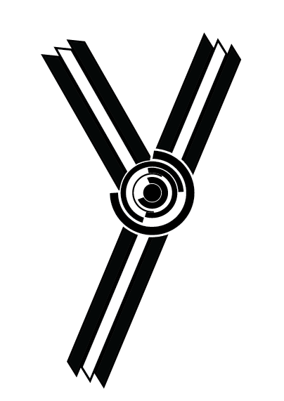
Y: I realised that for some reason I had done this letter in lowercase. Although it wasn't that noticeable, I put amends to it.
 |
| Original |
 |
| Sketch |
 |
| New Version |
G: The G has been the main problem I've had with the alphabet. There isn't really any other letter with the same shape & joins as this one, so it made it very hard to create. I ended up just putting the rings on the join to solve the issue, but I still didn't think it looked right.

 |
| Original |
 |
| New Version |
X: Like the 'S', this letter was completely different to the rest of the set as it's edges are straight and not stepped, and the middle black cross doesn't even join the edges.
 |
| Original |
 |
| New Version |
N: I like this one, but it didn't fit in with the rest of the set because of how the three lines are completely separate and not joined like the other letters. I put it back into Illustrator and joined up all the lines and it flows a lot better and looks a lot more like the other letters in the alphabet.
 |
| Original |
 |
| New Version |
New Alphabet
Name Tag:
|
Original
|
|
Edited Letters
|
 |
Colour
|
 |
Outline
|
Thursday, 18 October 2012
OUGD403 - Alphabet Soup: Typeface (4)
I carried on with the patterns I was using for the 'R' and the 'X' - mainly straight lines and perfect curves. Once I had those two base ideas, it became pretty simple to create the rest of the letter forms. I just put them together and manipulated them to create the letter I wanted.


I settled on the last one as it showed the point and the other three made the letter seem quite soft, which is not what the letter is at all, as they look a bit more the a 'U' than a 'V'. In the end I did actually use the first one as the final 'U'.
The same problem happened in 'W':


2) 'O' as a main feature:


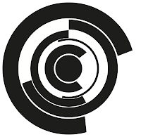





The main issue that arose was how complicated to make them. This was down to the use of the circles and how many of them to use. Originally I intended to use the 'O' for every circle I needed, however, when scaling down, the lines started to blur into one another and made it quite difficult to tell where they were separated.
To solve this, I decided that, depending on the size of the circle, the number of rings would be reduced. The 'P' is an example of this. I got rid of the inner rings to stop the clutter and sort of give an outline to where the letterform stops in the centre. It makes it a little more obvious what the letterform is than if it was just the 'O'.

From then on it was pretty simple to create a full alphabet. However when it came to creating a couple, I had a few different ways of doing it, and had to take some time to try figure out exactly which one to use, taking into consideration the whole alphabet working as a set.
The 'N':


I was trying to make the 'N' in the same style as the 'M' with the circles at the joints, but however I tried it, it wasn't working very well. I used the 4th one as my final one as it looked better and sat with the rest of the alphabet a lot better.
The V:


I settled on the last one as it showed the point and the other three made the letter seem quite soft, which is not what the letter is at all, as they look a bit more the a 'U' than a 'V'. In the end I did actually use the first one as the final 'U'.
The same problem happened in 'W':


Again, like the 'V', I decided to use the last one as I knew there would be other letters with exactly the same issue, so decided from this point onwards all those letters would be done in this way.
As there are a lot of different shapes in the alphabet I put them into a couple of different categories to make it easier to create them.
1) Straight lined:


2) 'O' as a main feature:


3) Straight lined & 'O' combined:


4) The Glyphs:


I put all the letters in the layout for the poster:


The finished hand-drawn poster:

Name Tag:
|
Subscribe to:
Posts (Atom)