1. What skills have you developed through this
module and how effectively do you think you have applied them?
|
|||||
The main skill I have
developed throughout this module is my practical work on the computer, using
Illustrator. At the beginning of the course I had used it for a minimal
amount, only knowing the basic controls, but now after the workshops we were
given I feel confident in my use of this program to create visual variations
and my final outcomes. I think this has definitely aided in making my work
look a lot more professional and finished.
The use of Illustrator has
allowed me be more creative and a lot less worried about taking risks in
pieces as I can now change it at the click of a button. This in turn has
helped my idea generation and development.
|
|||||
2. What approaches to/methods
of design production have you developed and how have they informed your
design development process?
|
|||||
My approach to design
productions has definitely been more experimental throughout this module. I
have taken time to get my ideas down on a piece of paper and then take it
from there, whereas I used to just go for it and make the changes later. This
has helped manage time during this project as I have a clear idea what I am
doing before I start doing it digitally.
The tasks in which we come up
with ten or twenty variations has become a lot easier for me because of this.
I have found I am a lot more open to what I can do creatively in development
because I now have the skills to fulfil these on the computer/by hand.
The main thing I have started
doing is looking at the briefs as if I was a viewer and what I would
understand, instead of as the designer who knows everything about it. This is
important as these outcomes have had to be things that have to recognised and
understood immediately, and I am learning to get a balance and capitalise on
this.
|
|||||
3. What strengths can you
identify in your work and how have/will you capitalise on these?
|
|||||
In my personal opinion, my
final outcomes are my strong point. The professionalism and cleanness of them
makes them aesthetically pleasing in my eyes. I need to bring this same
approach to the development stage and remember to keep it all at the same
level of professionalism.
Another strength of my work
is the ideas generation. Although I may not come up with a huge amount of
ideas, I do feel that the ones I come up with are strong ideas and get the
message across well. From the few strong ideas I have, I am able to combine
them to create the final outcomes.
|
|||||
4. What weaknesses can you
identify in your work and how will you address these in the future?
|
|||||
My main weakness is that in
the end, when we are doing group critiques, not everyone understands exactly
the message that I am putting across. This is something I need to work on and
to make the message as clearly as possible so anyone who looks at it will
know exactly what they are looking at. Although I feel they are aesthetically
pleasing, others may not and this could lead to them not understanding what I
am saying through the piece.
Another weakness is that I am
more focussed on the final outcome than the development and ideas generation.
I need to give myself a balance and be able to spend more time on this and
hand drawn development than doing everything digitally to try get a final
outcome quickly.
|
|||||
5. Identify five things that
you will do differently next time and what do you expect to gain from doing
these?
|
|||||
1.
The first thing I want to change is the
amount of digital to hand drawing ratio. I would like to increase the hand
drawn element in my work, as this is an important feature of being a
designer. I feel I have not done enough, however this could be down to the
time frames of the brief and trying to get a final outcome out before the
deadline.
2.
I would like to do more ideas and design
development in the briefs so I can come up with a more resolved and thought
about final outcome. This will help me learn what gets the message across and
will benefit me in the future.
3.
Improving and sourcing my research is
something I would like to work on. I want to be able to get a balance between
research, development and the final outcome. Research is definitely the thing
that is lacking and I have always had an issue with.
4.
The quality of my hand drawn works. A lot
of my hand drawn pieces are development or quick sketches. I would like to
incorporate this element into the final outcome some how so I can get some good
quality drawing/hand rendered work in there.
5.
I would like to start making more
sophisticated work. I don’t feel like I have been doing this yet. I think it
has all been quite simple so far and I would like to make more intelligent
and sophisticated work. I would also like to make work that is more true to
my style than the work I have been creating. I am more of a post-modernist
designer than a modernist and I don’t feel that has been shown.
|
|||||
6.How would you grade
yourself on the following areas:
(please indicate using an
‘x’)
5= excellent, 4 = very good,
3 = good, 2 = average, 1 = poor
|
|||||
1
|
2
|
3
|
4
|
5
|
|
Attendance
|
x
|
||||
Punctuality
|
x
|
||||
Motivation
|
x
|
||||
Commitment
|
x
|
||||
Quantity of work produced
|
x
|
||||
Quality of work produced
|
x
|
||||
Contribution to the group
|
x
|
||||
The evaluation of your work
is an important part of the assessment criteria and represents a percentage
of the overall grade. It is essential that you give yourself enough time to
complete your written evaluation fully and with appropriate depth and level
of self-reflection. If you have any questions relating to the self evaluation
process speak to a member of staff as soon as possible.
|
|||||
Showing posts with label Message and Delivery. Show all posts
Showing posts with label Message and Delivery. Show all posts
Friday, 23 November 2012
OUGD403 - Module Evaluation

Friday, 16 November 2012
OUGD403 - Message & Delivery: Distribution (Finals)
Mailing List:


Leaflet:

Critical Evaluation
Self Evaluation
Alternative envelope design considered after Crit and Self Evaluation:


Thursday, 15 November 2012
OUGD403 - Message and Delivery: Distribution (3)
The Envelope:
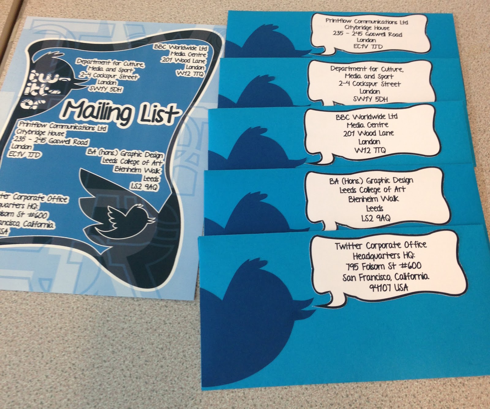
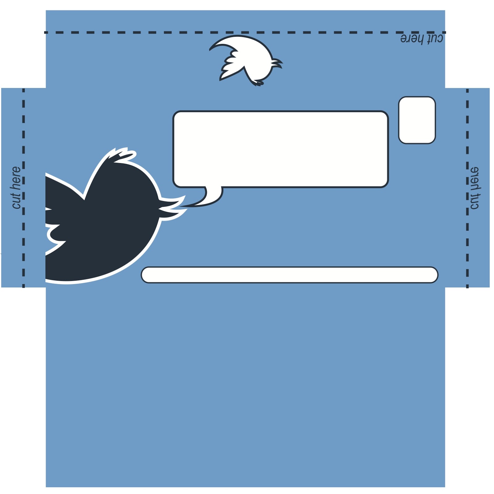
From the original design of the envelope I changed a couple of things around to make it fit around the leaflet that I had created. Instead of the plain standard speech bubble, I changed it to one from the leaflet, along with this I made the main twitter bird larger and moved everything up a little so it was right at the top. The main difference I made was getting rid of the cut tabs as they would not be necessary anymore. I stuck with a standard envelope net because it doesn't have anything on the inside of it now.
 |
| Original |
 |
| Edited |
I thought that the paper I was using would not be very good through the post and would probably get ruined so instead I created a design around using thicker blue paper and having each element cut and stuck on. I liked the idea of this because everything else was all done on the computer and this gave it a bit of a human touch.

The Mailing List:
Government Department for Culture, Media and Sport
As this is the government department for media, I thought it was appropriate to send them a leaflet as it will highlight the fact that media and social networking is talking over.
BBC Worldwide
BBC are always interested in new information and articles on anything to do with technology and social networking, and as this leaflet is making a statement on how social networking is taking over, I felt it was appropriate to send them a leaflet.
Twitter Corporate Office
Although sending it to Twitter may not seem like a logical thing to do, I thought it would be a good indication to them on what some people think of twitter and social networking.
Printflow Communications Ltd
PF Comms Ltd is a design company that I have been to do a bit of work at and am still in communication with. They are interested in what work I continue to do, and I think they will find this piece interesting.
BA (Hons.) Graphic Design
Design-wise, I kept the sheet pretty simple with the same format as the leaflet. I kept the watermark at the back, and manipulated one of the speech bubbles to be the main space on the page. I did two layers of this and cut two different sections out using different areas of the twitter bird logo.
I wanted to keep it simple, but interesting at the same time and not just a list, so for each address I gave them their own white bubble to make each stand out against the background . I also included the small twitter logo I had created.

OUGD403 - Message & Delivery: Distribution (2)
I started to think that having the cut tabs on the envelope might be a bit too impractical for the person who receives the envelope, so I focused more on the idea of a leaflet/information sheet inside so it wouldn't get damaged as easily as it would if it was the inside of the envelope. This also gave me the chance to be more creative as I can scale it the way I like instead of sticking to the dimensions of the envelope.
The idea is to create a sort of poster/leaflet with all the information on, that's easy to read and not too cluttered. This ruled out having more than one piece of paper to go inside the envelope. I want it all in one place where it's all easy to read and won't be missed on a piece of paper that might be left inside the envelope. The main concept is to have easy to read information
that got the point across simply and shortly, so there won't be any
interest lost or it be too overwhelming for the reader. In the end I decided on A4 as this is the typical size to go in the envelope and would be the easiest and simplest way to create the leaflet.
Twitter is about speech, so the idea of a Twitter bird and a speech bubble is one that I wanted on going through the leaflet and envelope. Because Twitter is informal and fun, I wanted to keep with that sort of approach, so instead of the standard shaped speech bubbles I drew out some more abstract shapes to use, so they fit around the three birds and fit on the page without looking too cluttered or random.

The one thing I had not done in this project is create a sort of logo that can be placed on this and the envelope, and even the three posters. I wanted to keep it simple and easy to read so I took the 'Futura' font and created an arrangement of circles over the top. I then cut these out from the letter and had two versions, the block colour version and the outline version.


After a few variations I decided upon the logo below, while block with a dark blue outline slightly out of place.

On the leaflet I placed this in the gap that was there:

I thought that this one it's own was perhaps a little boring and plain, so considered what could be done to make it more interesting. Blue isn't necessarily the most eye-catching colour so I knew I had to do something to make it a bit more memorable and standout. I took the text and created a watermark style over the whole background of the image. I think it really makes the three speech bubbles stand out and makes the leaflet as a whole, a more visually interesting piece.

Once visually happy with the front of the leaflet, I looked at the back. I wanted to keep it simple and like a poster that could be kept. A simple layout with only a couple of elements so it didn't detract from the information that would be on the front of the sheet.
Variations:


I wanted to keep consistency with the front page so changed the background colour to a lighter opacity so it would match. It created a much calmer and balanced image in my opinion, and the layered letters stand out much more on this background colour than they did on the on the bolder one.


The main problem I found with this is that the lettering seemed too harsh almost so I went back and looked at the logo I had designed. I then made the decision to change the font used, changing it to the font used by Twitter themselves - this also makes it very clear exactly what the subject matter is.

I replaced the previous one on the leaflet with this one, and found it seemed to sit much better and make the elements balance a lot more with the smooth lowercase lettering instead of the harsh and straight uppercase font used.


Now that I have the general designs sorted I thought about the information I wanted to put on, and what it was exactly that I wanted to communicate to the reader. I thought it was important to keep my main original statement: '140 characters is the new #communication', as I feel this is what brings all the research and ideas into one simple statement.
The most important bit of this leaflet is the information, and for this, I need a typeface which sticks with the playfulness of Twitter, but is readable at the same time. As a Twitter post is someones personal message, I looked at handwritten typefaces to use as it would keep it within that sort of area.

From the fonts above, I put them into context to see how they fit in with the leaflet and layout of the whole thing.


 |
| Chosen one - Shadows Into Light |
Looking back at the research I originally conducted, I took a couple of the most important facts and made them the basis of this leaflet:

I placed the twitter bird in the top right hand corner of the back sheet so that when it is folded, that will be right there and the first thing seen. It also makes it very clear what the subject of the letter is about because of how well known it is.
Throughout the design process I had the leaflet created by four curve-edged rectangles to keep it a little more playful and informal - these would also be the points where I folded it to go inside the leaflet. However when it came to printing out and actually folding, the cut out areas were significantly smaller than they looked on the computer screen, and did not look right at all.


So because of this, I went back to the designs an took out the spaces making it into one sheet with nothing cut out or anything. I then went with the typical three-fold to fit perfectly into the envelope.
Wednesday, 14 November 2012
OUGD403 - Message & Delivery: Distribution (1)
Using the same research from the last brief, I must now create an envelope and appropriate solution to the message/statement I want to communicate. The envelope is a standard DL 220X110mm size.
Initial Ideas:


Initial Ideas:

There were a couple of solutions I came up with that I was strongly considering doing. The first is having the envelope open out and the inside to be the information I wanted to put across. This was a simple idea and would just involve a bit of double sided printing.
The second idea was having a leaflet inside, either in a simple A4 format or in the shape of the twitter bird.
After consideration and variations on the format, I decided the best way to move forward was to do the double sided envelope that opened out.
I wanted to keep it simple, like the posters, and keep with the same message. As a starting point I looked at how I could incorporate the poster ideas with the inside of the envelope.

I kept with the posters for the inside, and with the four statements I made, '140 characters is the new...'. It essentially looks like the 'Type & Image' poster on the inside. To make it work as an open out envelope, on the net I added an extra tab to each side with a 'cut here' and a dotted line. This would mean that it wouldn't just be ripped open, and the inside image would not be affected.
Subscribe to:
Posts (Atom)