- Publication & Promotion
- Product & Packaging
- Product & Distribution
I started by deciding to stick with the research on film and create something to do with this rather than do something primarily about print. I started to look at magazines and layout as I think a publication will be best suited to my research.
I started by looking at the magazines available for the iPad to do with film:
Looking through them, there were only a few that were primarily about film, and even then, only a couple were actual full magazines. quite a few were just a few pages long with a couple of interviews with the actors/directors, and not completely about the films themselves.
I started to look at the layout of the magazines instead as the content wasn't particularly important to me research at this point. I looked at two iPad magazines - Empire & Picturehouse Reccomends. They both had a similar article on the same film 'Life of Pi', so I took the layout of both to compare.
Picturehouse Recommends:
Empire:
They both have very similar layouts, with very little colour aside from the images. They're very simple layouts which are easy to read. The Picturehouse Recommends is more user friendly as the text is a lot more spread out/in smaller chunks and columns.
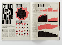
I also looked at spreads from Ray Gun & The Face.
Ray Gun:
The Face:
Raygun covers:
Magazine Layouts:
Initial Ideas:
- Leaflet
- Magazine
- Book
My initial idea before this research was to recreate some of the movie posters in the same sort of style of Saul Bass in not having realistic images or a very typical approach of just the main character and the title - rather something else related to the film. I would also like to incorporate the posters into the overall style of the magazine instead of them sticking out. I want a more integrated approach so they don't just look randomly placed throughout the publication.
When thinking about the style that Bass worked in, it doesn't really relate to the work which I had in mind - Carson & Ray gun etc. I have found these as a good source of influence and ideas as to how layout can be innovative in a magazine publication even though the shape & size is limited.
When thinking about the style that Bass worked in, it doesn't really relate to the work which I had in mind - Carson & Ray gun etc. I have found these as a good source of influence and ideas as to how layout can be innovative in a magazine publication even though the shape & size is limited.
Creative movie poster:
Remade posters:
Film websites:


No comments:
Post a Comment