After the crit I got a lot of feedback in terms of the layout and way the information is presented on the page. Although I am relatively happy with the way my book is looking, however I do think that some of the feedback was right, and personally I think that the book isn't as visually exciting as it could be. Although I like the layouts of the pages and the way the book reads, I do think it is a bit boring with everything all in the same colours throughout.
My initial idea was to use just red and black throughout, as these are the colours of the original Air Jordan's - the sneakers which essentially started the brand - but I don't think using just these two colours fairly represents the contemporary and youthful style of the Air Jordan products. There is a lot more to the brand than just the single pair of sneakers so I do need to try encompass the whole brand into the identity for this booklet. I also need to think about the fact that this needs to be carried through into the next brief, so it needs to be something exciting enough to take further.
After considering a lot of different options and looking back over some the secondary research I had collected of the kinds of publication I liked, I tried out a couple of different ideas in terms of colour and layout.
The image below essentially sums up everything I have learnt in this small exploration.

The final thing is that the body copy definitely works better in black than in the darker blue colour. It has much more prominence on the page in black, and even though this does work quite well in the blue, I'm not sure other colours would work as well. I also like the idea of the larger text being in the colour anyway, so that's another reason to keep the text in black.
While experimenting with the colour and researching in Air Jordan and the colours they predominantly use, I decided on three colours; red, blue & green. These are very common throughout their products, and using them will make the book a bit more visually interesting, while keeping the same layout throughout.
I looked through the book and decided that the way to incorporate them properly was to split the book down into three sections: The history, the branding & today. These were the three sections which all my research sat in very well, and in a pretty even amount. In terms of colour, for the first section I will use red, the second section will be blue and the third as green.
At this point I wanted to figure out how to split the three sections properly instead of just turning the page and suddenly it's a different colour. I decided on using small dividers which will have the section title on. I'd hardly call them pages because they aren't the width of the pages, and don't hold any of the actual research on them. However including these gave me an issue of the fact that most of the book is spreads and the divider would go straight into a blank page before turning onto the spread. Because of this I decided to find three images which summed up each section, and use these instead of having a blank page, as shown below.


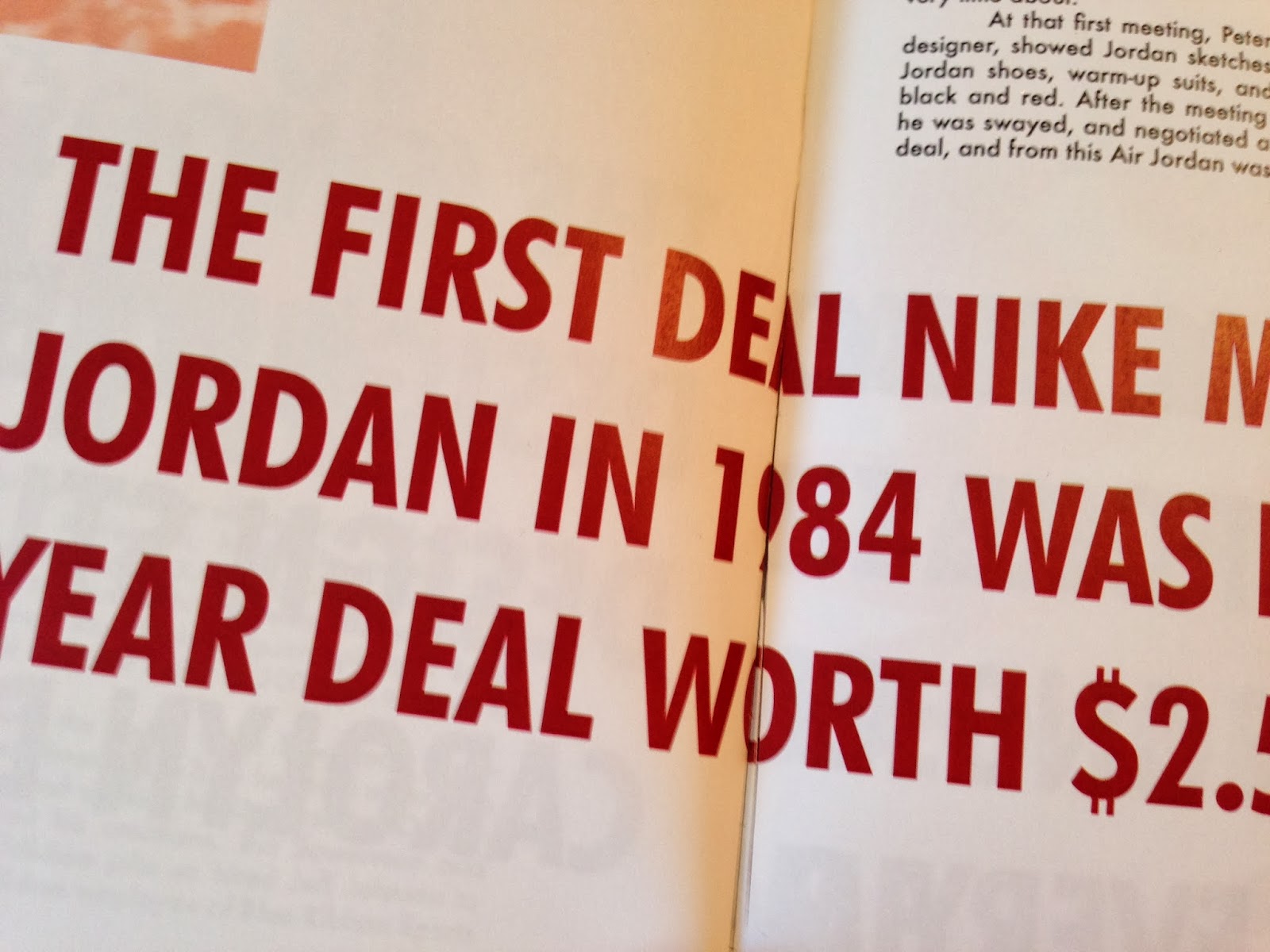
I have found that fitting everything on these two pages has been quite hard, especially for the right hand page. Getting the larger text to work has been the main issue. I haven't been able to find a way of laying it out that has been successful and fits in with how well the rest of this kind of text sits throughout the other spreads.
To fix this issue I decided to combine the two pages into one spread. This is relatively easy because the subject of the two pages is Michael Jordan, so joining them together isn't a problem at all, and the body copy does seem to flow well together. By joining them together, it means I only have to have one heading, freeing up a lot more room to make everything sit much better.

Once I was happy with this, I moved on to making the colour changes for the rest of the book and added in the dividers.


Here I found an image which reflects the history and heritage of Nike more than the image previously used. This is an image of the first ever Nike sneaker, and it works much better in giving context to this page.


PDF


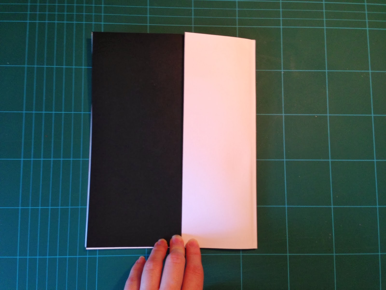
As well as this, the divider flap on the front cover works well to bind the book together, but I don't think it works with the front cover at all. I much prefer it without, so will consider just using the black cover as I think this looks a lot more professional and striking. I will consider adding in an extra sheet just inside to say the title of the book instead. If this is the case, I must remember to add in a page either side of my content otherwise it could potentially be cut off when bound together.
No comments:
Post a Comment