Tuesday 18 March 2014

OUGD503 - Studio Brief 2: Oasis (4)

After the crit there were a few things that needed addressing. The first thing I did was edit all the body copy so it was all in lowercase. After this I decided that the whole campaign needed something to bring it together and explain the messages.

With this in mind I designed a poster which was a bit of an introduction into the messages.
I then moved onto adding the illustrations to the rest of the messages as Daisy had finished them. She created a wide range of illustrations in terms of colour variations which meant I had a lot to work with to get the right colour illustration working well with the  text and background.

On the first one I did, I encountered a bit of a problem in the fact that the illustration was three dresses together, however to work well together they needed a contrasting dress in the middle. This was an issue because we decided previously that the contrasting colour on the illustrations should be the background colour.

I tried it with this illustration and then the one with all the dresses in one colour:
The second one works better, however neither work brilliantly. With this in mind, I tied it where the three dresses were spread out, meaning I only needed to use them in one colour and they contrasted well against the background.
I think this one definitely works better but I will have to check it by Daisy to make sure she is happy with it like this as it is her illustration.

I then moved onto the other messages and added the illustrations.
Overall I think the illustrations work really well with the text and background. They are all interesting but simple designs and balance out the text.

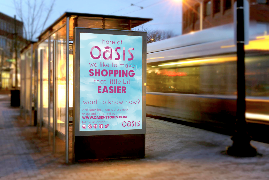
I then went back to my web-based delivery and added the illustration to the green one I was missing it from. As well as this, I changed the header and footer to solid white as it was commented on in the crit that when it was a bit transparent it was a bit hard to read the text.
At this point I also decided to make some kind of App for the web-based delivery too. I thought this would be the perfect opportunity to explain the concept of the campaign. I did this in four simple pages, mocking up how these messages could be displayed on a smaller screen.
At this point I am happy with the design of the App and think it works well because of the simplicity and easy to navigate design. I will get Daisy's feedback on this though in case there are areas she feels could do with improving.

Earlier in the week Daisy had been down to Oasis and taken some primary research photo's for us to use for superimposing. Even though the shop workers weren't too happy with her taking photo's, and having h er do them quickly, there were a good amount of good quality images.

As one of my agreed jobs was to do the photoshop work, I took these photographs and Photoshopped them so they were much lighter and better quality.
Once happy with how they all looked, I chose out a few and started to superimpose the messages on.

I started with a simple rectangular image:
I superimposed the first image on.
However I found that the background make the smaller text very hard to read, and it would be at a distance, so I went back into Illustrator and moved the background around until there was a darker shade of the pink under the blue.
The lack of white under the text definitely works much better.
I then moved onto superimposing another few. I wanted to do them over a mix of locations so we had some variety in terms of which ones to use for the submission boards. I decided on another five locations in total and mocked up five of the messages, making sure to variate the colours used.
At this point I am happy with all the progress I have made in terms of how the messages are being distributed in-store and across the web-based media. What we need to do now is meet up and discuss everything and see what needs further development or cleaning up before creating the final submission boards.

No comments:

Post a Comment