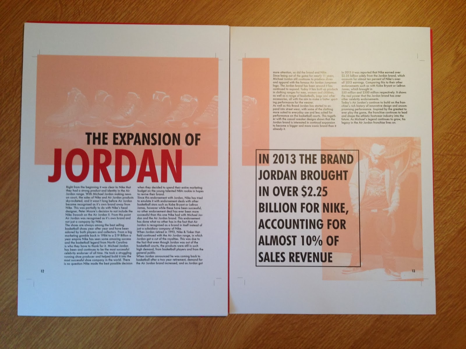
From this PDF I looked over the publication to try spot and sort out as many errors as I could. Once I was happy with this I went about making a mock-up of the publication to see how it looked printed and see if any elements didn't work as well printed as they did on screen.
I printed it out to 75% of the intended size as it was just a mock up.
Printing went without a hitch and everything seemed to flow well. I then went about cutting it all down to size. I will leave a margin along the left side so I can bind it so it is more realistic for the crit.
Once I had cut everything down I started to think more about the binding techniques that I will use for this mock up and for the actual printed publication.
For the actual print I want it to look as professional as possible so have decided that I will perfect bind it. This technique is usually for publications with a lot more pages than I have, however I have seen documents with single pages perfect bound together. For this mock up I decided to just do a simple Japanese bind as it is a quick bind that I have done a lot of times.
To get an idea of how well this could work I did a couple of attempts of practicing this as I haven't ever done it before but know how to.
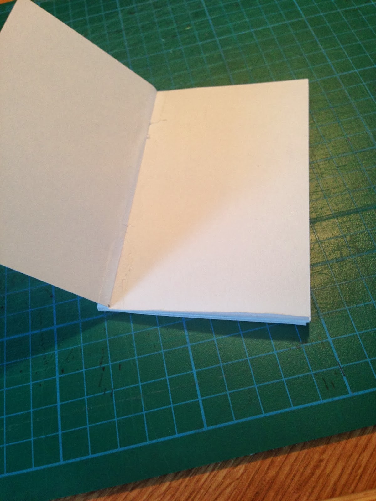
My first attempt was successful in getting the sheets to stay together in a publication but there were a few issues that I have encountered.
The first is that I used too much glue when binding the pages to a sleeve so it spilled out onto the areas where I didn't want gluing on the first and last pages.
The second issue is that half way through the pages, it splits completely down to the sleeve, meaning I didn't put enough glue on the initial coating to bind the pages together.
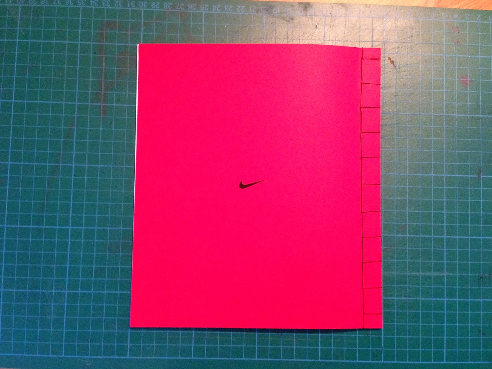
With these issues in mind I did a second practice, this time using a coloured piece of paper for the sleeve so it is a bit more realistic and applied to my publication.
Overall this attempt was much more successful. I put more glue on and left it to dry for longer and this definitely benefitted how well the book worked from page to page. I had a small issue of too much glue on the sides again so a little bit did go onto the front and back page, but I have realised how to stop this.
To see how this binding would work on my publication, I printed out a 50% scaled version of my publication and then bound it together using this technique.
While binding this book there were only two problems I came across, luckily which can be fixed.
The first is that a double page spread didn't line up completely. I'm not quite sure why because all the others seemed to, but this is something I will have to keep a look out for in the future.
The second is that when perfect binding the sleeve must be bound to the front and back pages. I didn't think about this until it was too late so have cut off part of the heading on my last page. This can be simply fixed by adding in an extra sheet of paper into the publication to stop this happening.
After I finished with this, I moved onto the potential packaging for the publication. For the crit it is required to have three different mock ups for potential ideas.
As I was stuck for a third idea that I liked and could potentially use, I decided to just stick with the following two and get the feedback from these.


No comments:
Post a Comment