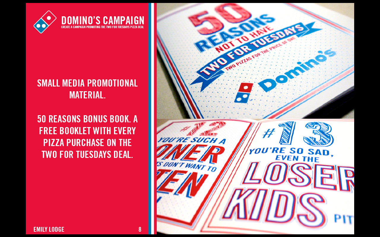
At this point I am at the point where I am finishing off this brief and starting to think about making the final design boards.
For the design boards I need to make them stand out, bold and very obviously for Domino's, while showing my work off to the best it can be. Previously I did design boards which were blue, and this worked well in both digital and printed version, however there were a couple of issues I found when I printed, such as a lighter blue box appearing around the images for some reason, so I have decided that I will not be doing these in the same style.
I also wanted a very clear place for type and image, and have decided that I will use red instead of blue as the majority of my work incorporates the blue as the main colour, so this will give a balance between the two colours.
My initial idea was to have text on the left, and the image on the right, so I started working on the boards with this as the direction I wanted to go.
Initial Boards:
At this point some definitely work better than others. The ones for the web side work well, however the ones incorporating photographs definitely need more work on to try integrate them with the other boards.


No comments:
Post a Comment