After leaving this work for a couple of days I came back to it and reviewed everything I had done up to this point. Although I was pleased with it when doing it, now looking back at it all I have decided it's all far too cluttered and just doesn't look great at all, and is quite far away from the initial design ideas I had, which isn't necessarily a bad thing, but at this point that idea is much better than what I have designed.
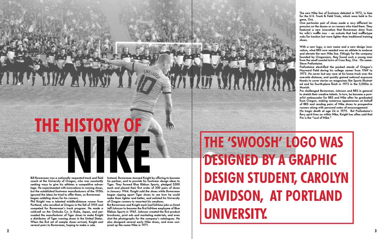
I decided to take it back to basics and started with the first spread again. I took away all the colour and tried it with a monochrome image, as I knew all three colours could go over this well. In terms of the image, it is monochrome but the opacity is at around 75% so it is lighter and the black or white will show over it better. I also wanted to try the idea of not using the boxes around the larger pieces of text.
Immediately I prefer this over the other layout designs I had done. It is much more simple and visually appealing than what I had been doing before. The red text works very well over the top of the image too.
I then worked on adding a bit more colour to the pages.
I start with making the first line of the heading all red, and think that this works quite well. Looking back to the larger piece of text, I don't like how the top of the second line is completely in line with the bottom of the image.
To fix this I made the image a little bit longer, moving it to the bottom of the gutter instead of where it was sat at the top of it. This looks much better already. What I am not sure about now is if the layout looks better with the frame around the red text or not.I tried it with a thin frame and thought that this definitely looks a bit more structured. I then tried it with a thicker frame.
I decided that the thinner frame looked better as it made the text stand out instead of the frame.
 |
| Final Spread |
I realise that I have taken the layouts pretty much back to how they were initially in terms of the visuals and placements of images. I have changed a couple of the layouts around after learning what I did from designing previously.
Something that had been nagging at me was the image colour. Initially I wanted to have it in monotone red, but when I did it initially this turned out much too dark to work with the text, however I have now realised all I need to do is change the opacity to make the image work in red and have text over the top when needed.
I am still torn over whether to have monochrome or monotone red images, so went into Photoshop and created both the images that I could use.
I then placed both of these into the first spread to see how they compared. I also input the content for this first spread to help get a bit more authenticity to the design of layout.Immediately I can see that this red image is exactly what I wanted to do initially and it looks how I wanted it too. It's a bit frustrating because I went through all the previous development because I couldn't get the red image working well, when all I had to do was change the opacity in the first place. At least I know that sometimes it's the simple changes that make the biggest difference.
I then went and replaced all the images in the publication. I changed a couple of the images to ones that were suitable after realising they just weren't working at all.
At this point I am happy with these layouts so started with ideas for the contents page. The initial idea I have is to make it like the larger pieces of text throughout the publication, in the bold typeface and with a line around it all, and all over the top of an image.
At the minute I'm definitely not happy with this, but as a starting point it shows me what's working and what isn't working. I'm not convinced about the image behind it, or the layout of the text, but I definitely want to use the typeface and incorporate the black frame somehow.


No comments:
Post a Comment