Website App Proposal
After completing the desktop version of my website, I started to look into designing an App version of it. I didn't want to change the design so much but I knew I had to make it more interactive as it will be on a touch screen and the user will be using their fingers to press. This means that all the rollover buttons on the homepage are pointless because when they click on them, they will be directed to the page anyway.
To solve this, I decided to recreate the buttons, putting the page titles above the images, so the user will know exactly what they will be looking at.
For the minute I looked at designing for the tablet being portrait. The desktop website is designed to be landscape so I need to get all the information on these pages to work on a portrait orientation. To solve this, I changed it so that on the content pages, the text is at the top, and the images are below, where you can scroll down to look at the rest of the images. I have also made the icons all larger so it is easier to see. The text is also at a larger size, with a navigation bar along the top which is all along the width.


For the phone App, the orientation is portrait but a lot thinner, so this was another challenge to work around. For the homepage I kept the majority of it with the same design, but made the buttons larger and put two on a row instead of three.
For the content pages, I have changed them completely. The first page is purely the information, which will scroll down if there is too much for the screen. At the bottom I put a button which will link it to the page with the images on.
I made the navigation bar on two rows instead of one, which will make it easier for the user to click on them. On each page there is also a button that will go back to the last page the user was on.


I am happy with the way both the App proposals look. They both stay within the design of the desktop website, but are more interactive and easy to use for the user.
For this proposal I widened out the content in which to use. I originally narrowed it down because there is such a huge amount and I would never be able to code it all. However as this is a proposal I can broaden that content out. I decided to do the subject of the evolution of the alphabet as a whole instead of focussing on five specific times.
My initial idea was to have the main page as one linear timeline, in which there was a navigation bar at the top with six links, and then the rest of the page would be an interactive timeline where all the information could be gone to by clicking on the titles throughout the page.
 |
| Initial idea |
- People may not want to scroll through the whole page to find what they are specifically looking for.
- The navigation bar has a limited amount on it, none of which could apply to a user
I then decided that this timeline page could be just one part of the website instead of the main page. With this in mind, I did a basic layout plan for the website.
 |
| Website layout plan |
I wanted the whole website to be interactive, but keeping in with a minimal colour scheme, like my original website.
 |
| Homepage |
 |
| Region page |
 |
| Region - when region is hovered over |
 |
| Europe page |
 |
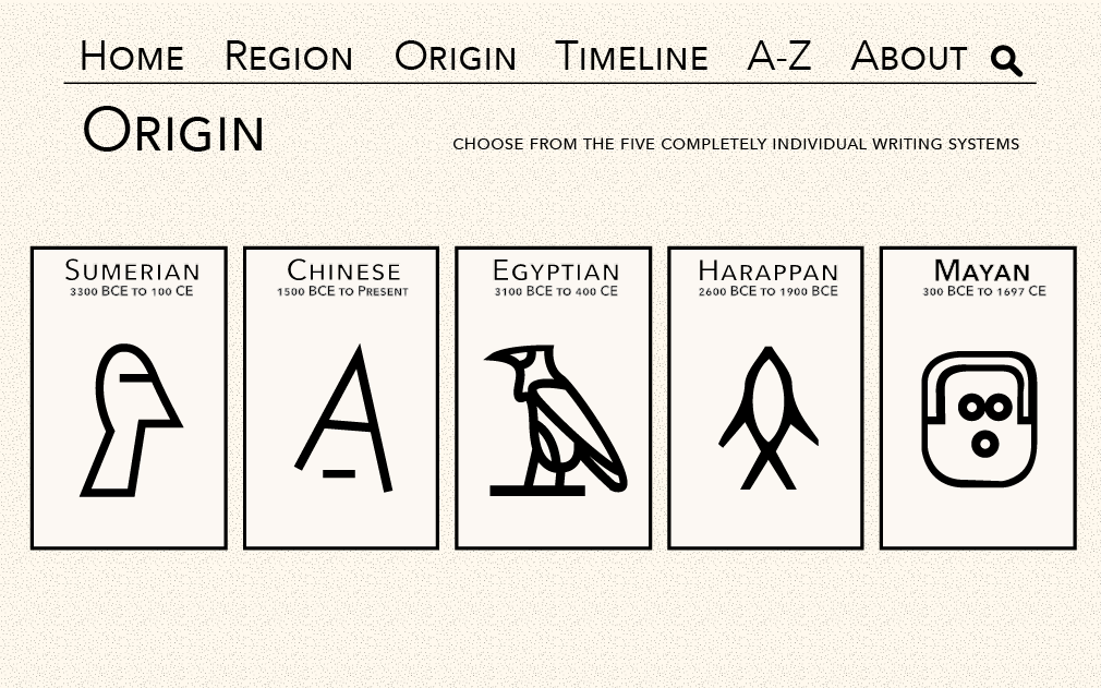
| Origin page |
 |
| Origin - when section is hovered over |
 |
| Timeline page |
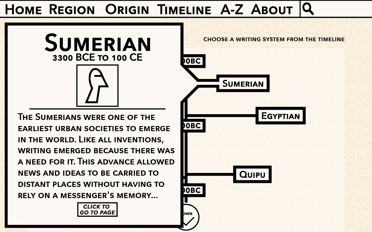 |
| Timeline - when link is clicked |
 |
| Content page |
 |
| A-Z page |
After completing this, I looked into perhaps doing it a little more minimal, with no background colour and a thinner font used. I think this works better for the navigation bar. The navigation bar above doesn't look as sophisticated as the one below. The one above almost seems like it belongs on a kids website, which is not what I'm looking for at all.


I then combined the two. This definitely balances everything out and doesn't make it look as child-like as the first mock-up. The thinner typeface definitely makes it look a lot more sophisticated, and having the background colour a lot lighter adds to this as well.


No comments:
Post a Comment