We were put into small groups to discuss our progress we had made with our briefs, explaining our concept and going through our rewritten briefs we had created in response to it.
Feedback for my concept was positive, and a lot of ideas were given into how I could further this brief and what areas I could look into/design for.The idea of it being primarily take-away is one that everyone seemed enthusiastic about and all agreed that it definitely shouldn't be a restaurant, more of a cafe with a main focus on to-go food.
I now need to think about exactly what I am going to include in the printed materials, and what is going to be proposed.
Rewritten brief
After rewriting the brief I started to focus on the creation of the brand as everything will come off of this.
 |
| Logo |
After choosing the primary colour scheme when designing the logo, I looked into the tints of the two main colours, the grey and the green. This will give me a lot more variety and options when it comes to designing.
 |
| Colour scheme |
I started work on the typographic pattern first as I had a clear idea of what I wanted it to be. I wanted to keep the theme of sandwiches strong, so for this, I wanted to do a pattern of all words to do with sandwiches & fillings.
I then chose four fonts to use, the two I have for the brand already, Futura & Quicksand, and then chose Franchise & Avenir Book. This will give more variation and potential to use them in other printed designs as well.
 |
| Chosen typefaces |
So far I am pleased with the outcome. Already I can think of a variety of ways in which this can be applied to printed & proposed media.
I then started adding colour to this. I decided on using three tints from the grey and green so it stayed balanced and there were a fair few in the same tint around the image.
I then tried one where black was incorporated to see how it would look, but decided against the design as it worked well without it.
Once I was happy with the design, I duplicated it and changed the size & orientation of the individual words to fit around it, making it a larger design. This will make it a lot easier for me to work with when it comes to potential large scales.
 |
| Final Typographic pattern |
 |
| Cut down pattern |
Once I completed this I started work on the shape-based pattern. I wanted to keep it similar to the type and work in the tints for this. I decided to start with the green, choosing two tints, one at 100% and the other at 50% so they were contrasting enough against each other.
With these tints & white I created a square based design, one with more white incorporated.
 |
| Design 1 |
 |
| Design 2 |
After getting some brief feedback that the pattern might be better smaller I made this change.
 |
| Design 2 scaled down |
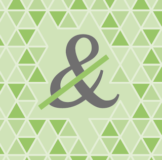
This design still wasn't working well so I started to work with another shape, a hexagon. I split this into six triangles and coloured the opposite triangles in the same tint, using 100%, 70% & 50%. I alternated these around the hexagon and created a pattern. I used 30% tint as outlines around each shape.
 |
| Design 1 |
I found this pattern was much more successful as it seems a lot less in your face and generally a very balanced pattern. However I didn't like the white diamonds between each hexagon.
To get rid of the white I created a background in the same colour and went through the tints until I found the one I was happy with. This was the 50% tint as it sat well and played a bit of an illusion when looked at.
 |
| Design 2 |
As the white spaces are now filled in, when you look at it, it suddenly stops you seeing hexagons and rater just a random array of triangles. I like this effect and am overall very happy with this design I have created. I can work with it a different scales and can overlay information & delete certain triangles or hexagons to create some more visually interesting patterns & designs.
I then looked into combining these designs to see what quick variations I can come up with at this point.
 |
| Combing with the logo |
 |
| Combining with the type |
 |
| Combining with the ampersand |
From this image I got the idea of using the shape behind the ampersand instead of using the triangles, so created a few variations where I am cutting away the triangles and taking the outlined shape left.
My initial thoughts is that it doesn't work as well on the block colour background compared to the one above with the triangles. However it does give me an option for how I could do branding when there isn't the triangle background in use.
With these three designs for branding I am very happy. There are a lot of options and variations that I can use for my printed media.
After doing this I made a slight change to the logo. Instead of saying 'restaurant & takeaway' I changed it to 'sandwich takeaway' as this is what the restaurant is now.
After doing this I made a slight change to the logo. Instead of saying 'restaurant & takeaway' I changed it to 'sandwich takeaway' as this is what the restaurant is now.


No comments:
Post a Comment