After the crit I started working on what the supporting media could be for my flow charts. I did a brain storm, looking at the different formats it could take as well as the content I could explore.
 |
| Supporting media brain storm |
From here I narrowed the content down to what exactly I wanted to cover.
I decided that by doing these four areas as supporting media I would get rid of the flow charts relating to them, deciding that the flow charts can be for ten different processes instead. However I decided that book binding should stay as a flow chart as there is a lot to consider when doing it, and it is a finishing process.
10 flow charts:
- Screen Printing
- Photoshop
- Illustrator
- Lino Printing
- Spot Varnish
- Book Binding
- Laser Cutting
- Letter Press
- Foiling
- Embossing
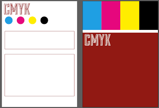
I then started work on the supporting media designs. My initial thoughts was to have them as four different packs of cards, with a title, short description and an image. I did a quick mock up of this for the colour scheme CMYK.
I also did a few mock ups of what the back cover could be:
After playing around with this idea for a while I decided that this wasn't what I wanted to do, and I was having trouble trying to make the backs look remotely decent.
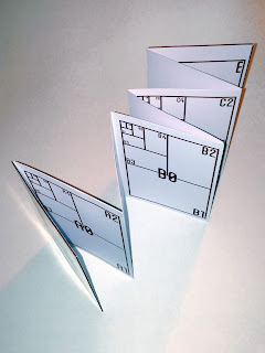
After thought I decided that I could do four different concertina books instead. These would be the length of an A1 sheet so each page has a reasonable amount of space. This means they can be on a small scale but still hold a lot of information, and the size would be a contrast to the large flow chart posters.
I did a digital version for Format:
 |
| Initial Idea |
I changed the title & ISO font to Sullivan like the titles on the flow charts. It looks a lot better immediately and a lot more like it belongs with the flow charts.
I then continued to make the next three double pages for this concertina.
 |
| Full Concertina |
From this point I decided to print it as a mock-up and put it together to see how it worked and looked. For the front cover, I decided to continue on from the numbering of the flow charts, having numbers 11, 12, 13 & 14, each for a different supporting media publication.
Mock-up:
Overall I think it worked well as a concertina, however I found that for the content of format, I want it to be a larger scale than what it is at. Although it is definitely readable and easy to navigate, for Format, I don't feel like this is the right format and size to have it at.
For each supporting media I have decided to have them each in different formats and sizes, but none larger than the posters so they would clearly be the supporting media.
I started with format, doing a design sheet for the plan I had for it.
 |
| Format Design Sheet |
The idea is that there will be six double sided cards at around A4 size, each a different paper size. The measurements would be on one side, the image of this on the other, and potentially it would be a fold out poster so you could see both sides at once, or it would be double sided with a piece of black card in between the two sheets.
To start with I did a few layout ideas for the two pages.
 |
| Layout ideas |
I then started on the Stock publication. I decided that for this one it would be a concertina format as it is a subject which carries on over the pages and isn't necessarily something different on each page. It is a continual subject, as is the concertina. I wanted this to be on stock with the potential for black card over the back of it.
 |
| Stock Design Sheet |
I took some of the scamps and drew out some layouts.
 |
| Layout ideas |
I then did the same for colour. I wanted this one to have a resemblance to a pantone swatch book with the format of it, a screw or ring in the corner or left hand edge to hold it together.
 |
| Colour Design Sheet |
From the scamps I designed six different potential layouts.
 |
| Layout ideas |
For the book binding media, I wanted it to be a booklet held together with either Japanese Stab Binding or Screws.
 |
| Book Binding Design Sheet |
From the scamps I did 4 different layouts.
 |
| Layout ideas |
After doing these layout designs I took the best bits from each of the designs and drew out the final five layout designs to scale. I want the information to be clear and easy to read, but have a decent amount on there.
 |
| Format Final Layouts |
 |
| Final layouts, Book Binding, Colour & Stock |
I then created the format and colour modes pages at the correct scale.
 |
| Format |
 |
| Colour Modes |
After completing these I went back to my flow charts.
I wasn't too keen on the idea of using the dark red through all of my work, and it started to become difficult to design the supporting media around this idea of white on red.
I have also previously used this colour in a lot of work and would like to design using a different colour scheme.
I looked into using five different colours with either black or white:
I decided on the black on yellow because it looked quite striking. The problem is that it will look different printed than what it does on screen, so to really decide, I printed out the red and the yellow variations.
 |
| Printed variations |
The red printed out a lot darker than expected. Even though I had previously printed it for the Format concertina mock-up, with a larger amount of information on the sheet and the title font the way it is, it makes it look a lot darker than I'd have liked. The yellow on the other hand stands out very well and makes everything easy to read.
Printing with black ink also gives me the chance to use coloured stock, which is something that isn't possible if I wanted there to be white on the page. This in itself makes the outcomes much more interesting to me as a designer and for the viewer as well.
I have decided to use three stocks for this project.
- Yellow stock as the main stock - flow charts, supporting media & packaging
- Black for backing & duplexing - supporting media
- White for media which needs other colours - the colour modes
I then applied these changes to the Format document to see what I could use in yellow and what not to.
 |
| Format colour changes |
I also added colours to the other half of these colour modes as they will be printed on white stock and will be seen properly.
 |
| Colour Modes |
After finishing these two sections off, I started work on the other two. I have chosen to focus on ten different binds for the book binding booklet, and will have vector illustrations for each of them. As well as this, there is a short description detailing the bind, the price and the quality of it. I left a gap of about 1cm along the top for where the screws are going to go to bind it together.
The idea is that the images will be printed on yellow stock, whereas the text will be on white and they will be stuck together on a black back.
 |
| Book binding pages |
Like the colour modes, this booklet is more about the information than the images so have made it purely text based. This will be printed on white stock with black back.
 |
| Stock |
Once I had completed these supporting media, I started focussing on the packaging.
I already had a basic idea of what I wanted. An envelope with a reference to their number in this pack and their title at a large scale along the longest side.
 |
| Packaging design sheet |
I started with a basic idea for the net.
I then added the text & colour to see how it would look.
For format, as the sheets are all separate, I wanted something to hold them together so created a slip that they will go in before being put in the envelope.
After being happy with this, I made a couple more design changes to the top line of text & adapted this to the other three pieces of supporting media.
 |
| Colour |
 |
| Book Binding |
 |
| Stock |
Now that all of the supporting media has packaging sorted, I thought about the packaging for the flowcharts. My initial thought is for poster tubes, so got a few to put them in and created a slip that will go around the tube.
 |
| Tube slip |
Once this was done and I had finished everything, I printed everything out, using a cheap yellow paper in replacement for the stock I will be using, and worked on creating the mock-ups for the final print crit. I will be printing out mock ups of everything I have so far, but only printing one envelope so I can see how well it works.
 |
| Book binding |
 |
| Format |
 |
| Colour modes |
 |
| Stock |
I decided this was the perfect time to try out a few of the paper duplexing ideas that I had for these pieces of media.
Stock - Black card on the back of the concertina
Aesthetically this works well when it's not folded, however the moment I started folding, the creases created large bumps and essentially ruined a few pages in the booklet. This is definitely a problem and something I will have to think about how to get around. I will have to try find some thinner black stock for it to work well, or I will have to bind it a double page spread at a time. This is not what I want to do as I think it's not as clean looking, however I will have to consider it for this to work.
Colour modes - black card on the back of the cards
This duplexing worked very well and I will definitely be using this in the final outcome. It is just a question of keeping it like this or potentially using the white or yellow stock on the back as well. This is something I will need to explore further.
Book binding - white on yellow on black
Although the duplexing worked exactly how it was supposed to, I'm not too sure about the yellow image in the middle of the white. It doesn't sit very well amongst the white I don't think, and maybe that's to do with how close it is to the edge. I will have to do more work and try this again because I do think it is an interesting duplex.
Format - white on yellow
This worked exactly how I thought it would, and does look a little bland even though it worked perfectly. I think it could be interesting if I were to have both sheets in yellow and have a black piece of card between the two, or keep with this colour scheme and have the black in the middle. I will be exploring further options with this one.


No comments:
Post a Comment