When I finished with the basic brand ideas, I started working on narrowing down the content in which I was going to design for and propose for.
 |
| Content brainstorm |
- Menu & takeaway mini-menu
- Coasters
- Sandwich take-away packaging - box & paper
- Sides packaging box
- Takeaway box
- Condiment packaging - box & bottle
- Stickers
- Loyalty card
- Business Card
- Leaflets
- Juice bottle
Proposed Printing
- T-shirts & Aprons
- Interior wall space & wall menu
- Exterior signage & Opening times card
- Take-away van
- Advertisements
Proposed Website
- Homepage & About
- Opening times
- Contact Details
- Menu
- Takeaway option
- Map/Location
 |
| Initial Ideas |
While working through my initial ideas, I thought about the idea of using the hexagon as more than just the pattern I had created previously. As the brief is to create a typographically themed restaurant I didn't want to use this pattern so much and forget about the type, so incorporating it into the shape designs for the outcomes is something that keeps it there and doesn't put the work on it to waste.
I had quite a clear idea for the menu so I started with that.
 |
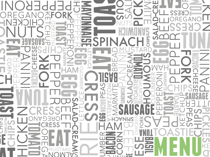
| Menu content |
There will be 7 sections to the menu:
- Bread
- Fillings
- Specials
- Sides
- Condiments
- Drinks
- Dessert
After deciding on the content I drew up some basic layout ideas.
 |
| Initial layouts |
I wanted the typographic pattern to play a big part in the design of this menu, so manipulated it for the front & back cover so I could get 'menu' in there. To make it stand out, I made the whole pattern in the grey, and had the 'menu' in green, and this worked quite well. I did two main variations of this, one with the text smaller, the other with it larger.
 |
| Covers 1 |
 |
| Covers 2 |
Once I'd done the cover I started on the inside. I wanted to keep the typographic pattern very prominent throughout the menu so used it as the background, using white boxes over the top for where the written content will go.
On the left hand page I wanted an image/typographic pattern, and the written content on the right hand page. For the purpose of experimenting with the layout I used the logo for the image page.


I did three variations of this after not being able to decide which way to go. I couldn't decide whether to have the green boarders or not. It separates the text from the background and makes it stand out, but at the same time, the one without the boarder works just as well. It also doesn't help that I don't really know what I want on the left hand page.
While deciding what to do with the menu I moved onto the small media to do with the restaurant, doing quick ideas for the business card, loyalty card and coaster. For consistency I wanted them all to follow a similar form.
 |
| Small media ideas |
For the business cards I wanted to keep the same layout but variate the colours. To keep in with the hexagon pattern I had previously created, I decided to make the business card in this shape. It is something a little different from the usual business card.

For the coasters I kept with the same concept of switching the colours, but on these I also changed the design for each colour.

Overall I think these work quite well, and within these three variations, there is possibilities for a further two variations in each with the colour change.
I then started on the loyalty card. This was something I wasn't entirely sure on but thought to include it as I could later decide to get rid of it if I didn't feel it fit in with the rest of the visual identity. I kept to the same format as the rest of the products, using the typographic pattern as the main piece of branding.
I didn't want to make this product too complicated so on the inside there's six circles with a number, and over these is where the stickers/stamps would go, and when it was full the buyer would get a free sandwich.

The final thing I did was do a quick mock-up of the building exterior.

Initial thoughts are that it works quite well although I am not happy with the top bar where the logo is. When having the proper logo up there it came out very small because of the height of the box, so I had to split it into two halves, and although it all came out at a more readable size, I'm not too happy with it.
After doing these few things I went back to work on the menu.
After spending a lot of time on it and knowing it wasn't working well at all, I decided to integrate some imagery. This is something I haven't had a chance to do yet in much work and have been wanting to do it for some time, so took this as the perfect opportunity to at least try out the idea I had. I know I have to keep this typographically themed to go by the brief, but there are definitely ways to incorporate the image work within that, also it doesn't say anywhere in the brief that I can't use images.
For the purpose of experimenting, I found a large image online to use for the mock-ups.
 |
| Found image |
The idea behind this was to combine the image and the '&' from the logo, with the image following the same strike-through and distortion of it.
To start with I put a filter on the image of the green colour from my colour scheme. I then took this into Illustrator and made two clippings from the same image, moving them in the same direction as the strike-through.

I then cut this down so it didn't have the corners off either side.

The first thing I did was look into the strike-through. In the image above it stops and there's a clear line between the two images which is something I want to experiment with and try make it seem a bit more fluid as an image instead of so cut and paste.
I tried extending the strike-through so it went from one edge of the image to the other.


This one has the same effect as the image above, separating the image pieces off too much, however it does look better because the white balances out the green.

Another variation I tried out was changing the image colour to sepia so that I could use green as a filter for the circle as I thought this is the direction to go in.
 |
| Getting the Sepia tone |


I tried two variations of this, one with the white strike-through and one with nothing. Although I do like the green filter, it's not coming out the colour I imagined, and I think this is to do with the image being in the Sepia tone. Aside from this I do prefer the image without the white strike-through.
I took the image back into Photoshop and turned it greyscale to see how well the green filter came out on it. I also experimented with the strike-through with different weights and sizes of the logo in general.


I found that the green filter and logo stood out better on a faded background so started to work with this.


As well as doing this I also started to look into how I could incorporate this into the menu itself and into each section. Sticking with the general layouts of the experiments above, I used a large circle in green with white text over it, experimenting with the filters and typefaces to use.


Going back to working with the logo over the image, while trying out some of the effects, I thought about making the image shown through the white '&'. While trying out some of the tools which would do that, I inadvertently redesigned the logo.

Immediately this is much more clean-cut than the logo I had been using. While creating the initial logo I wanted to incorporate a circle but could never get it quite right, and with this one created it fulfilled exactly what I wanted.
I also like the fact it is all just in one colour now and doesn't rely on changing two colours. This means I can put it in any colour I like and use it over any colour I want, which is exactly what I need. This is also now a logo which can easily work on it's own and be memorable because of the fact it is only one colour. Before I was having trouble working this on it's own, but I do think this can work in that way.
After a bit of editing to make the strike-through even, I brought in the 'ampersandwich' text from the previous logo design and reworked it as a whole.

My immediate reaction was that the bottom section just didn't fit anymore, and I didn't think it was entirely necessary anyway, so decided to get rid of it.


I think the text is a bit too thick to sit with the logo and my initial thought was because of how the line sits between the two lines of text. I changed the weight of this, but thinner it still didn't sit right.
I then decided to work with a couple more ideas I had, working from the previous ideas I had done with the original logo.


To complete this logo I looked into the green colour tints.
 |
| 100% green, 0% green |
 |
| 90% green - 0%green |
Once I had done this I took it back into the photograph experiments and used it over the greyscale image.


I think that this is already working much better than before. Although I did like the two colours used on the previous experiments, I do like the simplicity of these ones and do think this is something I can see running through the brand.
With the white logo design I decided to try the image with the green filter again as it would probably stand out against it more.


The ones wit the boarders give a more professional visual in my opinion, however I do think when printed if I leave a white boarder it'll just look not cut down. I don't like the logo's where it is just outlines. I thought it could be good but the block colours definitely work a lot better.
After doing all these photograph experiments I was happy with everything I had gone through and learnt through the process. To make a start on the real pages I would be using, I took a number of photographs to use.
The whole concept behind the restaurant is that it is a fresh sandwich bar, with fresh ingredients & healthy ingredients. To put this across the images I will be using throughout the branding will be of vegetables and bread.
I don't want to use so many images, but keep them all relatively similar, so I chose out one loaf of bread to use and a variety of common vegetables.
I originally took 150 photographs and went through them all and edited them, narrowing them down to 88 which would be good enough to use.
 |
| Final photographs. |
I then went back to designing a few different double page layouts in which all of the elements I have been experimenting with will be included.
 |
| Layouts |
I then drew out a basic layout which I would go by for these, taking into account all the different elements on each page and making it so each would fit into this grid system.


The next thing I did was choose the typeface I wanted to use throughout the menu. Overall I have already got four typefaces which I have used in the typographic pattern, however only one is appropriate for the aesthetic that I want to go with. For the titles I wanted a bold typeface, that would stand out against anything I put it on.
 |
| Typefaces |
After referring to the previous typeface variations and trying out another few, I decided on 'Edmundsans' (top left). In both upper and lower case this has three settings, regular, medium & bold, all of which were perfect for this publication.
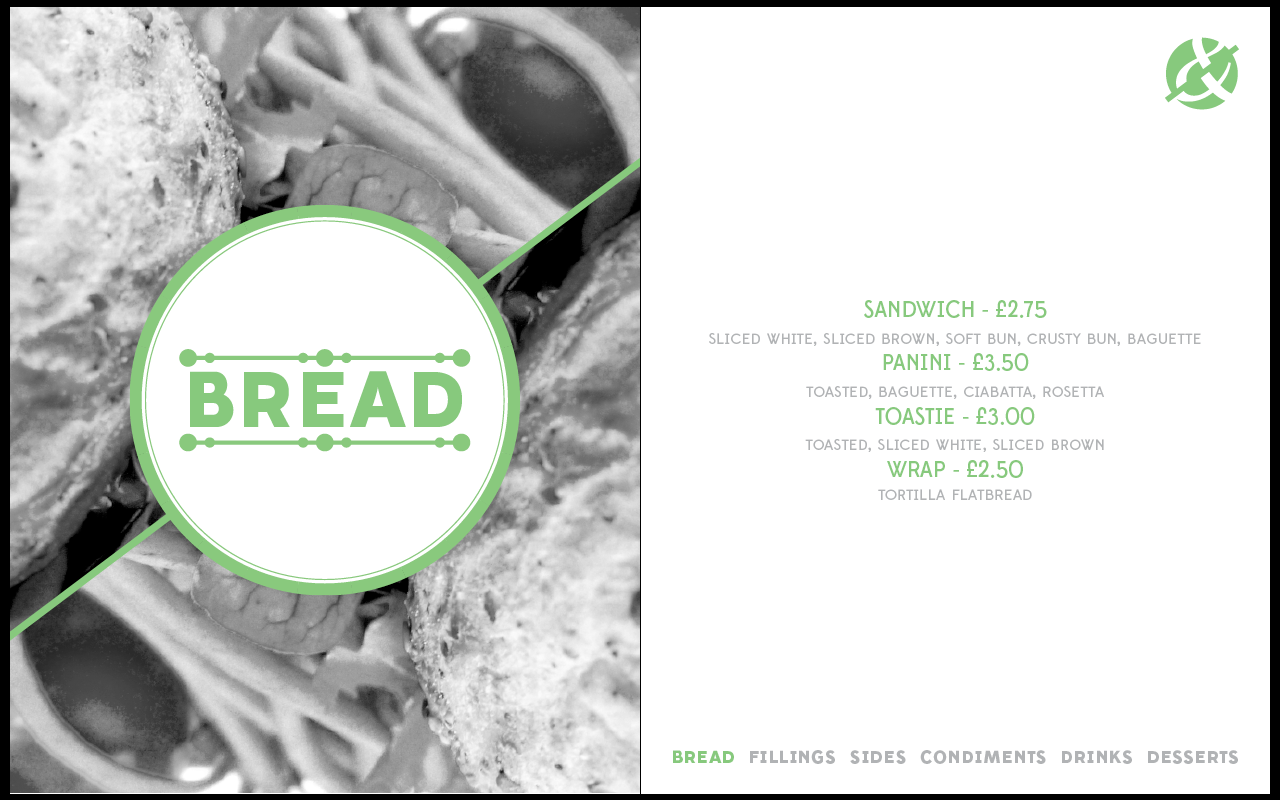
To start with, I worked on the front page.
The main idea is that all the images inside the menu will be greyscale, so for the front cover I wanted to use an image with the green filter on it to make it stand out.


At the moment I like it, but I wanted to include the clipping of the images like I had been doing before, so started playing around with the idea of that.


Something I wanted to keep in mind is that obviously the whole point is for it to be typographically themed, so I started playing around with the idea of having the type pattern over the top of the image somehow.


For the inside I tried out a few different ideas for the left hand page, starting with just a simple image and the title in the circle over the top. Immediately I decided that the title in the circle over the top was the way I wanted to go. I tried this with a white page and green page.


I also changed the format so it wasn't as tall as previously. It immediately looks better as there isn't as much unnecessary space now.
The first clipping I tried was the same image flipped, and I do think this works well.


As this is the 'bread' page, I chose an image where the bread was present.

For the text I stayed with 'Edmundsans', using medium. I used a 16pt for the titles and a 14pt for the detailed text underneath.

In fitting with the colour scheme I turned this text green.

 |
| Edmundsans throughout |
Although I like Edmundsans for the titles on each page, I wasn't particularly keen on some of the lettering that it was coming out with in the text side. The 'w' for example isn't a typical 'w', and isn't what I want. The type as a whole is a bit too tall and isn't as contemporary as I would like.
To sort this, I changed the text typeface to 'Quicksand'. This is one that I have used previously in the original logo and in the typographic pattern so I know it will work well.
 |
| Quicksand as text typeface |

To fix this, I typed in the longest word - 'condiments' - and lowered the point size until it all fit in the circle comfortably. Luckily it didn't come out too small and does sit quite well on the page because of the boldness, so it doesn't get overpowered by the image at all.

I then applied this to every page of the menu.
Once I had finished I took what I had done in the insides and looked back to the front cover. What I had done previously doesn't really fit in with the simple look on the inside, so I wanted something to reflect this.
I decided that to do this, taking away the image would be the best option. It means that the menu is clearly still typographic influenced, and I could keep it simple.
Following what I had done inside, I drew out a clear box (instead of a circle) and placed the logo and the titles in it.

This looks much cleaner than the use of the image and puts me at ease with this being typographically influenced. I was getting a little concerned that I was making it purely image based, but having the front and back covers like this still shows the branding and its importance over the images.
Final menu:


I am pleased with how this menu turned out and think that I have kept it consistent and fit together well. I think the images work particularly well and make the whole thing look a lot more sophisticated and works very well.
Once I finished this, I printed it out to see how each page works printed. I printed it at 50% scale so I could bind it and fold it together.
As it is a quick mock-up I printed it from Preview, which meant there was a thick white line going through the middle, but for the purpose of the mock-up I didn't see it as much of a problem.


I am happy with how this mock-up worked out. It printed well and the images look at a good quality which is something I was a little concerned about.
Some of the smaller type didn't print brilliantly but because this is at 50% the size it will be printed at, I'm not too worried about it. The green also printed out differently to how it appears on screen, but it is a much better green, so I am pleased with that.
After doing this I moved onto redoing the business cards with everything I had learnt from the menu. Doing the menu really helped me define the branding and identity of this restaurant, and I do think I can work with this now in creating the other products for this brief.
For the business card I decided to use the unused idea for the menu front cover, so I took this for the business card covers.
For the business cards I want to do one with the image and one typographically based, doing two variations in each.
Variation 1 - image based:


Variation 2 - type based:


No comments:
Post a Comment