Illustrator workshop 23.10.13
Colour modes
- CMYK
- RGB
- CMYK for print
- RGB for screen
- K - Key - black - used to darken shadows and define images
Different ways to create swatches:
Different kinds of swatches:
Normal Swatch:
Global swatches:
When changing the colour of a global swatch it will automatically affect every piece of work using this colour. It will change the colour immediately.
When using global colours, the colour pop-out changes to choosing the tone instead of another colour.
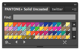
Spot Colour
- Colour printed not using a mixture of CMYK. Colour that is printed with it's own ink.
- Spot colours can make print jobs cheaper
- Creates consistently
- Can print colours that aren't possible using CMYK - e.g. metallic & florescent
- Unique reference number - uses pigments to mix and create the colour
Click on pantone swatch to add it to the swatch list.
This colour reference only works in commercial print because the colours in Inkjet printers are made from CMYK, not spot colours.
- Halftone - makes it possible to print different tints of one colour at the same time
- Used when screen printing with tones and tints.
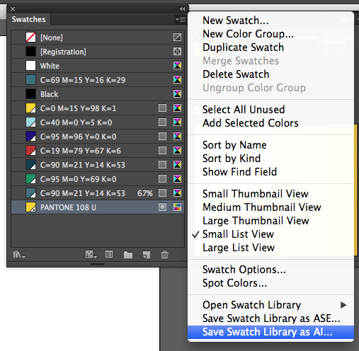
Saving swatches:
ASE
Enables you to open it in any adobe software program
Save this is the same project folder so it is easy to find when trying to access it on another program
Opening a swatch library:
Opening an ASE swatch library in photoshop
Photoshop Workshop 6.11.13
- To change the colour mode of an image - 'Image' Menu - 'Mode'
- There are colours that you can produce in the RGB colour mode that can't be produced with the CMYK colour mode
- Gamut - a range of reproducible colours
- RGB is the preferred mode for Photoshop
Seeing if this document is ok for print: Gamut Warning
Image adjustments:
 |
| Hue/Saturation |
 |
| Proof Colours |
Proof colours - shows how it will be printed but still works in RGB on screen
 |
| Proof Colours setup |
Working with colour swatches
Do delete swatches: Hold alt and click on a swatch
To add a swatch: Click on the swatch palette - the foreground colour chosen will be the new swatch.
- Save swatch - for photoshop swatches
- Save swatches for exchange - swatches which can be transferred to use in Illustrator etc
Loading swatches: will add the swatches to the default palette
Replace swatches: Will replace swatch palette
Spot colour swatches
 |
| Click 'colour libraries' |
To find a specific swatch, you can just type in the reference number
- A photoshop document can only support one colour mode - using a spot colour on a CMYK image isn't going to work.
Working with spot colours
Duotone:
Must be a grayscale image to turn the image into duotone
Monotone
Duotone curves:
Duotone mode is editable - you can change it at any point - changing the colour or the curves
Duotone
Changing the curves:
Tritone
Quadtone
Choosing a default
Second way of using duotone:
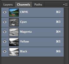
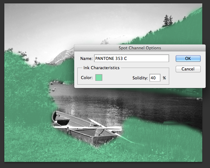
Using Channels
Use the paintbrush to paint on where the colour goes
Use a selection
These are all editable
Solidity
Indesign Workshop 20.11.13
 |
| New document |
 |
| Creating a frame |
Working with swatches:
 |
| Swatch tab |
 |
| Applying a colour |
 |
| Adding a new swatch |
 |
| New swatch menu |
 |
| Changing the swatch colour |
 |
| Swatch added |
 |
| Swatch applied |
- All swatches are global - will change the colour of all shapes using this colour
 |
| Changing the swatch colour |
 |
| Colour change applied |
Tint swatches:
- Changes the tint of the selected colour
 |
| Creating a tint swatch |
 |
| Tint swatch menu |
 |
| Tint swatch added - shows tint percentage |
 |
| Tint swatches applied |
 |
| Changing the original swatch - changes tints as well |
Pantone swatches:
 |
| Pantone list in swatch menu |
 |
| Choosing a pantone swatch |
 |
| Chosen Pantone colour |
 |
| Pantone added to swatch bar |
 |
| Pantone tint swatches |
 |
| Difference between CMYK & Patone |
Working with an image:
Duotone image:
 |
| Choosing the duotone image |
 |
| The image placed |
 |
| Images pantone colours automatically added to swatch bar |
Spot colour:
 |
| Choosing the spot colour image |
 |
| Image placed |
 |
| Pantone swatch added |
 |
| Choosing illustrator spot colour file |
 |
| Illustrator image placed |
Separating colour:
 |
| Opening document for separation |
 |
| Swatches for this document |
 |
| Separations preview |
 |
| Separations preview menu |
 |
| Changing the view to 'separations' |
 |
| Clicking the view icon to show what will be printed in which colour |
 |
| Swatches which have nothing in their colour to print |
Setting for print:
 |
| Go to the print menu |
 |
| Print menu |
 |
| Page info - tells you which colour the print will be |
 |
| Changing the colour to separations to set print for halftone printing |
 |
| Frequency & angles change for each colour - 40-60 frequency for screen printing |
Spot colours:
 |
| Opening new document |
 |
| two shapes overlapping in separate colours |
 |
| 'knock out' effect |
 |
| Adding a black box |
 |
| Black will overprint |
 |
| Attributes option |
 |
| Attributes menu |
 |
| Overprint fill option |
 |
| Result with three colours |
 |
| Shows the percentage of colour used in each section |
 |
| Shows area where there is going to be too much ink |
For spot varnishing:
 |
| Text will do knockout effect unless changed to overprint fill |
 |
| Overprint fill applied |
 |
| No knockout effect anymore when applied |
 |
| Overprinting with swatch colours |
 |
| Creating a mixed ink swatch |
 |
| Changing the percentages to match those of the tints created |
 |
| Two original colours & mixed ink swatch |
 |
| Shows percentage when printing this mixed ink for colour |
 |
| Shows percentage when printing this mixed ink for colour |
Final Workshop 4.12.13
During this final workshop we were given an InDesign document and told there are 8 errors and problems to solve in it. We were put into groups of three to do this. I was with Charlie and Jane. We managed to find all 8 quite quickly.
The Document
1. Spot Colour
The document is only allowed to have 5 inks (CMYK and a Spot Colour), however there are 2 extra spot colours which are not being used.
2. Bleed Lines
The background colour of the first page does not extend to the Bleed Line.
3. Image Link
The image to the Illustrator File has a missing link.
4. Background Colour
The Background Colour being used is an RGB Colour Mode. The document requires CMYK as it is for print.
5. Image Size
The Image being used is the incorrect size for the size of the frame. It has been resized in InDesign to 15% of its original size therefore changing the dpi and making the file size much bigger than it should be.
6. Colour Mode
The Colour Mode for the 3rd Bird is incorrect for Print as it is using RGB. It must be CMYK.
7. Image resolution
The resolution that has been used for the image is 72dpi which is incorrect for Print.
8. Registration Inks
The amount of ink being used is over 300% so the Ink Limit has been exceeded. This is due to the designer using Registration Ink which has all ink colours within it.
After this we were given a quick talk on 'pre flighting', which is the set up checks which are done to a document before it is sent to print.


No comments:
Post a Comment