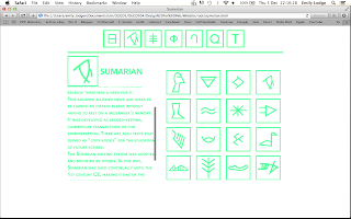
After the crit I took away the comments and explored some of the suggestions.
I took a screen shot of the website into Photoshop and changed the green to black to see how it looked.
My personal opinion on it is that I do prefer it in the green, and I don't think there is any more reason to put it in black than there is in green. So because of this I am going to keep it in the green as I have spent a lot of time designing it in the green & creating all the image files, which would all have to be recreated if I wanted to change the colour.
I started to add in the text content. I set the body copy font to Avenir Next as this is the one which I had planned to use.
 |
| Adding the content |
 |
| Original text content |
When previewing the page with the text, I found it quite hard to read as I didn't know how to change the text from the default setting to one of the other style settings. To try solve this, I decided to put the point size larger as it was quite small on the page to begin with.
 |
| Larger point size |
 |
| Small caps |
I then started playing around with the coding to try get the text thicker. I finally figured it out, changing the font weight and playing around with it until I was happy.
After adding all the content to the website, I viewed it in my web browner and thought that the Time Line looked a little out of place because of how small it was. It is quite hard to read the text on it as there is quite a lot to fit in such a small place.
I decided to change the timeline to be easier to read and a little bit more interactive than just looking at one image on the page.
If I had all the skills necessary to make this website to what I want it to be, the timeline would be fully interactive where each piece of text could be clicked and would lead to a different content page dedicated to the text clicked. However as I do not have these skills, I settled on just making it a larger timeline and a vertical one instead of horizontal, which will allow me to put more information on.
 |
| Timeline designed |
I quickly fixed this by making the content box & container longer, and when I inserted the image again, it fit on the page perfectly, with a scroll bar to go down it.
Finished Website
I am relatively happy with the outcome I have produced and do think it shows off my understanding and skills gained in the web design software workshops. This brief has opened up new opportunities to me as a designer in something I didn't think I would be capable of doing, but I have found it quite an easy brief to do overall. There was a lot of work involved to make each page work, and a lot of preparation, but I think it definitely paid off and I have a website I am happy with.


No comments:
Post a Comment