So because of this I decided to take a different approach to have the left hand page as a title page, and the right hand page as the representation/idea behind it. This initial idea came with the development of the first of the 10 thing. It is more of a simple idea and would be easy to read/navigate.
Just because you design a typeface does not make you a typographer
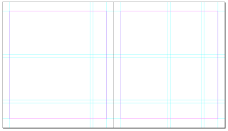
To create the bespoke grid, I created a document with margins of 12 mm on the sides and 16.5 on the top & 21.5 on the bottom so the content would be more towards the top of the page. From there I made a 12x12 grid to the margins, then deleted some guide lines to create the bespoke grid.
 |
| Bespoke grid |
 |
| Thumbnail designs |
As the initial idea is to have the whole page as the title page, I needed to make sure the title fitted to the grid correctly. I took the grid across to Illustrator to begin work on this.
 |
| Grid on Illustrator |
 |
| Title text |
 |
| Initial Layout on grid |
As the plain text laid out is a little boring, I edited it so it fit to the page better and looked like it wasn't just placed there.
As it is only text, there is large sections of white space. So because of this, going back to the ideas of backgrounds I did on the design sheet, I started to create a background using a hexagon. I created it with three different sizes, all the same line size. I layered it over itself a few times, and then on top of this, did the same pattern, but only the outline of that pattern. From there I changed the opacity so it wouldn't be such a strong background.
I then layered the text over the top and variated the colour.
I decided the blue looked the best as when the opacity is low, the colour is still good and bold, but not too overpowering. I think the red is too dull and the yellow is too light.
I wanted to accentuate the text from the background so created a coloured outline around the text, with a white and black outline around that to give it a bit more of a stance on the page over the background. I found that the black was a bit too dark, especially with the black lines around the text, so I changed the text to white.
It looks a lot better in white, but it doesn't have an obvious focus point, so because of this I coloured the two words which are the main focus, and are not joined to the other words.
 |
| Final Design |
I then took this final design across into an InDesign document.
For the second half of the page I wanted to keep it consistent, so too the Hexagon pattern from behind and used it to create a background for the second page. As I want to keep the whole book consistent, I plan to keep this going throughout the whole book, with a low opacity, but in different colours for each page.
I soon found that I didn't like the idea of the image being the full page, and wanted it to have a bit more of a layout on the page, not just covering the whole thing, so I changed it to fit into a frame.
 |
| Layout Idea |
 |
| With colour & image |
As I am not completely convinced on this and have been edging towards more of a book design look, I decided to rethink the layout idea for the whole book.
I have decided that I want to make the book very clean cut and look like an actual design book, taking layout influence from Mike Perry's 'Pulled: A Catalog of Screen Printing'. Each page layout is different, but is consistent and in the same kind of format throughout.
Page examples:
I started by creating a page to the size of 190x215 on InDesign, putting the margins to 12mm on each side and 16mm on the top & bottom.
When I had this, I started to add in a grid with a 5mm gutter. The larger the number of rows & columns, the more creativity I have with the layout.
I created a 12x12 grid to the margins. From here, I designed the ten grids.
Hand rendered designs:
2
3
4
5
6
7
8
9
10
After creating all the layouts the next thing to do is to look at possible typefaces & sizes to use throughout the spreads.
All are bold and easy to read. Akka is more of an abstract typeface where as the others are plain, however I am uncertain as to whether this would suit the document as a whole. At the minute, Big Noodle Titling & Franchise Bold are the two I am considering the most. However Portagol ITC might bring a bit more character to the pages. I feel that this would look good as the numbers, but maybe not necessarily as the text because of the stencil markings. Futura is simple and easy to read, but I prefer the other four as they are taller thinner typefaces.
For the body text I want something that is easy to read at smaller sizes, so it was obvious to go with Sans Serif typefaces, however I did try one Serif typeface. Initial thoughts are that 'airplane', 'Caviar Dreams' & 'Gill Sans light' are the easiest to read and look the most contemporary. I then put these typefaces and example designs into a layout to see how it would work.
 |
| Layout Example |
I then put the typefaces into the layout to see how well they integrated & worked.
 |
| Bellrose Light |
 |
| Gill Sans Light |
 |
| Orator Std |
 |
| Top Modern |
 |
| Caviar Dreams |
 |
| Caviar Dreams Bold |
 |
| Avenir |
I decided that the typeface best suited was Gill Sans Light for the body text 7 page numbers & Big Noodle Titling for the headings/number. From this I created the following layout incorporating these.
Pagation & Identity
 |
| Standard pagation |
Originally I had a standard pagation, but because of the fact I am not having titles on each page, I needed something which gave each page its identity and made it clear what the reader is looking at. As the page number is right under the margin, putting text next to it would be directly below the images. So because of this I created another guide directly below the number, and then moved it below so there was a clear margin in between.
 |
| With margin |


 As it is only text, there is large sections of white space. So because of this, going back to the ideas of backgrounds I did on the design sheet, I started to create a background using a hexagon. I created it with three different sizes, all the same line size. I layered it over itself a few times, and then on top of this, did the same pattern, but only the outline of that pattern. From there I changed the opacity so it wouldn't be such a strong background.


 I then layered the text over the top and variated the colour.

 I decided the blue looked the best as when the opacity is low, the colour is still good and bold, but not too overpowering. I think the red is too dull and the yellow is too light.


 For the second half of the page I wanted to keep it consistent, so too the Hexagon pattern from behind and used it to create a background for the second page. As I want to keep the whole book consistent, I plan to keep this going throughout the whole book, with a low opacity, but in different colours for each page.


No comments:
Post a Comment