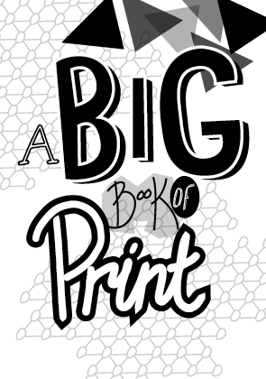
The format that I have decided to go with is the book inside the 'screen print' packaging. I think this is the most interesting and creative idea. I started to plan out a basic idea of what it could be like and a net for it.
The basic idea that I have come up with so far is that the box is a screen, and the viewer pulled the 'squeegee' down to 'spread the paint', and on the front cover of the book will be the same image/cover that is on the front of the packaging. This idea also helps me get a sizing for the book/publication inside. To make it obvious that it is a screen printing screen, it needs to be a portrait book, and to make sure it's not too overwhelming for the viewer it needs to be of a decent size, around an A4 size.

Lettering ideas:

From these I then put them onto Illustrator and drew over them to create the vector files.


My initial thoughts on these six are that I definitely prefer the bolder ideas, number 1 and numbers 4,5 & 6. These definitely have a lot more emphasis and make the word stand out. They are also less complicated than numbers 2 & 3, which does make them stand out a lot more.


For print, I wanted the word to look like it was paint/printed, so went for quite loose lettering. Both ideas have worked well I think. The second does look more like it has been done in paint, but the first is a bit more structured and is more consistent.

For 'of' I wanted something that wasn't so bold, but isn't completely forgotten about either. I did a few different variations of this and have decided that the ones on the right are better, however I won't be sure until I use them in a mock-up of the front cover.

Like 'of', I didn't want 'book' to be too bold as 'big' and 'print' are the emphasised words on the cover. I wanted it to look like it had been written in a thin pen and be a little more structured and classical hand-drawn look. The second one is the most successful I think, and I will definitely be using this one.

The 'A' isn't particularly important, and I don't necessarily need it. I designed lettering that is simple and nothing too bold. The ones I like are the block letters and the one with serifs on the bottom. The others aren't particularly good when put in Illustrator and I won't be using them.

After doing these letters, I did a couple of mock-ups of layouts for the front cover.


The third one is definitely the one that works the best because the letters all seem to balance each other out and fit together well. In the first one the 'big' is a bit too big and overwhelming and doesn't really fit together with the other words. In the second one the 'big' works quite well, but I do think that the third one is much better.
From this I took the third one and experimented with some ideas of how I could create a background for it and give it a bit more prominence.

These are the two variations that worked the best from this. As I want the print to be in one colour as to look like it has been screen printed I need the design to work completely in just black and white. Taking this into consideration I think the second one will work better because the 'big' will be in full colour instead of the stock colour, so it will stand out a lot more.
To see how this would work with colour I did a few variations:


Overall the red and the bluer colours work better because they have a bit more contrast against the white, but it will all depend on the colour of the stock in the end. The one where the letters are all white does stand out, but I don't think it works well and is hard to look at compared to the others.
I have decided that the red works the best as it has the biggest contrast against the white, and is bolder than the blues or greens.
Chosen colour scheme:

After leaving this work for a couple of days I thought of another idea and general feel for the whole publication. Although I liked the hand drawn element, I did worry that maybe it would be too informal and unstructured throughout, and as someone who likes to work with structured and considered layouts I moved forward with this second idea to see how it went and if it was any better.
Visually it is a lot simpler, but I do think it works a lot better. Sometimes less is more and I do think that this is the case here.
Second idea:


I have found that although this is a lot more straight forward, I do have a lot more room to be creative in the publication as a whole. In the original idea I think I was more focussed on the front cover than the concept for the rest of the book, and in this idea I have a more solid approach for the book as a whole.
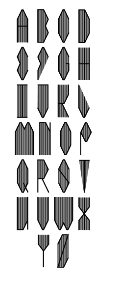
When creating the mock up layouts above, I couldn't find a typeface that I was happy with to use throughout the publication, so have decided that I will create my own for the titles, giving the publication a unique edge.
To do this I looked over the lettering I drew for the original idea to see if there was any that I particularly liked and would like to use as influence. The two I particularly liked are below:


After doing this, I drew out a few variations of how the typeface could look.

I decided on the third one and started working on how the other letters for the typeface could look.


After getting a basic idea into how each element of the letters could work, I went back into illustrator and developed the overall height and angles of the lettering.

Making the letters taller and thinner resulted in the angled edges to be a lot less prominent, so I made them longer because I wanted them to be a noticeable design feature.
After settling on the design for the 'A' I started to create the other letters.
 |
| Basic net |
 |
| Net 2: 'W' & 'M' |


 |
| Finished typeface |
After finishing the typeface I experimented with the general look of it and came up with another 9 variations. Although some will definitely not be used, it is good to see how I can further develop the typeface and how much I can do with it.
Variations:


 |
| Changing the 'P' |
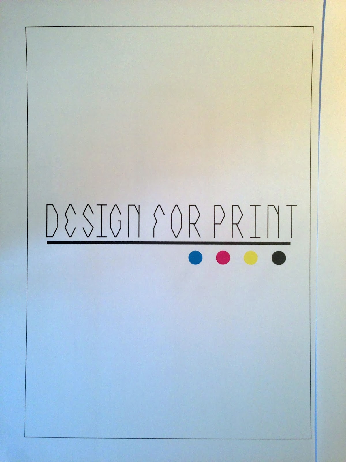
I then took it into Fontographer to turn it into a typeface.
When creating a typeface, it gives the options of lowercase and uppercase, so I decided that for lowercase I would use one of the variations I created. I didn't want to have anything too different so went with the typeface outlined.
|
| Lowercase font |
 |
| Uppercase A |
 |
| Lowercase A |
 |
| Whole typeface |
 |
| Finished typeface |
 |
| Installing to FontBook |
 |
| The two fonts |


As it is a front cover, I want the text to be well seen and prominent, so I thickened the lines to make it a bit bolder.

I then printed the three of these out to see which one looked the best when printed.


No comments:
Post a Comment