Brief:
Glacier Coffee Roasters, a startup company which is inspired by Glacier National Park and animals living there, is aiming for providing high-quality coffee through "Third Wave Coffee" movement, like Stumptown and Intelligentsia.
Target audience is coffee drinkers looking for a better cup of coffee and enjoy different flavors from various coffee producing countries.
We are open to all kinds of designs and ideas. Thanks in advance for your efforts. We believe that it will be fun working with you talented designers.
Logo must be associated with Rocky Mountain goat (Oreamnos americanus), which is the symbol of Glacier National Park. It can be a baby, a mother or both.
Coffee elements, like coffee beans, cups, portafilters, latte art, etc are not required. Use them if they look great with the logo.
We plan to have our company logo (or part of it) printed on Nuova Point blue PALERMO coffee cups (COLOR:http://www.nuovapoint.com.au/blue_milano.php) & (SHAPE:http://www.nuovapoint.com.au/palermo.php). Please make sure the design can go well with it.
We are looking for an iconic brandable logo. The logo should be applicable to different subjects like coffee bags, signages, coffee cups/mugs, walls, websites, etc. Because of the multiple purposes, it has to look good on black/dark backgrounds and white/light backgrounds. Variations of the same design will be great. And It should be easily resizable, should be identifiable when relatively small.
From the brief set, the main things I have taken away from it is that they want:
- A logo - something that can be reproduced on cups/other media
- Use of a mountain goat
- Look good on dark or light backgrounds
- Colour variations of the same design will help
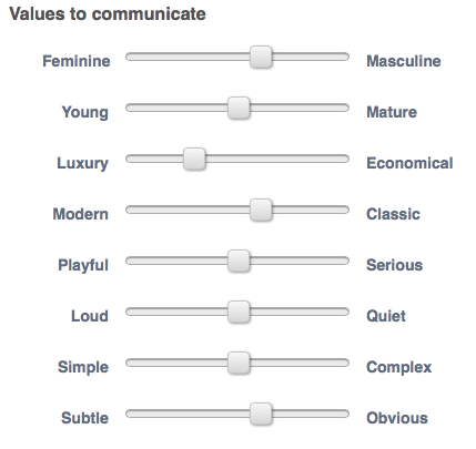
The values they want to communicate aren't exactly helpful because they are 50:50 on the majority of them, so at the end of the day, it'll be down to what they as judges personally like.
I drew out some initial ideas as a starting point.

I drew out some initial ideas as a starting point.
From here I chose the one which I thought was going to be visually strong and something that other people may not think about. I decided on choosing the one in the bottom right as it plays on negative space.
I took this idea into Illustrator and created the initial design.
I took this idea into Illustrator and created the initial design.


For the starting point I'm happy with it. The mountain is very defined which is good. When creating this I didn't think it'd work that well, but now it's finished it has worked out the best out of everything and is very clearly a mountain.
What needs changing is the typefaces I am using and the outline of the goat. The outline isn't a particularly definitive shape for the goat. It wouldn't be that obvious to someone who saw it for the first time. The typeface isn't particularly exciting. It is a little bland and doesn't stand out really, so I need to find one that is a bit more exciting.
I'm also not happy with the shape it makes. It seems to stop quite abruptly, so I would like to have something that brings it all together and makes it obvious that it is a logo.
Taking all of these things into account I created the following:


The brief writer wrote a note saying for designers to try more colours other than black and white and to try brighter more adventurous colours as a whole, so I did a few variations as shown above. They show that this can work in a variety of different ways with colour, having it all the same colour, or having it in multiple colours.
Following on from this suggestion from the contest holder, I decided to go in a more contemporary direction to see if there was anything else I could do which was better and incorporate a number of colours.


My design didn't get shortlisted, but that doesn't particularly bother me because the whole point in entering this was to do just that. I didn't expect it to go any further than me entering it.

My response is shown above. Initial thoughts are that it is completely different but works well. I'm not too pleased with the typeface used for the title, and the bottom bit of text reminds me of the Starbucks logo, so that's something that I need to change. However I do like the colours used and the overall aesthetic look of the logo. It is a lot more striking as an image than my previous designs and the simplicity of the shapes works well.
From this I continued to work on it. The first thing I did was get rid of the bottom line of text and change the typeface and positioning, getting rid of the green area all together.
I changed the overall shape of the design so it was a semi-circle shape. It is a lot more distinctive. I also changed the title typeface back to the one I was using previously, and this works a lot better with the secondary typeface and fits in with the image design.
The contest holder also asked for it to be shown is different forms so I took the goat and created a couple more options to what it could potentially look like.

I can't say I'm particularly happy about how these turned out, but they are development. At least I know what I don't want to do.
I decided to stick with the original shape, scrapping the other two.
The next thing I did was change the colours. They are a little bit dark and don't look as clean as they could be. I have used too much colour on them so I wanted to get rid of the unnecessary colours.

I changed the blue so it was lighter and got rid of the cream colour altogether (apart from in the goat), and changed the text so it was in black again. This works a lot better as an image as it looks a lot more sophisticated.
I was happy with this design so decided on this one being the one I would enter. I did three colour variations of it just to show the different colours which could be used, keeping it open for the contest holder to see this.
 |
| Final entry |
 |
| My entry entered |
I chose this brief because I hadn't done much branding, and this incorporates both text and image working together.
I did this one in particular because the concept interested me and I thought it would be a good one to test myself on and see how much I could develop my designs from the initial design stages. This brief was also quite well written, which is more than can be said for a lot of the others on this website.
I feel a lot more confident in entering these design competitions after doing this because even though I didn't get short-listed at least I did enter and it's really not as much of a big deal as I initially thought.
No comments:
Post a Comment