Vans Customs
Women - 6 pairs
Men - 5 pairs
The customisation option for Vans seems to only be available on the US store, offering 5 pairs to customise for men and 6 for women. Sticking the Van's signature style, the initial page features a mixture of clean cut design with a hand-made feel it it with the images used.
The design page:
Amount of choice for colours/patterns for some options:
The following image shows how much you can customise using this application.
Views available:Overall this is a good customisation application. In layout terms, everything is easy to find/understand and there is clear sections, and a large amount of space to see the shoe being customised. There are a good amount of colours, but not too many to make something horrific. The choice of using pattern is interesting too, and can give the shoe a bit more character. One of the downsides to this custom application is that some elements only allow one or two colours, making it not really truly custom made. There are limitations, and sometimes these are good for the sake of the shoe, but some are a bit too limiting. There is only five directions of view on this shoe, and although it does show everything you need to see, something at an angle would help to be able to see the shoe as a whole.
Nike ID
Women - 159 pairsMen - 94 pairs
Nike ID is definitely a large customisation tool in terms of the amount of sneakers that can be customised. The initial page is clean and easy to navigate.
The initial design page:
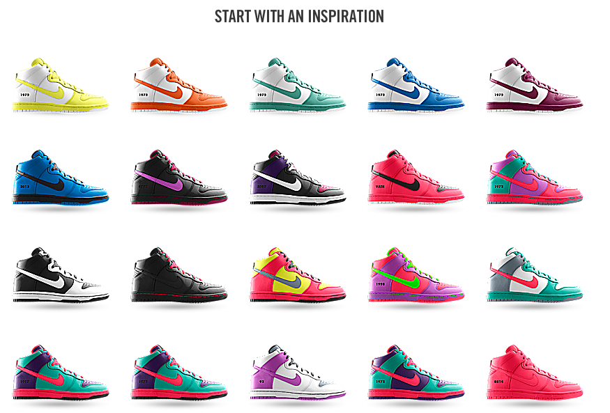
Below the customisation options, there is an option to start with some pre-made designs. This is helpful to the user because it shows a few initial ideas of colour schemes. Below that, there is a section on three of the features of the customisation.
Starting blank:
The following image shows all the customisations that are possible with this application.
Views available:Overall this customisation application is very easy to use and makes it very clear to see what the shoe would look like in a lot of different angles. The layout is easy to use with a lot of space for the custom shoe There are a lot of options when it comes to customising, however there is a limited palette of colours, around fourteen all together. These are all quite bold colours, so if a user wants something subtle, they are very limited to only a couple of colours.
Women - 138 pairs
Men - 198 pairs
Adidas mi offers a huge amount of shoes available to customise. These range from everyday wear to specific shoes for football etc. The layout is quite like a typical layout on a internet shop, so is a little bland, but it does what it needs to in displaying the shoes available.
Initial design page:
Choice of materials & colours:The image below shows the amount of customisations available on the shoe.
Available views:
This application offers a wide range of customisations, especially with the choice of materials that can be used on various parts of the shoe. There is also a very large range of the individual elements on the shoe that can be changed and extras that can be added for personal touches. The layout is easy to use and when a part is selected, an arrow pops up to show you exactly which bit of the shoe you are customising. This makes it much more user friendly and makes it quicker for the user to know what they want changing and where.
Converse
Unisex - 13 pairs
The converse website offers two different types to customise. The first is a selection of the 13 blank shoes, the second being a few shoes that have been designed by artists/designers where the canvas is not available for customising.
Shoe choice page:
Initial design page:This customisation application definitely has the most choice when it comes to colours/patterns available to use. The user can even choose between two fonts for their iD tag.
Available views:
Overall this application is definitely the one constructed for the user. There are a large number of customisations, especially when it comes to colour. This definitely takes into consideration all the people who potentially wear this shoe and has options for everyone. The user can see this clearly and would know that the shoes they are designing would be totally individual to them and they wouldn't see another pair the same. The layout is clear and easy to use, with a good amount of available views of the shoe when creating it. Another thing to point out is that the other applications all have names and have branded themselves, whereas this one doesn't.
Reebok
Women - 16 pairs
Men - 20 pairs
For such a large brand, the amount of shoes available for customisation is surprising, however there is a range across the use of these shoes.
When choosing a shoe to design this page is interesting as it does something the other brand's applications don't, in showing a blank version and full colour version side my side. This makes it easier for the user to see exactly what they could potentially customise on the shoe straight away, and how these colours work on the shoe.
Initial design page:
Available views:
Out of all the customisation applications, this was definitely the hardest to use when it came to seeing the shoe. The initial layout is very sterile and clinical, but this does benefit the shoe when it is coloured in. When it came to trying to rotate around the shoe, it took a good few attempts for it to register what you were trying to do, and offers a limited amount of views on the shoe. It doesn't even let you see the inside half of the shoe. On the plus side of this application, there is a decent amount of colour choices, and ever element is customisable, including the logo to an extent, which isn't possible on the previous applications.
Puma Factory
Unisex - 3 pairs
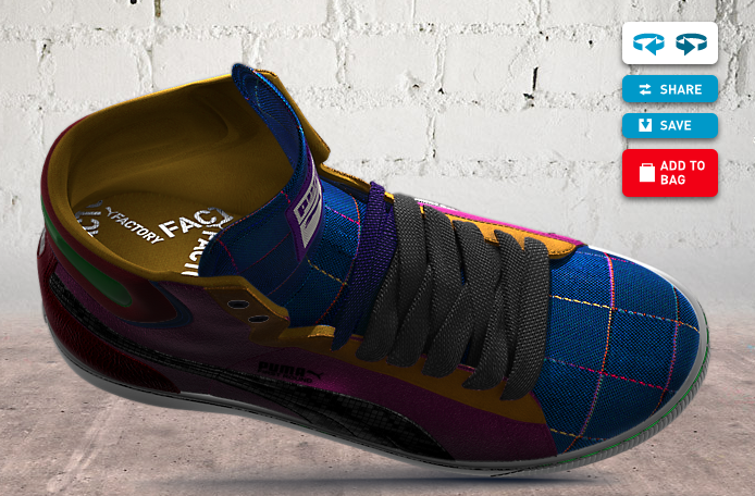
For Puma, there is only 3 shoes available for customisation, which was a surprise considering the amount that rivals such as Nike & Adidas offer. Immediately this one has a lot of character with the images used, and the shoes are much more realistic in design than on other applications.
Shoe choice page:On this application you are able to choose a 'starting point'. This is basically the same as offering you already designed shoes.
Initial design page:
This initial design page is different from the others in terms of design of the menu choices. On the others these are on either the left or right of the shoe, but on this one these are initially along the bottom, with pop outs that appear. This gives the shoe a lot more room on the page and certainly makes it easier to look at.
In terms of colour choices, these vary depending on the material chosen. This could be an issue for some users because they might like a colour but not the material being used. It also seems that the colours are all quite dark unless using suede of vegan leather.
Available views:
It is obvious that Puma has invested a lot into this application because of the realistic graphics of the shoe and how the application works. There is a large amount of custom options, however some of these are hideous, and some of the materials available are questionable. However, looking at it as a customisation application, there is a lot of choice in all areas of the shoe, from colour to material. It is very much made for the user to have what they want, not what's easy for the company to make. It's a shame that they only offer three shoes for this application as they would probably have a lot more customers if it was more widely available.I have found it interesting looking into these customisation applications because it shows very quickly which brands have invested a lot of time into these, and for what reasons. For example, Nike and Adidas have a huge range of shoes available to customise, but because of the premium materials used, these come in a limited amount of colours. Whereas Puma has only three shoes available to customise, but a huge amount of choice. This does depend on the initial amount of shoes that the brand does offer in the first place. Van's for example, it only offers around ten or eleven different pairs of shoes, and it gives you six to be able to customise. It was strange to see Puma only had a three pairs when they sell a large range of other shoe, which I'm sure would be a bit disappointing to users who potentially wanted to customise a particular shoe.
Each of the applications are very similar in layout and areas on the shoe that can be customised, however Adidas and Puma are a lot less clinical and have a bit more character to the whole process than the others do. They keep this consistent throughout, whereas with, for example, Vans, the first couple of pages are very in with the Vans branding, but after that, it could be on any website.
Each application had good points to the design/use, and they all had their bad points too which could do with improvement. Usability on all of them was similar, however it did get a bit tedious when some of them had a lot more options than I initially thought. Overall I was the most impressed with the Converse website because it was clearly very audience driven in the amount of customisation available. It wasn't complicated or too long winded, but does allow the user to truly make the shoe their own. I am the least impressed with Reebok. It seemed like it was just an application there for the sake of it and not much thought had necessarily gone into the design of the whole thing. It was also quite bland and a bit flat.


