After finishing the brief I reviewed everything I had done and decided that I needed to make the App side of the website a bit more useable and adaptable to the screen sizes, but keeping the main elements. I started on the iPad App.
When working with these I need to think about what information from the website is needed for these tablets, and what isn't necessary.
I made the contents larger and more adapted to the screen size, thinking about how larger clickable buttons would need to be as well their positioning on the screen.


After the success of these I started on the phone app, following the same idea as above. For the phone, as this screen is so much smaller in reality, I decided that the navigation I have isn't suitable as it will be too small across the screen, so because of this I created a new navigation bar to use, which was much larger and easier to use.


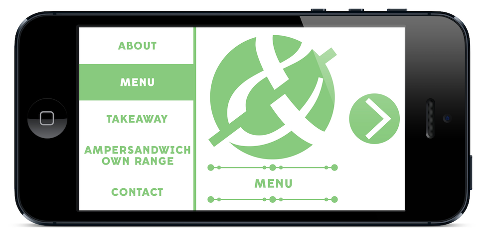


This works much better on this screen size than the design I had previously. This is down to the limited information on each page and the new navigation bar, making it much more usable for the user.
Crit
After the crit I applied the changes that were talked about. I faded out the typographic pattern on both the menu's and changed my business cards to include the photographic images.
Changed Menu


Changed Takeaway Menu


Added Business Cards

No comments:
Post a Comment