Today I have a print slot at 3pm, so I have the morning to refine my poster ideas and potentially create some more work that needs to be printed in the print room because of scale. As I have a very good digital printer at home, I don't need to rush the smaller elements of my work as I have the weekend to print these and get them right.
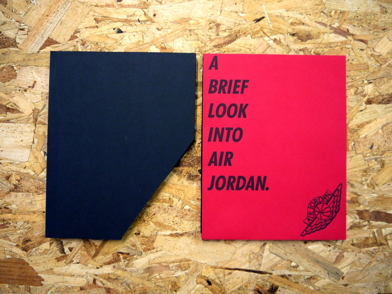
Before going for my print slot, my exhibition book arrived in the post. While I was initially excited because it is the main element to this brief, I was quickly pretty disappointed at the fact that the printers had made an error in printing.
While my work printed out perfectly, they'd made the mistake in having pages from someone else's publication in the back of mine.
This is obviously very disappointing to me as it is the main element to my final project of this second year on the course, so it should be my best stuff to date. For this to be ruined by printer error, and frankly, some terrible design work at the back, is a huge disappointment to me.
However, it could have turned out much, much worse, so I am thankful that none of my work was affected by this error. I emailed the printers about this and hope that they get back to me soon, however, with only a few days until deadline, I think it's unlikely they will get me a reprint as they are based in Amsterdam.
After speaking this through with Phil, and being assured that it was fine and to just write a note, I got on with the work to print at my print slot.
With one poster done, I quickly made a few other variations in different colours. I first looked at the original one I had, and decided that I liked the idea of having a bit of a 'past and present' as this is an image of two of the 10 players who are still in the NBA, LeBron James and Kobe Bryant, and I had a similar image from about 30 years ago of two of the 10 players who are now finished with the NBA, Magic Johnson and Michael Jordan. I thought that this would also be a good opportunity to use the red logo, making the posters a pair.
Posters:
Continuing on the 'pair' route of the posters, I did a blue and red poster pair, once again, past and present. Tim Duncan is in the blue, who is currently still in the NBA, and Larry Bird is in red, a past NBA player.
I think that these photographic posters work really well. I do still think the mixed colour ones work best, however I think it is good to have the blue and red variations, and these could potentially print out better than they are seen on screen.
As well as these photographic posters, I wanted a generic vector designed posters which could be used as well. I wanted to use this as an opportunity to have the logo large as it hasn't really been used in a large size anywhere yet, and I think it would be a waste to not try do something where this is the main element.
Poster:
I also started working on the idea of a purchasable poster. My first attempt didn't go well at all really, so I wanted to redeem that in creating something which would work for all ten players in a simple format. I also needed to make them desirable to buy, and something that people would like to put up on their walls at home or similar.
I decided that I would use Wilt Chamberlain as the player to create the poster for, as I had an image of him which I thought would work quite well.
The elements that I need to have on this poster are: the image, player name, sponsorship logos & exhibition logo.
From my previous development of the book and posters, I knew that generally the images looked better in the monotone blue than the monotone red. I did consider having these player posters in full colour, however I think that having the monotone colour makes them individual and recognisable to the exhibition.
I started by putting these elements together in a couple of variations.
Immediately I can say that the block colour under the text works better, however the placement in the top corner works better than over the block. With this in mind, I decided that what I needed was for their names to be all on one line. In the exhibition book I broke them down to two, but working it like this onto the poster just isn't working. With the text on one line it means that the block colour can be thinner and won't look as imposing as it does on the poster above.
I tried it with the text in white and the block colour in the red. The white looked a bit too plain above so changing these colours over might look better. I also added the slashed line to make a bit of a separator and break it down a bit more. I tried a few variations of this.
I think the block colour and name being at the bottom is a step in the right direction as I wasn't too sure about it floating over the image before. It just looked out of place. At the bottom there is the sponsorship logos which do ruin the text a bit, and these can't be moved.
I tried the text at the top, meaning I had to move the logo down to the bottom right hand corner instead.
I tried two variations of this. The first was definitely better. However, I'm still not sure about it because of the size of the logo, and placement in general.
I tried a couple more variations for the logo.
I like the both of these. They work much better with the logo at a smaller size and seem to be much more balanced.
I decided on the last one being the layout to go with, purely for the practicality of it. The logo being in the top corner may not be suitable if the image were to be for another player, so having the logo in the bottom right means that I won't have to change the layout at all.
Chosen poster:
After completing this poster, and deciding that I had completed all the posters I would need for this brief.
With these done I moved onto the rest of the promotional material for the exhibition that was going to be larger than an A4 print.
I decided on creating a small concertina that could be something in public to promote the event in a bit more detail than the flyers.
I first looked in my brand guidelines as I know I had made rules about smaller printed material. This must measure at 120x160mm when folded.
I initially tried a 5 paged concertina (like the Jackson Rising task), however I found that this was very difficult to work with. I had initially wanted to use this concertina to promote the 10 players, however with a front page and a back page, I would either only get 4 or 8 players in a concertina, which would be a bit awkward considering there are 10 players. The only way to even it out would be to have 2 players per concertina, but I didn't want to make 5 different concertinas.
With this taken into consideration, I decided on just creating one concertina which promoted the event instead of the individual players. I think that this would be more suitable for a piece of promotional material too as it would be about the event, not the players.
I decided I wanted to keep it similar to the way the flyers and posters were done with a very simple layout.
I decided on having it with only three pages on each side as this would be all that I needed.
Content:
- Front page
- Back page
- Details page
- Exhibition Info
- Player names
- Image
As there are three pages I decided that each side could go with the three colours of the NBA and the exhibition - red, white & blue - with one page in one colour as the background.
I did a quick mock up of how this would fold out so I could put the information in the correct pages. I got the idea from seeing this project on Behance:
Link
I liked the way the flat colours worked against each other and thought that the general layout and design would be fitting to what I wanted for my concertina.
Concertina:
Outside:
Inside:
In preparation for my print slot I also created a document of my logo in four variations so I could print them out as stickers.
Stickers:
The black line indicates where the stickers will be cut.
Having these means that if worst comes to worst and I create something larger than I can print, I can always use a sticker to brand it.
At this point I have the following items ready to print:
- Posters - 280x420mm X6
- Stickers - A3
- Concertina - 360x160mm
- Flyers - A5 X2
I will also be printing my book cover and packaging for my research book.