Friday, 25 October 2013

OUGD504 - What Is Design For Print? (2)

The format that I have decided to go with is the book inside the 'screen print' packaging. I think this is the most interesting and creative idea. I started  to plan out a basic idea of what it could be like and a net for it.
The basic idea that I have come up with so far is that the box is a screen, and the viewer pulled the 'squeegee' down to 'spread the paint', and on the front cover of the book will be the same image/cover that is on the front of the packaging. This idea also helps me get a sizing for the book/publication inside. To make it obvious that it is a screen printing screen, it needs to be a portrait book, and to make sure it's not too overwhelming for the viewer it needs to be of a decent size, around an A4 size.
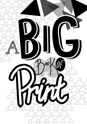
As I want the tone of the publication to be friendly and seem hand crafted, I want the type throughout the book to have a hand-drawn style, so I started to do a few ideas of how the words could be drawn out. The title I am starting with is 'A Big Book of Print', with particular emphasis on 'Big' & 'Print'.
Lettering ideas:
From these I then put them onto Illustrator and drew over them to create the vector files.
My initial thoughts on these six are that I definitely prefer the bolder ideas, number 1 and numbers 4,5 & 6. These definitely have a lot more emphasis and make the word stand out. They are also less complicated than numbers 2 & 3, which does make them stand out a lot more.
For print, I wanted the word to look like it was paint/printed, so went for quite loose lettering. Both ideas have worked well I think. The second does look more like it has been done in paint, but the first is a bit more structured and is more consistent.
For 'of' I wanted something that wasn't so bold, but isn't completely forgotten about either. I did a few different variations of this and have decided that the ones on the right are better, however I won't be sure until I use them in a mock-up of the front cover.
Like 'of', I didn't want 'book' to be too bold as 'big' and 'print' are the emphasised words on the cover. I wanted it to look like it had been written in a thin pen and be a little more structured and classical hand-drawn look. The second one is the most successful I think, and I will definitely be using this one.
The 'A' isn't particularly important, and I don't necessarily need it. I designed lettering that is simple and nothing too bold. The ones I like are the block letters and the one with serifs on the bottom. The others aren't particularly good when put in Illustrator and I won't be using them.
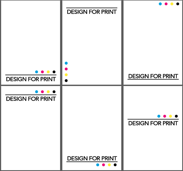
After doing these letters, I did a couple of mock-ups of layouts for the front cover.
The third one is definitely the one that works the best because the letters all seem to balance each other out and fit together well. In the first one the 'big' is a bit too big and overwhelming and doesn't really fit together with the other words. In the second one the 'big' works quite well, but I do think that the third one is much better.
From this I took the third one and experimented with some ideas of how I could create a background for it and give it a bit more prominence.
These are the two variations that worked the best from this. As I want the print to be in one colour as to look like it has been screen printed I need the design to work completely in just black and white. Taking this into consideration I think the second one will work better because the 'big' will be in full colour instead of the stock colour, so it will stand out a lot more.
To see how this would work with colour I did a few variations:
Overall the red and the bluer colours work better because they have a bit more contrast against the white, but it will all depend on the colour of the stock in the end. The one where the letters are all white does stand out, but I don't think it works well and is hard to look at compared to the others.
I have decided that the red works the best as it has the biggest contrast against the white, and is bolder than the blues or greens.
Chosen colour scheme:
After leaving this work for a couple of days I thought of another idea and general feel for the whole publication. Although I liked the hand drawn element, I did worry that maybe it would be too informal and unstructured throughout, and as someone who likes to work with structured and considered layouts I moved forward with this second idea to see how it went and if it was any better.
Visually it is a lot simpler, but I do think it works a lot better. Sometimes less is more and I do think that this is the case here.
Second idea:
I have found that although this is a lot more straight forward, I do have a lot more room to be creative in the publication as a whole. In the original idea I think I was more focussed on the front cover than the concept for the rest of the book, and in this idea I have a more solid approach for the book as a whole.
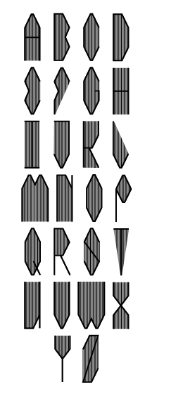
When creating the mock up layouts above, I couldn't find a typeface that I was happy with to use throughout the publication, so have decided that I will create my own for the titles, giving the publication a unique edge.
To do this I looked over the lettering I drew for the original idea to see if there was any that I particularly liked and would like to use as influence. The two I particularly liked are below:
I like them because of how simple they are and how the letters are made up of just straight lines and geometric shapes. Taking this, I created a basic shape for the 'A' to start with.
After doing this, I drew out a few variations of how the typeface could look.
I decided on the third one and started working on how the other letters for the typeface could look.
After getting a basic idea into how each element of the letters could work, I went back into illustrator and developed the overall height and angles of the lettering.
Making the letters taller and thinner resulted in the angled edges to be a lot less prominent, so I made them longer because I wanted them to be a noticeable design feature.
After settling on the design for the 'A' I started to create the other letters.
Basic net
Net 2: 'W' & 'M'
Finished typeface
After finishing the typeface I experimented with the general look of it and came up with another 9 variations. Although some will definitely not be used, it is good to see how I can further develop the typeface and how much I can do with it.
Variations:
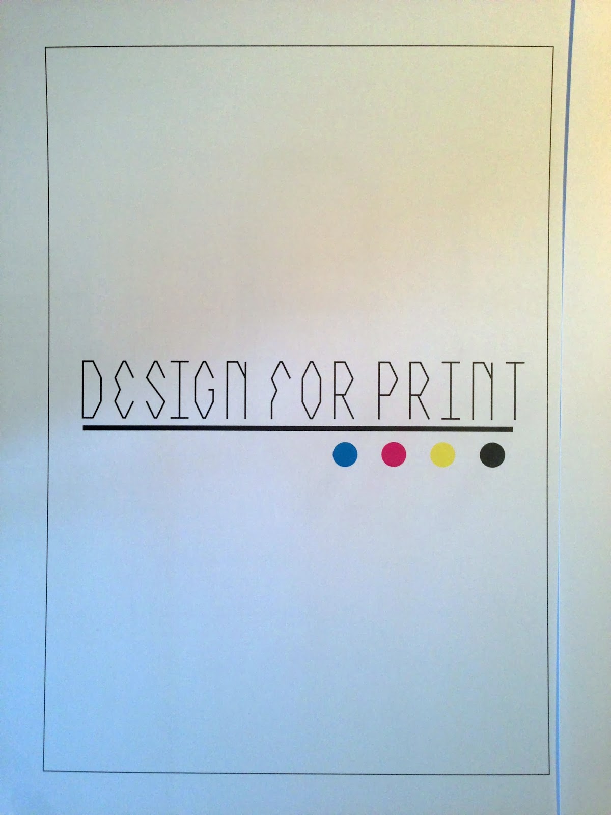
I then too the original typeface and laid it out on the front cover chosen in place of the text:
Overall I like the look of it and it does seem to flow well and fit in with the overall look I was going for, however putting the letters together for the first time has shown a design flaw that I didn't consider before as I was just designing the letters individually and not together. The 'P' looks quite odd and not as strong next to the other letters, so because of this, I have opted to change the top of it.
Changing the 'P'
I then took it into Fontographer to turn it into a typeface.
When creating a typeface, it gives the options of lowercase and uppercase, so I decided that for lowercase I would use one of the variations I created. I didn't want to have anything too different so went with the typeface outlined.
Lowercase font
Putting the letters into Fontographer:
Uppercase A
Lowercase A
Whole typeface
Finished typeface
Installing to FontBook
The two fonts
I then replaced the text on the front cover designs with the typefaces, doing the two different variations:
As it is a front cover, I want the text to be well seen and prominent, so I thickened the lines to make it a bit bolder.
I then printed the three of these out to see which one looked the best when printed.
All three worked well printed, but like on screen the thicker text did work the best because it stood out a lot more.

Wednesday, 23 October 2013

OUGD504 - Design For Web: Studio Session 2/Study Task 5

Building on from what we did in the session before, we started this session by thinking about what five pages we would have on our websites, the content for each of these pages and a basic layout.
As my subject is quite a narrow and specific area I found it quite easy to create five separate areas:
  • Page 1: Homepage
  • Page 2: Anatomy of Type
  • Page 3: Hand Drawn vs Digital
  • Page 4: Video's of hand drawn type
  • Page 5: Origins/History
As a group we discussed the five main pages that any website could have:
  • Home page: Indicative of content/intro
  • Contacts page: Enquiry form, social media links, contact details
  • Gallery/Portfolio
  • Forum/posts/user posts
We also discussed what our pet hates were for websites and what made a bad website:
  • Contact details not on the home page - having to troll through the whole website to find them - especially annoying when on a phone/tablet
  • Images/information categorised and sub-categorised when there isn't enough of it - e.g. a website with only twelve images, all of them split into five sub-categories
  • A landing page - a 'click here' page to get onto the homepage instead of a homepage immediately
  • A homepage with little information - no clues as to what to do next when on the home page etc
After this we were given the task of drawing out a layout for what we would like our home pages to look like:
I want my website as a whole to be clean and simple, so went for a structured approach with a clear navigation bar, a large title image and a short information paragraph underneath, with contact information at the very bottom.
Once this was done we were split into groups of 5/6 and laid out our layouts for a mini crit. We swapped groups and gave feedback to another group of people while ours were done.
My feedback received:
The majority of it was helpful, although there were a few points which weren't constructive. The main point which was mentioned a few times was the audience my content is being directed at. Although this is hard to show on a layout design, I will definitely consider this when designing and creating the website.

Tuesday, 22 October 2013

OUGD504 - Design for Web: Studio Session 1

In groups of three, we went through out Summer Brief research to break it down to what we want to include on the websites we are creating.

Me - Hand Drawn Type:
Abi - Swiss Alps:
Charlie: Chocolate
From this we then had to write a statement/brief on what we want to do.

I am creating a website dedicated to hand-drawn type, looking particularly into the anatomy of type and how hand-drawn type creates visual differences to digital type. It is aimed at people that are interested in type/are designers looking for information/inspiration/videos on type.

Task:
Select five websites that you think are good to do with your subject.
Collect research - qualitative, quantitative, primary, secondary etc.

Friday, 18 October 2013

OUGD504 - What is Design For Print? (1)

To start this brief off, Charlie, Anna and myself got together and did two brain storms so we had a better understanding into what we needed to include and what were big subjects.
Brain storm 1 - A general overview of what needs to be included
Brain storm 2 - Content focussed down
From this is gave us a better idea into what the brief was asking us to do. From this, I wrote myself a few questions to answer and see how I want to create this info-pack, what I want to use, what tone of voice I want to use, and for what audience.

What print processes/finishes do I already know?
Digital
Screen printing
Lino printing
Letter Press
Book Binding

Which print processes do I want to learn?
Foiling
Embossing

What processes do I want to use to produce the outcome?
Digital
Potential screen printing/letter press
Book binding

What content do I want to use?
Print processes
Stock choices
Colour theory/choices
Costing
Finishes

What audience?
People who are interested in printing - designers who want to know about the different print processes/how to print in these processes and what to consider.

What tone of voice?
Informative
Informal - friendly, not casual
Easy to read

Info-pack Research Link
Content Research Link

After researching into info-packs and into the content, I made a design sheet exploring the potential formats that I could create this pack in.
Format Ideas sheet:
From the 10 format ideas I have come up with there are a few I am considering to do. Number 4, the pyramid pack. I think this is quite a creative and interactive way to display the information and is definitely something to consider. Number 6, the book in a 'screen print' package. This is the idea that I like the most because it is a book and packaging which has a bit of a twist, which is interactive and will make the book seem more interesting. Idea 9 is a simple book, which is the easiest thing to do in this brief, and the idea that I feel most comfortable doing.

Wednesday, 16 October 2013

OUGD504 - Concept Workshop

Today's workshop is to get us thinking about concepts, how far these can go and the different directions that it came take us. It is to help us get used to the idea of creating good concepts and making them strong and thought through, with good understanding and good follow through.
The brief is that we will be given words to work with and create a concept for either a hotel, restaurant or bar situated in Leeds.
We were put into groups to complete the workshop. Once in our groups we were presented with two jars, and instructed to take three pieces of papers from jar 1 and one piece from jar 2.
Jar 1 & Jar 2 picks
 From these we had to brain storm words associated to these three words to start coming up with a variety of potential concepts & ideas.
 Our initial agreement was that 'Curtain' was our least favourite and 'Court' seemed the best option. We came up with a variety of different angles relating to the words, and decided on doing either something to do with Time Travel/Futuristic or a Court of Law. There were multiple ways in these two ideas that we could interpret them and start creating strong concepts for.
Time Travel/Futuristic:
A long bar - each section of the bar a different century/time period with relating drinks/furniture & decor. Potentially going down the futuristic route with chrome/metal, a really clean & minimalist approach, a high end bar.
Court of Law:
A bar situated in an old courthouse, keeping the layout & furniture of it and designing a bar around it - potentially for young professionals/lawyers.
Audience is key and is what we spent most of the time discussing, deciding if we wanted to aim it at younger people/students or professionals. Taking into consideration the fact that the Leeds area already has a huge amount of bars that are heavily populated by students, and there aren't really a huge majority of high end bars, we decided on the audience of young professionals.
After further discussion and feedback from the tutors, we decided to push the concept further in the Court of Order direction, thinking about how we could put a clever twist on it. The idea of a prison theme came up and we decided to expand on this concept.

We were influenced by research we did into an old prison in the Netherlands which has been converted into a luxury hotel, Het Arresthuis. When converted all original interiors have been kept, with the whole thing just being modernised and updated. We found it very interesting and quite an innovative idea and the outcome is something we as a group admired.
The concept we created is a bar in an old prison, aimed at young professionals, and a sophisticated feel to the place. Interior-wise, we want to go with simple and clean design, sticking with black and white to go with the standard old-time prison colours. We will also keep all the interiors there already, building the bar around it and incorporating it as much as possible, keeping the original brickwork/doors/stairs.
Choosing a name is something that took us quite a while to do. We first came up with a list of words that were associated with prisons, such as Witness, Sentence & Banged Up. However as we wanted to keep the concept sophisticated and aimed at the young professionals market we had to have a name which doesn't make it sound like a student bar, so many of the names were thrown out.
The final three we were between were:
Sentence - like the sentence you're given when going to prison
Bars - like the old style jail cell bars
Contraband - the smuggling in of items into prison which are regarded as illegal or not allowed
After discussion we decided on Contraband because the whole concept is having a bar in a prison, and drinking alcohol in a prison is something which is illegal and classed as contraband.
Initial ideas for the logo were to incorporate the prison cell bars in some way. While drawn ideas were worked on, I created a few quick ones on Illustrator.
The problem we found using the bars as a background was legibility. Although it was our initial idea for how we wanted it to look, it didn't work as well as we'd hoped, and because of that, we decided to keep it very simple and just go with white text on a black box.
Chosen Logo
After this was decided we worked on the drinks and music side of things. We decided that as well as usual bar drinks, we'd have a few others which are specially tailored for our bar, all with names relating to the prison theme. 
As the bar is aimed at young professionals we wanted a mix of genres of music, but nothing that sounded too tacky, so went with more sophisticated music such as jazz etc. As well as this, and because the space we have is so large, the idea of having live music or events on is something we have also included.

Overall we worked quite well as a group and all were in agreement in the final concept. Although there were initial conflicts at the beginning, once we worked on this concept we all agreed it was the best one to take forward, and creating everything around this concept was enjoyable. 

Presentation

Wednesday, 9 October 2013

OUGD504 - What Is Design For Print? (Studio Session 3)

For this session we were split into groups and had to discuss the breakdowns of the five logos/branding we brought in.
My 5:
Fairtrade
  • For fairtrade products
  • Green & blue - earth colours, grass & water. Ethical & organic.
  • Similar to Ying & Yang sign
  • Person waving - friendly
  • Simple image - will be easy to recognise and see at different sizes & on different stocks
  • Type is sans serif & bold - easy to read.
  • Memorable image that will be recognisable without text
Common Man
  • Identity for restaurant based in Melbourne
  • Simple design - can be used on any kind of stock, easily printed & easily read
  • Black - easily seen on any colour
  • Sans serif typeface - approachable, common
Mexout
  • Mexican restaurant in Singapore
  • Hand drawn logo - implies a casual/young atmosphere
  • Black on white - sophistication
Mind
  • Identity for mental health charity
  • Attempted visual representation of what someone's mind would be like living with a mental health issues
  • Hand written style of type - approachable, contemporary and appeals to a wide audience
  • Blue - calming colour
Woodblock Chocolate
  • Chocolate brand based in America
  • Simple typeface - different from usual chocolate brands
  • Blue on white - stands out from other colours used for chocolate brands
Task: Take a logo/s that particularly interested you and do a full breakdown with research into why the logo/s have been created that way. Give initial thoughts, research & comparisons between the two.

Mind
Original identities
Rebranded identity
Mind is a charity to aid those with mental health issues. It was founded in 1946, originally as the National Association for Mental Health, and renamed as 'Mind' in 1972. The newest branding was designed by brand consultancy Glazer.
Initial research into Mind's branding shows that the local branches were adapting the existing logo to suit their own purposes, which in turn diluted the brand and the strong brand message of a united cause, ambition and cause against mental health. With areas of the business not using the same branding, it makes the business seem disjointed and not as one, which is a big problem when it comes to serious issues like mental health, where dependability and professionalism is key.
Glazer worked with the leadership team of Mind to identify the charities ambition, purpose, values and behaviours, and used that to create a new brand identity which reflected these.
In the original branding a dove is used, which is a symbol of many things, from love to hope and promise. Although this does work with the charity's aims, it is a widely used symbol and doesn't individualise the charity. If you saw the dove, you wouldn't instantly think of Mind, like seeing the M for McDonalds. To solve this problem a new logo was created which The new is a visual metaphor for essentially what a mind of a mental health patient would be, and gives the impression that working with the charity will solve the problems and confusions, that it will clear their mind.
The main difference between the two brand designs is that the new one is a lot more contemporary and approachable, whereas the original is very serious and could be off-putting to people who are reluctant to get help for their issues. In this sense the branding is successful and the message is quite clear in something which is hard to create a visual representation for. The logo fulfils its purpose.

 Rover
On first look it is unclear as to why a viking longboat is used as the logo for a car company identity. Initially thoughts are that they hold themselves in high stead and feel they are a superior brand. The use of gold, red and black also gives this impression as they are bold colours which when together seem majestic and important.
When researching into this, it becomes clear very quickly as to why the longboat is used. 'Rover' as a word, not a name, means a wanderer. Knowing this, it makes it very obvious what the logo is representing. The company are saying that they are wanderers or explorers in their field, implying that they have a certain greatness over other 'boring' car companies.
If someone does not have this knowledge then the logo really doesn't give across the message it's trying to. When the knowledge is known it is successful and the concept is good, but it is unsuccessful branding because memorable logos with a good concept need to be seen immediately.

Starbucks
On first look, it is clear that the image is of a mermaid, however the relevance to a coffee shop is a little puzzling. The original logo was is brown, like coffee, however because this is a generic colour for coffee, it has been changed to green. This is unclear at first but further research into this shows that coffee beans are green before they are roasted and turned brown. Losing the text around the image is also something they have done, and this is successful because the logo is so widely recognised all over the world. When you see it, you know it is Starbucks, so in that sense the logo is successful because it is memorable. They haven't changed the logo a huge amount since 1987, rather just modified it, keeping the same image and zooming in on it, keeping it clear exactly what the image is of.
Research into the reason for use of a mermaid becomes very clear quickly. In order to capture the history of coffee involving seaports and sea travel, the designers looked into old marine books, including Moby Dick, where there is a shipmate called Starbuck. The image is not of a mermaid, but of a two tailed siren, which features all throughout Greek Mythology. It is a sea creature which is dangerous and beautiful creatures who lured sailors with their voices and songs to shipwreck on the rocky coast of their island. In relevance to a brand, using the image is them pretty much saying that their coffee is irresistible and draws you in.
Knowing this, it becomes clear the message that the brand is trying to put across, and exactly what they think of their brand and products. They hold themselves as a superior coffee maker to others, and using the image of a siren puts across that they think their coffee is more addictive and better quality than others. As a whole, I do think that the branding is successful, because even if you don't know the exact history behind the image, you do know it is a sea creature and you do recognise it easily, even without the brand name, which is something that is quite hard to achieve.

Virgin
Virgin Group is a multinational brand created by Richard Branson in 1970, and operates in multiple areas of business, most recognised for travel, entertainment and lifestyle. Overall there are 400 different businesses worldwide underneath the Virgin name. The logo was designed by Trevor Kay and Ray Kyte. Branson has described the 'V' as an expressive tick, representing the Virgin seal of approval. This V on it's own is widely recognised.
Initials thoughts when looking at the logo is that the hand written style type is a lot more approachable than a straight-laced typeface used by other corporate companies. It also almost humanises the brand as a whole and makes it seem a lot more relaxed, fun and open, which is also reflected in the colour choice of red. This colour indicates a sense of boldness and playfulness and implies that there is a sense of exploration and ambition to the company. Red represents many things including action, exciting, powerful, passionate and determination, which I think are all things that a brand does want to put across to assert itself as superior and above other brands in a similar field.
There isn't necessarily a huge amount of a concept put into the making of this brand other than wanting to put across what red & hand written work defines, so I think that the branding is successful. It is a logo where just looking at it, the meaning behind each decision is clear and not too hard to understand the reason behind it.

Tuesday, 8 October 2013

OUGD504 - What Is Design For Print? (Studio Session 2)

Studio Session - 8/10/13
Studio brief:

As a group we had to discuss what we had found when looking for examples of the six categories and come up with definitions and an understanding of each.
Group summation
As a class we shared these and wrote a general list from what we had all decided upon:
What is...
Format - Scale, size - working with that
Colour - colour modes, hue, functions etc
Production - 'The actual working of it' - collection of processes to create final product
Process - The method
Finishing - Production & process
Stock - Substrates of printing/considerations

All of these are linked.

Using the five physical printed sheets/objects, in groups we had to put them into the following categories: Format, Colour, Production, Process, Cost & Subject areas.

Format
We split the formats down into: Bags, Packaging, Business cards, Vinyl cases, Magazines/Catalogues, Books & Leaflets.
We decided to split the objects into these groups because of the large variety of shapes and sizes, so putting them into categories for purpose made it simpler. We found this helped us see the different quality and variety of objects in these sub-categories. We found we had quite a large variety of each of these categories.
 
Colour
In this category we split the objects down into four sections: Full colour, 1 colour/mono print & 2 & 3 colour & monochrome.
Looking over the variety of objects, the majority were either full colour of mono print. We discussed whether we would count stock as a colour as well, deciding that we wouldn't count stock and would only count ink colours. We found the majority of objects were one colour on stock, and the category with the least objects was monochrome.
Production
We split production into three groups: Mass Production, Short-run production & Bespoke production.
We discussed what we all perceived each of these titles to be. The main issue that came up was that these objects are all created specifically for their purpose, meaning they were bespoke, but they are made in large volumes, meaning they are also mass produced. After discussion it was decided that the same could be said for any object, and that because of the large quantity of the same object, they would be classed as mass produced.
We also found that many of the items mass produced were made of a cheaper quality, and those in the short run/bespoke were of a higher quality, with more expensive stock or printing processes.
 Process
We split the objects down into five categories: Digital print, Screen printing, Letter Press, Finishing/Foiling. We found that the majority of objects were digitally printed. The more high end objects were foiled or finished very well, and the lower end objects were printed cheaply.
 Cost
We had to put the objects in order for cost per unit. To start this one off we referred back to the choices we had made in the previous categories, deciding on the cost of each print process, an average on how much it would have cost to assemble, the amount of pages/sheets used for each object and the quality of the stock. Getting an initial idea was easy, with the cheap stock having the worst quality, so therefore the cheapest price, and vice versa for the more expensive objects. The issue came in deciding on the price per unit for printing the editorial objects, such as newspapers and magazines. We decided quickly that newspapers were made on such a large scale that the cost would be relatively cheap, but not so cheap because of the cost of the inks.
 Subjects/Areas
We split the objects down into four areas: Branding/Identity, Editorial/Publishing, Packaging/Promotion & Information/Way finding. We found the majority of objects were in packaging/promotion and the least were in branding/identity.

From the exercises we then had to write a list of everything we don't know, that we would like to find out about printing.
My list:
  • Difference between bag packaging and branding
  • What counts as mass production? How many units?
  • Definitions of mass production, short-run & bespoke
  • What counts as bespoke? Individual items or more than one?
Preparatory task
Collect 5 examples of logos/branding which will then be broken down and discussed in the next session.

Research & answers to questions I want answering about print
Difference between bag packaging and branding - is a branded shopping bag promotion or packaging?
Shopping bags can be classed as both promotion and packaging. They are a representation of the shop/brand as well as a carrier for the product bought. They are a constant reminder of where the the product was bought, meaning they are promotional material.

Definitions of Mass production, short run & bespoke
Mass Production: Method of producing goods in large quantities at low cost per unit with a sustained quality production. Goods/prints are standardised. Mass production requires mass consumption to work and keep unit costs low.
Short run: Short-run printing production is typically around 500 units or under and often uses digital printing techniques.
Bespoke: Bespoke is 'made to order' or made specifically for one purpose. A one-off design.

What counts as bespoke? Individual items or more than one?
Bespoke is an individual item/print created specifically for one customer.