Thursday, 8 November 2012

OUGD404 - Identifont Task

We swapped our five fonts around and were given the task to identify the fonts given using the Identifont website. This website asks about the characteristics of the letters to determine the mystery font.
The five fonts I was given and identified by Identifont:

Verdana - correct
Mistral - correct
Rockwell Extra Bold - correct
Harrington - correct
Lucida Typewriter - incorrect
Actual - Lucida Fax

OUGD404 - Visual Literacy

Session 1 - 6.11.12

Visual Literacy - The language of Graphic Design
  • Construct meaning from type & image
  • Interpreting images of the present, past and a range of cultures
  • Producing images that effectively communicate a message to an audience
Visual Communication - Process of sending & receiving messages using type and image

All that is necessary for any language to exist is an agreement amongst a group of people.
  • Rules - can not be broken - an agreement of everyone
Principles - how the rules came about - there to be investigated
  • Type is illustration - shapes & lines used to create letterforms

STONE - Chipping
SABLE - Brush (Ancient China etc)
BONE - Quill to generate writing & letterforms
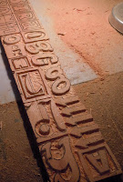
WOOD - Carvings - soft material that could have hard edges when printed
LEAD - Letterpress - Combines typefaces - casted & moulded - a huge range
SILICONE - Digital - a lot of possibilities

Stone
Sable (Brush)
Bone (Quill)
Wood
Lead (Letter Press)
Silicone (Digital)
Digital type now has references to the older styles (brush strokes etc)

Bauhaus - brought together traditions & mass productions.
               - form & function in typography - form followed function

Bauhaus Typefaces:


Typeface I created for OUGD405 based on Bayer:

Function can drive form.

Johann Gutenberg - 1455 - The 'Gutenberg press' - first mass production - the bible
  • Global typefaces - typefaces forming in the middle east etc
  • Nokia created a global typeface - taking other cultures alphabets into consideration.
  • Typographers taking other cultures language into consideration.
My chosen 5 typefaces from task - Choose 5 typefaces from the LCA Font Book:

Arcadia
Bauhaus Standard
Latha
Monoline Script
Monotype Modern Standard

In groups we laid out all our typefaces and categorised them into six different categories depending on their characteristics.
  • Serif
  • Sans Serif
  • Hand written
  • Type writer
  • Modern/contemporary
  • Traditional
As we had such a range of 30 typefaces, all which were completely different, we found this task quite hard to begin with. We started by splitting them into two main categories: Serif & Sans Serif. From here we went through the piles and split them further into the other four categories: Hand written, Type writer, Modern & Traditional.

As a class we complied a list of all the different categories we made.
  • Serif
  • Sans Serif
  • Hand Written
  • Type Writer
  • Modern
  • Traditional
  • Western
  • Contemporary
  • Digital
  • Script
  • Decorative
  • Bold
  • Light
We were then given the six headings to categories our typefaces into:
  • Stone
  • Sable
  • Bone
  • Wood
  • Lead
  • Silicone

Once they were in the categories we then had to think of one word that described the top typeface. Ours were:
  • Roman
  • Calligraphy
  • Script
  • Block
  • Modern
  • Basic 

Wednesday, 7 November 2012

OUGD403 - Message & Delivery: Posters (1)

Brief
Produce designs for a set of three high impact posters that deliver a personal identified message derived from your research into part one of this brief. The three posters should work as a set or series and be visually consistent. The first must be produced solely using type, the second solely with image and the third a combination of both type and image.
You are restricted to the use of two colours plus stock.
Three posters in a 2:1 format presented at A3 size.


I am going to focus on the idea of social media taking over the world's communication - sticking to Twitter as it's the most contemporary way, and is always featured in the news on stories with people's opinions.

Type
Initial ideas:


The main idea with this poster is sticking to the 140 characters, as that's how many characters are allowed in a twitter post. From this, I came up with the four sentences:

140 characters is the new #letter.
140 characters is the new #phonecall.
140 characters is the new #conversation.
140 characters is the new #communication.

All together, these four sentences do come to 140 characters, and they get across the message that I want.
The initial idea was the type them like a post: 
140 characters is the new #letter.140 characters is the new #phonecall.140 characters is the new #conversation.140 characters is the new #communication. 
However when I started working on variations, I found that this wasn't practical, and just to keep them as four separate sentences was the best thing to do, as it would be easier to manipulate and give a lot more freedom creatively.

The original idea for the type was the number in the twitter blue, the 'characters is the new' in black, and hashtag word in red. This gave each it's own individuality and didn't make the statement forgettable.

Although I like this as it is, I didn't feel that when the four statements were together, they all stood out on their own against the background, so I gave outlines to everything.

Digital variations:

Image

Initial Ideas:

I got the initial idea for this one first out of the three posters. I wanted to keep it simple, just combing together a couple of elements. This was mainly down to the fact that I could only use two colours and stock. I didn't want to make something overly complicated. I want it simple and straight to the point.
I combined two elements, the twitter bird and the world map.


This is the first one I did. The world map inside the twitter bird, with one colour, the map a few tones lighter. I felt it was a good starting point and was exactly what I was aiming for.

Digital Variations:


Both

Initial Ideas:

I found this one the hardest to do because there is so many possibilities and paths I could go down. It helped that I had basic ideas for the other two done. As they have to work as a set, I didn't want them all to be too different. I wanted to keep the same elements in each of them.
I used the two main elements of each - the twitter bird, and the main sentence from the type: 140 characters is the new #communication.

This is the initial poster I came up with, just using the twitter bird layered a few times to create a background, and simply putting the text over the top, and a small full twitter bird in the corner. I think it is clearly about twitter, and gets the message across. From this, I started creating variations using all of these elements and colours.
Digital Variations:


Initial set


Tuesday, 6 November 2012

OUGD403 - Message & Delivery: Research

From Tuesday 23rd October, get a newspaper and choose one story to research about.

Daily Mail: 'Internet trolls' sick taunts over Adele's baby boy'


Tuesday was a particularly slow day when it came to news, especially when it was recommended to find a happy/decent story instead of something horrible and morbid. This story about Adele and twitter is the one that took my interest the most, and is something that I could definitely take the horrible side away from.

I started looking at Twitter in general, and the huge amount of information that gets passed about on it. This included abuse and bullying, to celebrity & world news, and even marriage proposals.